This article is part of a regular series of conversations with the Review’s contributors; read past ones here and sign up for our e-mail newsletter to get them delivered to your inbox each week.
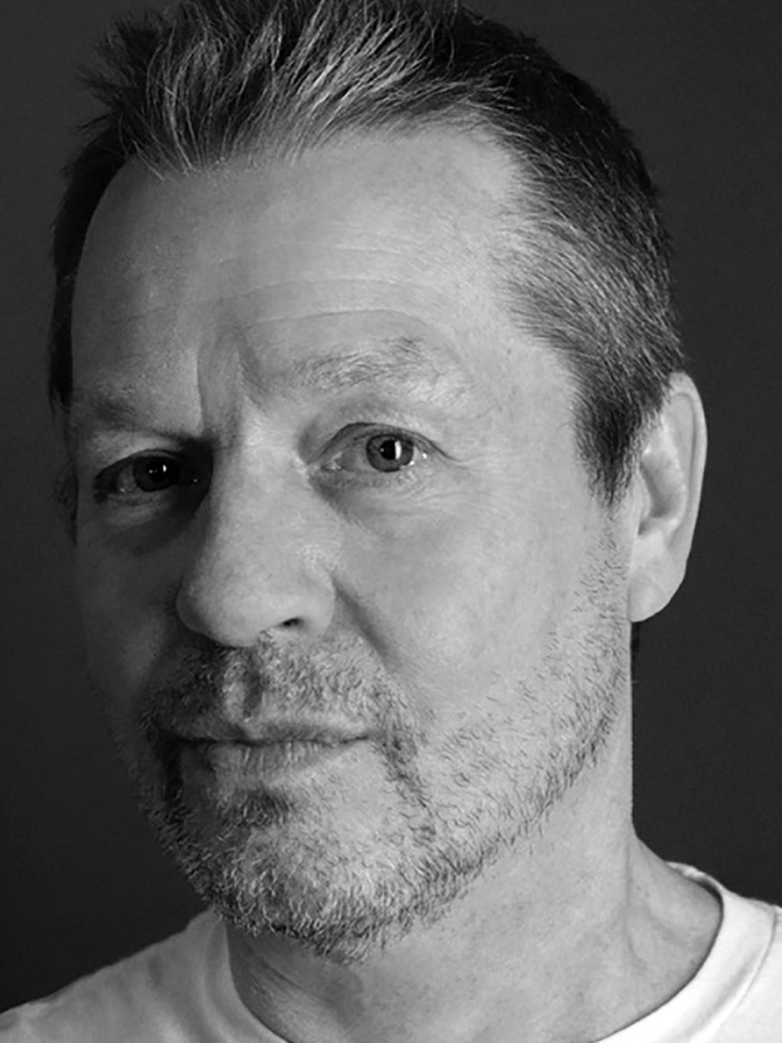
Alain Pilon is a French-Canadian illustrator and artist based in Montreal. I’ve been working with him for twenty-five years, but our first meeting was a social occasion on a freezing winter night in Montreal in 1999. Over a bag of chips and a bottle of wine, he gave a friend and me a tour of his studio before taking us to dinner.
At the time the wine and the potato chips and the late-night restaurant seemed to me the height of chic, urbane life. I’ve always sensed this kind of high-low sophistication in Pilon’s work: a thick, hand-drawn line with a meticulous, almost machine-made background. Or a color palette straight out of Depression-era Quebec paired with surreal ideas about cultural theory. I can ask him to approach any idea, and he’ll come back with an unexpectedly weird take, strong but gentle.
We didn’t know what to expect when we asked Pilon to draw the cover for our Fall Books issue. He came up with a handful of sketches: a dancing ink bottle, ducks, Central Park, and, our favorite, wilted flowers and fruit crawling with grubs. It made me think of vanitas paintings and Sam Taylor-Johnson’s Still Life (2001), a strangely moving stop-motion short film of a heap of rotting fruit. I e-mailed with Pilon over Labor Day weekend, just after I arrived home to a bowl of moldy lemons.
Leanne Shapton: You gave us so many ideas for the cover. How did you arrive at the one we selected, Le Festin?
Alain Pilon: Fall is a reminder of the cycle of life. Nature and books come and go. They grow old and die, feed others and regenerate in various forms. Maybe I’m just trying to reassure myself about the meaning of it all. The quiet feast became an urgent quest for an answer.
What is your relationship to the still life? Your work is usually so conceptual, but do you draw or paint a lot of still lifes? Flowers? Fruit?
I am not a big still life fan. For this project I wanted to make an image that was less conceptual than what I usually draw; I was looking for something more abstract, more philosophical, if I may say so. I created a mood, a glimpse at life and death. The light color palette, the soft texture, and the simple composition may help tone down the tragedy of what is happening on the table. You have to look twice before noticing the wilted flowers, the rotten fruit, and the maggots.
What did you read and watch growing up?
I grew up watching cartoons on TV: Woody Woodpecker, Popeye the Sailor Man, and Looney Tunes. I was also fascinated by Batman (the Adam West one), The Outer Limits, and TV shows like Ripcord. I read Tintin, Asterix, and a lot of American comic books. As a teenager I devoured Mad and Pilote magazines. Later I discovered more adult publications like Métal hurlant, Charlie mensuel, and Raw. I loved the work of Gary Panter and Charles Burns, and I used to steal a lot from them during my years of apprenticeship. (I am very sorry about that.) Later in life I started reading a few incontournables: Balzac, Dumas, Maupassant, Céline, Sartre, Beauvoir, Camus, Romain Gary, Jack London, Hemingway, Fante, Salinger, Bukowski, Mailer, Capote, Angelou, Roth, McCarthy, Carver, Auster, Tolstoy, Döblin, Bulgakov, and Hilsenrath were my companions during difficult times. I am interested in everything related to the Vietnam War, Native Americans, and boxing. But with time, my tastes tend to change.
How does boxing influence your artistic practice, if it does at all?
Fifteen years of boxing have indeed had a lot of effects on my way of seeing things. For several years I trained five or six times a week, not counting the jogging sessions. I felt in control, disciplined, and very focused. I could face any difficulty, both in my personal life and in my artistic practice. Boxing was a turning point in my life.
The hand-drawn sans serif type on the cover is beautiful and even. What fonts and typefaces do you like to draw and why?
Most of the time I compose the texts on my computer with Microsoft Word, then I make a print and trace the letters with a pen on a light table. In the case of the cover, I used the Futura font. Sometimes I use letter stencils.
How has living in Montreal shaped your work?
I’m going to answer with a cliché, but living in Montreal nourished me with French culture and American culture, thanks to which I benefited from a very wide cultural range. Without a doubt the best of both worlds.
Are there any books you are reading this fall?
During the summer I read A Widow’s Story by Joyce Carol Oates, La Place (A Man’s Place) by Annie Ernaux, L’Absente de tous bouquets by Catherine Mavrikakis, La Compagnie des spectres (The Ghost Company) by Lydie Salvayre, and La Sainte Paix by André Marois. Right now I’m reading Barthes and Daphné B.
Advertisement


