One of the most well-intentioned artistic initiatives ever undertaken by the United States government has turned out to be among its least successful: the embassy design program meant to present America’s best architectural face abroad. The latest evidence of this effort’s often dispiriting outcome is the selection of the little-known Philadelphia firm of KieranTimberlake to create a new US embassy in London.
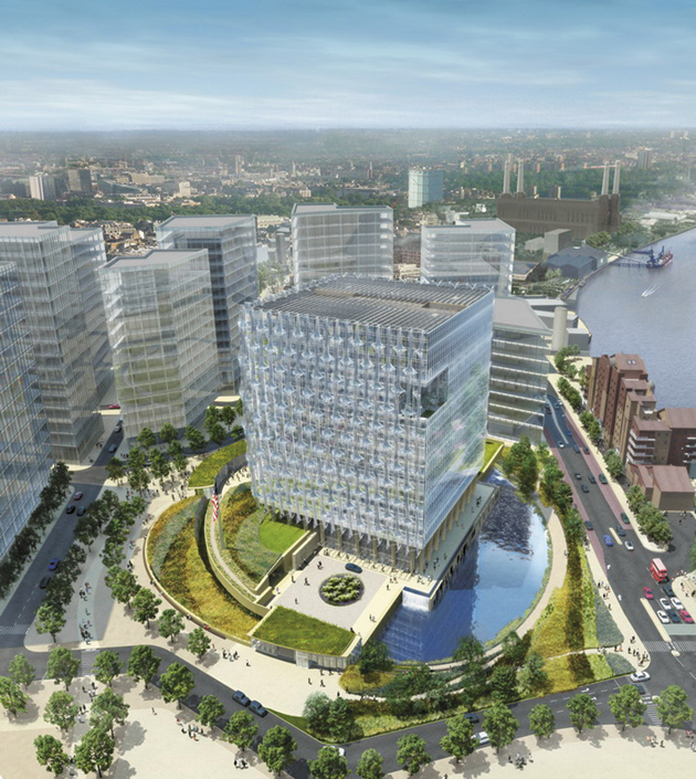
Planned for a derelict industrial site of almost five acres near the Thames in south-of-the-river Wandsworth, the project carries the astonishing price tag of $1 billion, and brings to mind an International Style corporate headquarters as well as a medieval castle keep. At first glance, this twelve-story cube-shaped structure recalls countless other glass-sheathed office buildings. However, upon closer inspection other associations predominate.
The embassy’s “ground” floor is elevated atop a bunker-like podium, the top of which is densely landscaped with grassy berms, trenches, and a water feature best described as a moat. The building’s square footprint, chunky massing, fortified perimeter, and relation to the river make it a twenty-first-century avatar of the Tower of London, several miles to the northeast on the opposite bank of the Thames.
The building’s exterior cladding of glass—a material often equated simplistically with governmental openness—is treated with polymer plastic to lessen its projectile force in case of explosion. Similarly, the undulating earthworks at the base of the tower are meant to deter the advance of truck bombers. Given the likelihood of another al-Qaeda assault on the capital city of America’s principal ally in the Iraq and Afghanistan wars, such defensive measures seem only prudent, but the extensive checklist of protective requirements included in the design brief clearly had an inhibiting effect on even the most gifted of the competition’s entrants.
The new legation building would replace Eero Saarinen’s US Embassy Chancery of 1955–1960, which occupies the entire west side of Grosvenor Square in north-of-the-river Mayfair. Whether intentionally or not, the modular, gridded elevations of KieranTimberlake’s project look like a stack-up of three Saarinen façades. (The old building has been sold for a reported $533 million to the government of Qatar, which plans to redevelop it into a hotel and apartments, but must retain the once-controversial, now-landmark street front.)
Saarinen’s Brutalist limestone intrusion, topped off with a garish gold sculpture of a screaming eagle, spoke as revealingly of America’s postwar hegemony as the mixed message of KieranTimberlake’s scheme does of our very different place in the world order fifty years later. Apart from the need for more office space, the old embassy’s locale was deemed to make it too inviting a target for terrorists, and thus prompted the move to a less populous neighborhood that could accommodate a setback of some one hundred feet for a buffering “blast zone.”
KieranTimberlake’s scheme was strongly opposed by the two British members of the seven-person design jury—the architect Richard Rogers and Peter Palumbo, a former chairman of the Arts Council of Great Britain. They were quickly joined by the mayor of London, Boris Johnson, and the government’s Commission for Architecture and the Built Environment, which initially announced that it could not approve the winning design.
According to The Guardian, Rogers and Palumbo “fought to the death” to keep their American fellow jurors from approving this entry, and instead pushed for the proposal by Thom Mayne of the Santa Monica firm Morphosis, which they maintain was “touched by genius.” Even though Mayne’s scheme is not nearly as fine as his magisterial Federal Office Building of 2000–2007 in San Francisco, it was indeed the best among four finalists, which also included Pei Cobb Freed & Partners’ tepid glass-skinned cross-braced ovoid and a confused neo-Constructivist composition by Richard Meier, which recalls the gigantic cash register pavilion at the 1939 New York Word’s Fair.
For a century and a half after independence, America’s foreign representatives were customarily housed in existing quarters built for other purposes. In 1926, Congress created the Foreign Service Buildings Office to oversee the design and construction of US embassies and consulates, but the results were hardly distinguished, and ran to Beaux-Arts Classical or Colonial Revival clichés. The widespread acceptance of Modernism after World War II led to a radical change in this country’s official architectural presence abroad.
In 1954, the State Department’s revitalized embassy design program embraced the new architecture in much the same spirit that it exported jazz and Abstract Expressionism: as talismans of American creative freedom at the height of the cold war. A major principle of this endeavor—the subject of Jane C. Loeffler’s 1998 book The Architecture of Diplomacy: Building America’s Embassies —was to give the new structures “a distinguishable American flavor,” while at the same time referring to local traditions in contemporary form.
Advertisement
Several architects followed that mandate all too literally. Edward Durrell Stone’s perforated New Delhi embassy of 1954–1958 summons up a lacy MGM seraglio; the colonnaded Athens embassy of 1959–1961 by Walter Gropius and the Architects Collaborative evokes a savings-and-loan Parthenon; and John Johansen’s circular Dublin embassy of 1957–1964 resembles a cross between an Irish Martello tower and a Jet Age airport hotel. The extent to which these culturally condescending designs—risibly aloof from the surrounding urban setting—all exhibit “a distinguishable American flavor” is somewhat akin to an obese tourist decked out in cargo shorts, baseball cap, and Hawaiian-print shirt.
Things got even worse after the bombing of two US embassies in East Africa in 1998, the reaction to which marginalized aesthetic concerns in favor of heightened security. As Loeffler wrote in 2005, “The inaccessibility of these [more recent] buildings, coupled with the new standardized design, may be harming efforts to portray America as an open society.”* With KieranTimberlake’s scheme, the costume has changed to the architectural equivalent of Kevlar body armor thinly disguised underneath a Tommy Hilfiger seersucker suit.
No doubt to soften the new embassy’s Fortress America connotations, the architects have gussied up their presentation with crowd-pleasing environmental details of the sort that real estate developers throw in to gain planning approval for otherwise objectionable projects. Here, the exterior will sport photovoltaic cells to collect solar power and make the building energy self-sufficient. One corner near the top of the structure will be cut out to create a covered terrace planted with large trees, a dubiously sustainable gesture derisively dismissed in advanced ecological circles as “parsley.”
Perhaps KieranTimberlake’s arboreal reference is Shakespearean. In Macbeth, enemy troops advance on the title character’s stronghold wearing tree branches to camouflage themselves, and thereby fulfill the cryptic prophecy that he will remain safe until “Birnam Wood do come to Dunsinane.” In Finnegans Wake, Joyce reframes that line as “a burning would is come to dance inane,” a not-inappropriate gloss on this tragicomic evidence of America’s postmillennial quandary in architectural guise.
(A version of this article was published on the NYR blog, blogs.nybooks.com.)
This Issue
April 8, 2010
-
*
Jane C. Loeffler, “Embassy Design: Security vs. Openness,” Foreign Service Journal, September 2005.
↩


