1.
With his prodigious gift for invention, shrewd understanding of communication techniques, and contagiously optimistic conviction that modern architecture and urban design still possess enormous untapped potential for the transformation of modern life, no master builder since Le Corbusier has offered a more impressive vision for a brighter future than the Dutch architect Rem Koolhaas. To be sure, there are other present-day architects also at the very apex of the profession who do certain things better than he does. Robert Venturi is a finer draftsman and a more elegant writer; Denise Scott Brown has a more empathetic feel for the social interactions that inform good planning; and Frank Gehry displays a sharper eye for sculptural assemblage and a keener instinct for popular taste. But when it comes to sheer conceptual audacity and original thinking about the latent possibilities of the building art, Koolhaas today stands unrivaled.
Through his Rotterdam-based practice, the Office for Metropolitan Archi- tecture—OMA—and its research-and- development division, AMO, Koolhaas has conceived some of the most daring schemes of the past four decades, ranging in scale from mammoth undertakings like Euralille of 1987–1994 (the reconfiguration of the northern French city of Lille with a new high-speed railway hub, commercial center, and convention hall) and De Rotterdam of 1997–2013 (three interconnected mixed-use towers that will be the biggest building in Holland) to exquisite smaller structures including the Casa da Música of 2001–2005 in Porto, Portugal (an ark-like concert hall), and the Netherlands Embassy of 1997–2003 in Berlin (the finest work to rise in the German capital since reunification).
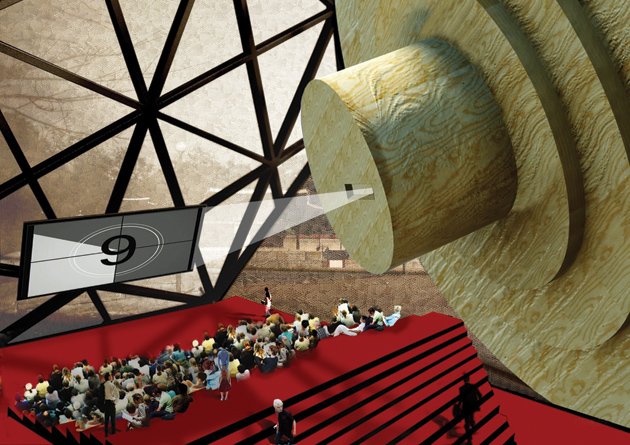
The full range of Koolhaas’s building career was on view at London’s Barbican Art Gallery this year in a sprawling and exhilarating exhibition entitled “OMA/Progress.” Designed by the Brussels firm Rotor, the installation conveyed the messy vitality of the OMA aesthetic through staccato text and vibrantly overloaded visual effects. The retrospective featured a nonstop, random projection of all 3.5 million images stored in OMA’s database, which made it impossible for any one person to see its contents in toto, a characteristically Koolhaasian conundrum.
The Barbican show—which included colored printouts casually pinned to wallboards or taped to the floor, huge unframed floorplans suspended from the ceiling, and rough-looking models strewn about—had the pleasantly disheveled air of an architectural office the morning after an all-night charrette to meet a competition deadline. Unlike some firms of its stature, OMA continues to participate in such contests, which many architectural stars avoid as beneath them and a waste of time and money.
As Le Corbusier did, Koolhaas knows that the power of presentation, verbal as well as visual, is a crucial (and perhaps the decisive) element in the realization of the building art. Following the great Swiss-French master’s profitable example, Koolhaas has produced several hugely popular books, including two perennial touchstones among the young: Delirious New York: A Retroactive Manifesto for Manhattan (1978) and S, M, L, XL (1995).
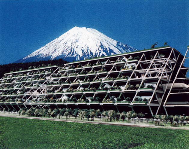
Koolhaas’s latest volume, Project Japan: Metabolism Talks… (written with Hans Ulrich Obrist), pays tribute to the Metabolists, the mid-twentieth-century Japanese architects at the forefront of that country’s rebuilding after the devastation of World War II, led by the elder statesman of non-Western modernism, Kenzo Tange. This heavily illustrated and engagingly discursive oral history was undertaken in 2005 (the year of Tange’s death at the age of ninety-one) to record the testimony of the surviving Metabolists, and it is destined to become a definitive reference.
In common with all of Koolhaas’s publications, one can readily detect that Project Japan actually concerns the author and his own interests as much as its ostensible subject. In this case, the Metabolists’ obsessive fixation on futuristic megastructures—stupendous agglomerations of superscaled buildings and integrated urban transport and other infrastructure meant to extend over many square miles, sometimes atop shallow bodies of water like Tokyo Bay, none of which were fully executed—has long been shared by the Dutch architect, who like his older Japanese counterparts in the Metabolists group has sought ingenious ways to overcome the severe geographic constraints of his tiny, sea-bound, and populous homeland.
2.
Artists of genius generally wish to appear as though they emerged fully formed, and Koolhaas is no exception. A scion of the Dutch avant-garde cultural elite, Remment Lucas Koolhaas was born in Rotterdam in 1944, at the onset of the Hongerwinter (hunger winter), that final ordeal of the five-year Nazi occupation of Holland. His polymathic father, Anton Koolhaas, was an esteemed journalist, author of beloved fables about anthropomorphic animals in the manner of Kenneth Grahame and George Orwell, and the scenarist for two Academy Award–nominated documentaries.
Advertisement
The elder Koolhaas was also an ardent advocate of independence for the Dutch East Indies. In 1949 the Netherlands granted autonomy to Indonesia, and three years later Sukarno, the new country’s first president, invited him to run a cultural program there, whereupon the writer moved his family to Jakarta. That four-year immersion in a third-world society—“I really lived as an Asian,” the architect has reminisced—was a central factor in fostering his uncommonly broad worldview, which gave him a distinct advantage when the globalization of architectural practice began to accelerate as he hit his professional stride decades later.
Following his father’s example, the young Koolhaas initially turned to journalism and screenwriting. In 1963, when he was eighteen, he began working for De Haagse Post, a right-liberal weekly published in The Hague, where he designed layouts and wrote on a wide range of political, social, and cultural topics. He later cowrote an ultimately unproduced movie script, Hollywood Tower, for the soft-porn director Russ Meyer, auteur of such camp classics as Faster, Pussycat! Kill! Kill! (1965).
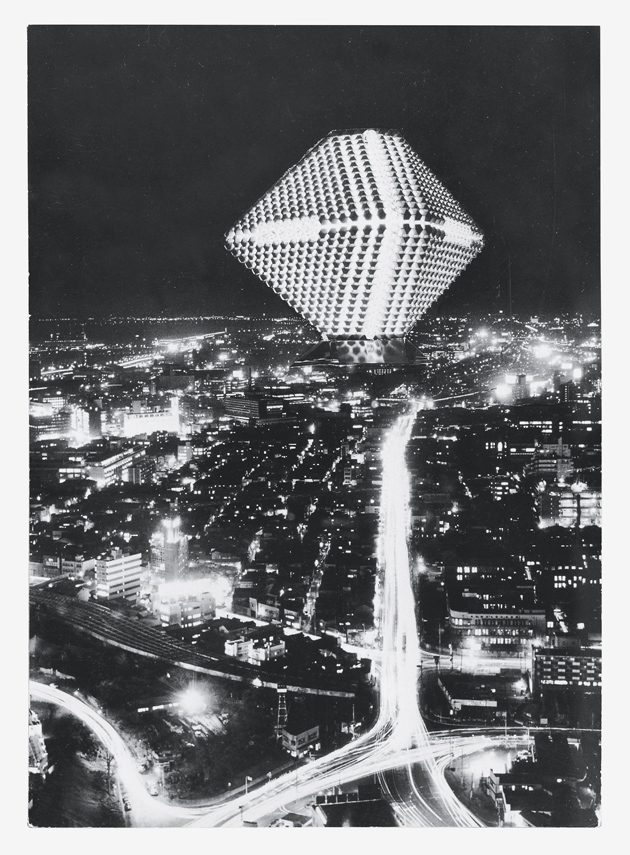
There were other family influences as well. Koolhaas’s maternal grandfather was Dirk Roosenburg (1887–1962), a vanguard architect in whose studio the boy made some of his earliest architectural drawings. Roosenburg’s best-known work was the Philips electronics company’s Lichttoren (light tower) of 1920–1928 in Eindhoven, a concrete-and-glass Art Deco office-and-laboratory building internally illuminated throughout the night like some twentieth-century Pharos—just the sort of romantic Modernism that Koolhaas evokes in his most imaginative speculations.
After studying at the experimentally oriented Architectural Association in London and later at Cornell (where he sought out the influential theorist O.M. Ungers), Koolhaas became the prime mover behind the Office for Metropolitan Architecture, which he founded in 1975 with the Greek architect Elia Zenghelis (under whom he had studied at the AA) and their respective spouses, the artists Madelon Vriesendorp and Zoe Zenghelis. Koolhaas has a domestic life not unlike that portrayed in Anthony Kimmins’s film comedy The Captain’s Paradise (1953) by Alec Guinness, who plays a ferryboat skipper who shuttles between a wife and a mistress in separate ports. Vriesendorp makes her home in London, but since the mid-1980s her husband has lived in Holland with the Dutch designer Petra Blaisse, who has collaborated on several OMA projects, including the interiors of the Seattle Central Library of 1999–2004. (The Koolhaases’ daughter, Charlie, is a photographer who did the principal illustrations for Project Japan, and their son, Tomas, is a cinematographer who is making a documentary film on the architect titled Rem.)
Vriesendorp created the most celebrated image in Delirious New York, which first brought her husband to international attention. The painter’s architectural fantasy Apres l’amour depicts an apparently postcoital Empire State Building and Chrysler Building lying side by side on a rumpled bed. In between them is what looks like a discarded condom but turns out to be a deflated Goodyear blimp—a sly reminder that the Empire State’s spire was originally intended as a dirigible mooring mast (an idea abandoned as too dangerous.)
Beyond such provocative erotic metaphors—the antithesis of the coolly technocratic renderings that typified postwar corporate modernism—what makes Delirious New York so unforgettable is its author’s deep insights into the psychohistory of urbanism: the ways in which the often unacknowledged or unexpressed ethos of a city is embodied in its architecture. Koolhaas’s almost cinematic exploration of Manhattan’s subconscious architectural mystique had an especially tonic effect on the collective civic consciousness when it first appeared, just three years after the fiscal crisis of 1975 brought the city to the brink of bankruptcy. Even at Gotham’s lowest ebb, Koolhaas never lost sight of the imaginative heights this greatest of metropolises could yet again attain.
3.
An entire book could (and in due course undoubtedly will) be written about Koolhaas’s spectacular trio of failed American museum proposals immediately before and after the millennium: an expansion of the Museum of Modern Art (1997) and an addition to the Whitney Museum of American Art (2001–2003), both in New York City, and a reconfiguration of the Los Angeles County Museum of Art (2002). (In 2001, he completed the Guggenheim Hermitage Museum at the Venetian casino-hotel in Las Vegas, but that small branch gallery, a consortium between the eponymous art institutions in New York and St. Petersburg, closed in 2008 after it lost too much money.) Koolhaas’s inability to either win or complete these three high-profile assignments in the most conspicuous architectural category of the past several decades says much about the frequently confrontational nature of his vision.
Advertisement
In the limited competition for the MoMA job, ten invited participants (among whom Koolhaas was by far the best-known) were asked to present broadly conceptual ideas. His irreverent scheme included two elements that irreparably offended the search committee’s amour propre: he proposed transforming Philip Johnson and James Fanning’s sacrosanct Abby Aldrich Rockefeller Sculpture Garden of 1953 into a sunken plaza not unlike the Rockefeller Center ice-skating rink. Even more insolently, he would have surmounted a seven-story addition atop Johnson’s 1964 wing with a billboard emblazoned “MoMA, Inc.”
Had the nonagenarian Johnson, a big fan of Koolhaas’s, not been in his dotage and thus out of the selection process, he likely would have defended such bad-boy tactics as precisely the reinvigorating shock MoMA needed to jolt it back to its revolutionary roots. But absent the crafty old power broker, the merits of Koolhaas’s scheme were overlooked and the job—which had been assumed to be his for the asking—passed instead to Yoshio Taniguchi. His decorous but chilly design, which combines the dismal immensity of an airport terminal with the disorienting placelessness of a convention center, fulfilled the Dutchman’s sardonic prophecy about the once-pathbreaking museum’s increasingly corporate character. Though Koolhaas’s impudence could be interpreted as professional suicide, one still cannot help but marvel at his critical bravery.
Four years after the MoMA debacle, the Whitney turned to Koolhaas in another attempt to add to Marcel Breuer’s stubbornly unexpandable Brutalist monolith of 1963–1966. During the 1980s, Michael Graves had produced three increasingly unsatisfactory versions of a pompous Postmodern enlargement that would have engulfed the original building in a welter of fussy classicizing polychromy, which was dropped after strenuous community opposition. Koolhaas’s far more radical plan called for a curved superstructure to be inserted behind the landmarked brownstones adjacent to the museum, an appendage that would have risen up and hovered over the Breuer building like a monstrous cobra. The Whitney abandoned that nonstarter after two years of even more vocal neighborhood protest.
The best of Koolhaas’s three lost museum schemes was for the Los Angeles County Museum of Art, which asked him to bring coherence to its jumble of dated 1960s Space Age–style pavilions. He immediately envisioned a drastic but brilliant solution: he called for the architectural equivalent of cutting the entire complex off at the ankles, leaving the footprints of the existing galleries and circulation routes intact, and then covering everything inside the oblong periphery of the multi-acre site with a gigantic bubble roof that suggested an inflatable tennis court shelter.
In one bold stroke, LACMA would have gained the unified and monumental civic presence it has always lacked. Instead, like the Whitney, the LA museum turned to Renzo Piano, the default-mode master of predictably safe and supposedly timeless institutional modernism. Alas, Piano’s incremental boxes (the compromised Broad Contemporary Art Museum of 2003–2008 and the warehouse-like Resnick Pavilion of 2007–2010) have only exacerbated LACMA’s organizational mess.
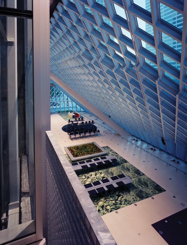
Apart from his short-lived Vegas display space, Koolhaas’s only executed art gallery remains his Kunsthal of 1987–1992 in Rotterdam, a temporary exhibition facility with flexible galleries arranged around a squared-off helix of interior ramps that lead visitors almost effortlessly from level to level, without the now-ubiquitous escalators that give so many contemporary museums (including Taniguchi’s MoMA) the air of a shopping mall. Koolhaas used this same low-tech internal circulation for his largest work in the US, the Seattle Central Library, which was enthusiastically received upon its completion in 2004.
Koolhaas’s Seattle project perfectly demonstrates his fundamental disdain for a major preoccupation of bien-pensant architects since the 1960s—“contextualism,” or designing a building to fit in with earlier structures near it. Given the dreary array of banal 1960s and 1970s high-rises that surround the entire city block dedicated to the new library, one can second his belief that it would have been futile to make any accommodating gestures toward such a negligible setting.
Wisely, he devised a blockbusting composition: an angular pile-up of prism-like glass layers wrapped in white-painted, diamond-patterned steel latticework that forcefully establishes itself by ignoring everything around it. In continuation of a modernist tradition that began with Joseph Paxton and Charles Fox’s Crystal Palace of 1850–1851 in London, the open, soaring, light-flooded interior of the Seattle Central Library provides a majestic public space that suggests that the activities taking place within it are of singular importance to the community—something that architectural neoconservatives have wrongly insisted lies beyond the emotional capacity of the modern design vocabulary.
4.
Koolhaas is inexorably drawn to the architecture of state power, and is fascinated by earlier architects attuned to power regardless of its source. None of the great twentieth-century masters was more assiduous in his willingness to work for clients of any political stripe, from Communists to Nazis and all stops in between, than Koolhaas’s idol Ludwig Mies van der Rohe. But whereas Mies’s design genius might excuse much guilt by association, it is hard to fathom Koolhaas’s perverse fondness for Wallace K. Harrison, a modestly accomplished establishment Modernist known mainly as the Rockefeller family’s de facto court architect.
Harrison’s in-law relationship to the Rockefellers gave him initial entrée, and he went on to oversee several gargantuan commissions under their sponsorship, including the collaboratively designed United Nations Headquarters of 1949–1952, Lincoln Center for the Performing Arts of 1959–1969 in Manhattan, and the Empire State Plaza of 1959–1976 in Albany, which he designed (at the behest of Governor Nelson A. Rockefeller) with his longtime partner, Max Abramovitz. Koolhaas—who mounted a quixotic exhibition honoring the aged and démodé Harrison at New York’s avant-garde Institute for Architecture and Urban Studies in 1979—has been particularly intrigued by the architect’s hypothetical X-City of 1946, proposed by the real estate developer William Zeckendorf for the Manhattan site later donated by John D. Rockefeller Jr. to the UN—a configuration resurrected by Koolhaas in Eurolille’s dated enfilade of slab-sided high-rises.
As for his own relations with power, Koolhaas harbors no discernible qualms about abetting a state-controlled propaganda agency of the current Chinese dictatorship. Following the example of architects from time immemorial, he has gone where the work is, and during the past decade that means China, where his major projects include the Shenzen Stock Exchange of 2006–2011, a monolithic, Miesian tower surrounded by a projecting “base” hoisted six stories above ground level by massive diagonal struts.
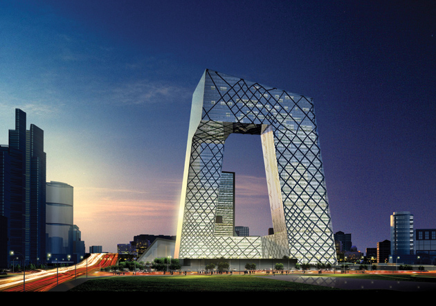
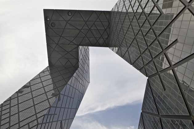
What is likely to remain Koolhaas’s most controversial commission is now nearing completion in Beijing: the 4.2-million-square-foot China Central Television Headquarters, begun in 2004 and now at least three years behind its original estimated occupancy date, with an estimated cost of more than $800 million. (A disastrous 2009 fire, which destroyed the OMA-designed hotel next to the giant structure, was largely responsible for the delay.)
The CCTV building brings to mind a twice-as-large, deconstructed version of Johann Otto van Spreckelsen’s Grande Arche de la Défense of 1982–1989 in Paris, one of the most visible, if least distinguished, of the grands projets initiated by President François Mitterrand. (Significantly, OMA lost the 1991 competition for an extension to La Défense, the office building district created just outside the city limits to spare central Paris from high-rise development.)
Despite their striking disparity in size—the CCTV structure is 768 feet high, the equivalent of a seventy-story tower, while the Grande Arche is the equivalent of only thirty-five stories—both are approximate cubes that inscribe a vast void within their clearly defined outlines. But whereas Spreckelsen’s slab-sided squared-off arch is dully static, the vertiginously off-kilter CCTV headquarters is a tour de force of high-tech engineering, orchestrated by Cecil Balmond of the London-based structural consultancy Arup.
The glass-and-metal-skinned Beijing behemoth is basically a pair of slightly inward-leaning L-shaped towers on two opposing corners of a vast square, and joined at the top by a breathtaking right-angled cantilevered overhang that imbues the composition with gravity-defying bravado. The horizontal and vertical elements interconnect in a continuous series of eight segments, a snakelike circulation system quite unlike that of any other office-and-broadcasting facility.
With a plethora of bizarre new architecture engulfing them, baffled Beijingers have devised a new architectural lexicon recalling the wry coinages long perfected by witty Berliners, who, for example, have dubbed the glass dome of Norman Foster’s Reichstag renovation of 1992–1999 die Käseglocke (the cheese cover). Thus the two-legged CCTV colossus has become colloquially known as da kucha (big pants crotch). In trying to preempt a sarcastic nickname of this sort, officials wanted to get locals to refer to the CCTV building as zhi chuan—knowledge window—a pretentious choice that backfired because of its close homophonic echo of zhi chuang—hemorrhoid.
But whatever moniker people adopt, one can predict that they will be beguiled by the highly unusual and equally controlled tourist route that is being built through the CCTV nerve center. Visitors will be able to navigate the premises in one nonstop loop while never disturbing day-to-day activities, a sure-fire public relations coup that will confer a bogus semblance of transparency on what of course is anything but an open operation.
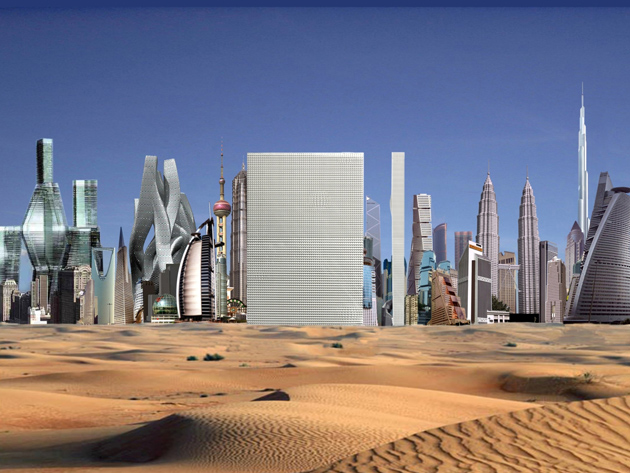
CCTV arises amid the urban free-for-all of Beijing’s Central Business District, a chaotic cityscape that makes 1980s Houston seem like Haussmann’s Paris. To counter that urban miasma, Koolhaas (and his design partner for this project, the German architect Ole Scheeren) applied a strategy explicated in Koolhaas’s 1994 manifesto, “Bigness, or the Problem of Large,” which enumerates five “theorems,” some of them evident in the Beijing scheme:
1. Beyond a certain critical mass, a building becomes a Big Building. Such a mass can no longer be controlled by a single architectural gesture, or even by any combination of architectural gestures….
2. …Issues of composition, scale, proportion, detail are now moot.
The “art” of architecture is useless in Bigness.
3. In Bigness, the distance between core and envelope increases to the point where the façade can no longer reveal what happens inside. The humanist expectation of “honesty” is doomed….
Where architecture reveals, Bigness perplexes; Bigness transforms the city from a summation of certainties into an accumulation of mysteries. What you see is no longer what you get.
4. Through size alone, such buildings enter an amoral domain, beyond good or bad.
Their impact is independent of their quality.
5. Together, all these breaks—with scale, with architectural composition, with tradition, with transparency, with ethics—imply the final, most radical break: Bigness is no longer part of any urban tissue.
It exists; at most, it coexists.
Its subtext is fuck context.
Such morally laissez-faire attitudes infuriate Koolhaas’s detractors, who see him as pandering to the basest market-driven impulses in a world that has largely abandoned the social vision of the early Modernists as either pragmatically impossible or impossibly utopian. As if to endow his free-floating Realarchitektur with legitimate parentage, he has championed a reappreciation of the work of Robert Venturi and Denise Scott Brown, who during the full flood of socially responsive design in the 1960s and early 1970s were similarly denounced for what some saw as their all-too-willing embrace of commercialism, epitomized by their incendiary study Learning from Las Vegas (1972) and its codification of the American roadside vernacular.
Venturi and Scott Brown’s position, however, was no unprincipled acquiescence to capitalist imperatives, but a resigned acceptance that these are conditions that all present-day practitioners—even high-style architects—must deal with, like it or not. A similar uproar greeted the 2001 publication of The Harvard Design School Guide to Shopping, a comprehensive analysis of retail design that emerged from a course that Koolhaas taught at the university and focused on today’s all-pervasive global consumer economy.
Two other books have emerged from similar studies led by Koolhaas as part of his Project on the City at Harvard’s Graduate School of Design, where he has been a visiting professor since 1995. Investigating what he has described as “a new type of metropolis that we have called a ‘city of exacerbated difference,’” Koolhaas and his students have focused on such immense ad hoc conurbations as five rapidly expanding cities in China’s Pearl River Delta (Guangzhou, Hong Kong, Macau, Shenzen, and Zhuhai), subject of Great Leap Forward (2002), and Nigeria’s biggest city, analyzed in Lagos: How It Works (2008).
These seminars are based on Scott Brown and Venturi’s now-famous 1968 Yale course that led to Learning from Las Vegas. But whereas they and their class gathered data by driving along and photographing the Strip, Koolhaas has admitted that he and his team were too scared by Lagos’s chaos to exit their vehicle, and instead rented the president of Nigeria’s helicopter to survey the city by air. “What seemed, on ground level, an accumulation of dysfunctional movements, seemed from above an impressive performance, evidence of how well Lagos might perform if it were the third largest city in the world,” he later wrote. Traffic jams became occasions for people to make sales.
Some critics consider both his subject matter and methodology de-haut-en-bas slumming. As George Packer wrote in The New Yorker in 2006:
That impulse to look at an “apparently burning garbage heap” and see an “urban phenomenon,” and then make it the raw material of an elaborate aesthetic construct, is not so different from the more common impulse not to look at all.
In much the same way that artists like Jeff Koons, Damien Hirst, and Takashi Murakami have appropriated ideas put forward by Andy Warhol and taken them to extremes the originator could scarcely have imagined, so has Koolhaas proceeded from Venturi and Scott Brown’s premises and transmogrified them in ways that can seem like grotesque parodies rather than sincere homages. There can be no doubt whatever about Koolhaas’s once-in-a-generation talent. What remains in question is whether his seeming indifference to progressive values will make future observers wonder why this cultural potentate was so reluctant to confront Chinese oligarchs with the same fearlessness he once marshaled against captains of capitalism on American museum boards.


