1.
Despite the persistent image of the architect as a heroic loner erecting monumental edifices through sheer force of will, the building art has always been a highly cooperative enterprise. Although the parti (basic organizing principle) of a design may sometimes be the product of one intelligence, the realization of a structure of even moderate complexity depends on a broad range of expertise seldom encompassed by any individual, no matter how singularly gifted. As an artistic endeavor, present-day architecture most closely resembles filmmaking, in which the prime creative mover, the director—even the most visionary of auteurs—requires the specialized technical skills of a large cohort of indispensable collaborators.
Thus an architectural team today comprises not only the long-familiar roster of structural engineers, HVAC (heating, ventilation, and air conditioning) specialists, acousticians, interior designers, lighting engineers, and landscape architects, but also computer software engineers, environmental impact managers, and (for certain public buildings) security analysts and anti-terrorism consultants, positions that did not exist a generation ago. One leading New York architectural headhunter reports an even wider array of new job descriptions, including sustainability director, virtual design coordinator, and digital librarian.
Given the growing complexity of architectural tasks and the ever-advancing technologies available to resolve them, that high degree of interdependence is only likely to increase. As Kjetil Trædal Thorsen, a founding member of the Norwegian architectural collaborative Snøhetta, told me in his Oslo office in 2011:
Architecture is now far too complex to be designed by any one person. It is truly a much more communal process than it ever has been. Our conceptual model is “the singular in the plural,” in which all of us are shareholders and each individual takes on responsibility for the company.
Perhaps only a post-industrial social democracy as progressive as Norway—surely among the most enlightened of all contemporary nations, with as good a claim as any other to being a thoroughly evolved and humane society—could have produced an architectural office such as this. A self-described non-hierarchical cooperative whose principals avowedly seek to avoid the personal celebrity we associate with Zaha Hadid or Daniel Libeskind, Snøhetta is far different from the top-down model adopted during the postwar period by large American architectural firms exemplified by Skidmore, Owings & Merrill, which patterned its organizational structure and management methods on those of the large corporations they hoped to attract as clients.
Instead, this far more informal group aims to give quite the opposite impression, that of mutually supportive friends who have banded together to come up with ingenious ideas that will make life better for everyone, primarily but not exclusively their sponsors. It is an uplifting ethos that a younger generation of enlightened clients has found irresistible.
Snøhetta promotes a more democratic workplace atmosphere than most other architectural offices. This may merely reflect prevalent employment practices in Scandinavia, but Snøhetta places a stronger emphasis on group participation in the design process than typical high-style firms. Rather than consigning junior assistants to repetitive backroom drudgery like detailing fire stairs and other minutiae of building-code compliance, the Norwegian collaborative makes a habit of handing over relatively small commissions to younger associates in order to develop their problem-solving skills. As Thorsen told me, the jobs handled by his less experienced colleagues are carefully monitored “so that they cannot get into too much trouble.”
Even the group’s unconventional nomenclature works toward egalitarian ends. Snøhetta, which means “snow cap” in Norwegian—a cryptic choice for an organization with such international aspirations—comes from the eponymous 7,500-foot-high mountain that is the tallest peak in the Dovrefjell range 240 miles north of Oslo. (As a group “bonding” exercise, Snøhetta employees make an annual pilgrimage to the mountain in central Norway.) The name was picked in 1987 by the firm’s six original organizers, all landscape architects committed to interdisciplinary group practice. The firm’s gradual evolution from landscape architecture specialists to a more full-service operation remains evident in an unusual attentiveness to environmental conditions and an exceptional aptitude for site planning. The only two of the original group still with the organization are Thorsen, who heads the main office housed in a converted pierside warehouse on the Oslo harborfront, and Snøhetta’s other principal (there are also five partners), the American Craig Dykers, who directs the US office in Lower Manhattan near their project at Ground Zero.
Since the turn of the millennium, Snøhetta has risen quickly with a series of well-received schemes that in turn have won them other prestigious commissions now in planning or construction. Their meteoric emergence after two decades of practice is a phenomenon on a par with that of their closest American counterparts, the New York firm of Diller, Scofidio + Renfro, who likewise display a keen instinct for contemporary urbanism. Although the firm is based principally in the Norwegian capital—site of the firm’s best-known work to date, the Oslo Opera House of 2003–2008—its increasingly busy branch in New York City oversees its American commissions, which include the National September 11 Memorial Museum Pavilion, begun in 2004 at Ground Zero; a 2010 proposal for reconfiguring Manhattan’s chronically amorphous and chaotic Times Square; and an addition to the San Francisco Museum of Modern Art awarded in 2010.
Advertisement
As a result of such conspicuous jobs, Snøhetta has been appearing on short lists for major commissions alongside avant-garde grandees like Jean Nouvel, Jacques Herzog and Pierre de Meuron, and Kazuyo Sejima and Ryue Nishizawa of SANAA—all Pritzker Prize winners. Perhaps because Norway, small and off the beaten path, has been less than central to the narrative of modern architecture, Snøhetta has downplayed its geographic origins to the extent that other Norwegian architects now view the firm as a multinational venture that has priced itself out of the local market for architectural services. That perception may be contradicted by Snøhetta’s participation in Norway’s admirable government-sponsored National Tourist Routes program—which has underwritten small but exquisite architectural interventions including rest stations, bicycle shelters, scenic viewing platforms, and the like in remote locales to encourage tourism to far reaches of the country—yet there is no question that the firm’s growing presence in the United States is part of a global-minded strategy.
2.
During the mid-twentieth-century heyday of the Modern Movement—which became closely identified with Scandinavia in the popular imagination thanks to that region’s widely distributed, user-friendly contemporary household furnishings—Norway had no internationally recognized master until Sverre Fehn (1924–2009) won the Pritzker Prize in 1997, even though Fehn’s late-life overnight rediscovery overlooked his youthful coup as designer of the much-admired Norwegian Pavilion at the Brussels Universal and International Exhibition of 1958, which brought to mind a woodsy version of Ludwig Mies van der Rohe’s renowned German Pavilion at the Barcelona International Exposition of 1929. This low profile no doubt had more to do with Norway’s relatively small population—in 1940 it numbered just under three million inhabitants, less than half the size of Sweden, a ratio still more or less maintained with five million Norwegians and nine-and-a-half million Swedes today—and commensurate level of building activity than it reflected any inherent lack of native talent.
To be sure, Norwegians eagerly embraced International Style architecture—which they call funksjonalisme (Functionalism)—without any of the conservative resistance to it that has never quite died out in the US. The new, unadorned architecture of modernism was suited to the rational, egalitarian tenor of Norway’s emergent social democracy, which was further informed by research in the social sciences—specialists called hvite frakker (white coats) in Norwegian—and steadily institutionalized as the twentieth century progressed. Since then, Norway has quietly developed one of the most impressive contemporary architectural cultures in Europe, sustaining an overall level of architectural excellence lately equaled on the continent only by Holland and Spain.
Two years after Snøhetta was first organized as a studio called Snøhetta arkitektur og landskap in 1987, it produced the winning entry in an open competition for a modern reincarnation of the fabled library of ancient Alexandria, one of the marvels of classical antiquity: their Bibliotheca Alexandrina of 1989–2001. The significance of this prestigious contest, which attracted submissions from seventy-seven countries—jointly sponsored by the city and the University of Alexandria, the Egyptian government, UNESCO, and the United Nations Development Programme, among others—was further enhanced by the spectacular waterfront site allotted to the scheme, not unlike that which the designers would later enjoy with their acclaimed Oslo Opera House.
For the new library, Snøhetta devised a structure that is at once monumental and humane, seemingly contradictory values that on more than one occasion these designers have demonstrated a particular aptitude for combining without the slightest incongruity. The building’s most notable aspect is a vast, windowless, slightly tilting, granite-clad cylindrical form that appears like some Ptolemaic vestige as one approaches from the south and enters it, either via a narrow elevated pedestrian footbridge that spans the wide traffic thoroughfare fronting the facility, or at street level, both of which routes lead to an overscaled, unframed oblong portal cut deeply into the curving stone façade.
As one nears the building it becomes clear that the masonry exterior is densely carved with inscriptions in lettering from all known alphabets, ancient and modern, a variation on the traditional practice of engraving the names of famous authors on the outer walls of libraries. This massive, fortress-like, yet propulsive enclosure also serves a practical purpose—to protect the interior from the sandstorms that blow up from the south and toward the Mediterranean just behind it.
Advertisement
Viewed from the sea, however, the Bibliotheca Alexandrina presents an entirely different appearance. Instead of the monolithic cylinder visible as one faces the library’s south elevation, the northern prospect is dominated by an immense glazed disc that slopes downward, almost to ground level, toward the water. With its regular pattern of triangular skylights, this gently angled roof brings to mind the composite telescopic mirror of an astral observatory. Beneath it lies the institution’s principal space, the great reading hall—a huge, nearly circular room, its roof supported by a modular grid of slender supporting columns that brings to mind both the domed and skylit salle de travail of Henri Labrouste’s Bibliothèque Nationale de France of 1862–1868 in Paris, as well as the forest-like profusion of columned arches in the Great Mosque of Córdoba. With such evocative cross-cultural references and strong civic presence, Snøhetta deservedly won an Aga Khan Award for Architecture, the triennial prize for outstanding construction in the Islamic world, in 2004.
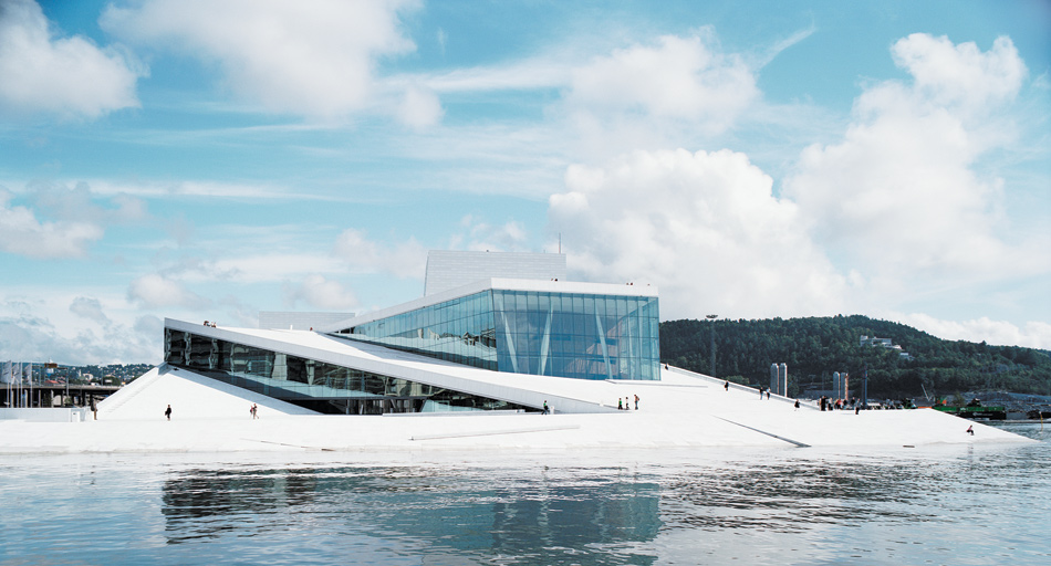
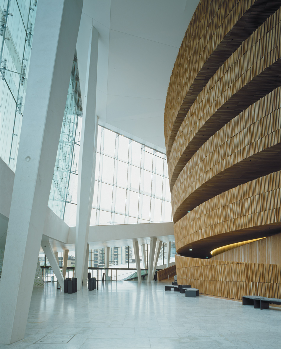
The work that launched Snøhetta into the architectural big leagues was their Oslo Opera House, which will certainly rank among the firm’s highlights whatever else they may do. Although this is by any measure a triumph of city planning, the building itself is not quite a masterpiece, though very fine indeed. It suffers from a clash of mixed stylistic metaphors. The crisply faceted exterior—which is clad with white marble, granite, and aluminum—and the soaring forty-nine-foot-high glass-walled entry hall with gigantic tilting columns have an insistent angularity that seems almost Deconstructivist, to use the word associated with the dislocated and distorted shapes of such architects as Peter Eisenman, Zaha Hadid, Daniel Libeskind, and Bernard Tschumi, whose work was included in the 1988 Museum of Modern Art exhibition “Deconstructivist Architecture,” which gave credence to this intentionally fragmentary style. These elements are in contrast to the undulating vertical-wood-slatted surface of the auditorium’s exterior and balcony promenades, which swell into the lobby like a remonstrative visitation from the ghost of Alvar Aalto, Modernism’s Mr. Natural.
In the building’s frosty-white reception area one encounters the Icelandic artist Olafur Eliasson’s The Other Wall (2004–2008), among several pieces commissioned for the building, an initiative documented in Jørn Mortensen’s handsomely illustrated monograph Visual Art in the Oslo Opera House. This sculptural mural installation, composed of white-painted medium-density fiberboard and backed with lime-green LED (light-emitting diode) illumination, is patterned in a molded-and-pierced harlequin motif that gives the lobby a retro-hip air reminiscent of a 1950s resort hotel. Far more successful is Pae White’s MetaFoil (2004), the stage curtain illusionistically woven from cotton, wool, and polyester to mimic an expanse of crumpled metal sheeting. This shimmering silvery Vorhang, ingeniously fabricated without recourse to any metallic fibers, provides an ideal foil for the auditorium’s somber elegance.
Paneled in dark fumed oak, the grand hall, which seats 1,364, is a superb example of how to give a modern auditorium an appropriate sense of occasion without digging into the threadbare grab bag of sham-classical decor. (Diller, Scofidio + Renfro’s much smaller Starr Theater of 2009 in New York’s Alice Tully Hall is another.) The most striking feature of the Oslo hall—which also has excellent acoustics—is Snøhetta’s reinterpretation of the once-obligatory opera house chandelier. Here, in a minimalist reduction that recalls the roof of the Bibliotheca Alexandrina, a huge disc of 5,800 notched crystal prisms is set flush into the big room’s ceiling and backed with LED lights to create a hovering, radiant effect that infuses the majestic space with an appropriate feeling of incipient excitement and democratic splendor.
Most importantly, the Oslo Opera House has given the Norwegian capital one of Europe’s most enjoyable and instantly beloved public spaces of the past half-century. This is largely due to the clever massing of the building’s exterior, which allows the general public to ascend broad ramps that frame the lateral walls and lead uninterruptedly up to the top. The roof thus becomes an extension of the plaza below as well as an observation deck that affords visitors to the building panoramic views of the city and its meandering waterways. In winter it is not uncommon to see skiers schussing down its ice-covered inclines, an utterly captivating spectacle that epitomizes these designers’ popular appeal. The paradox that superb urbanism is not automatically synonymous with great architecture underscores the frequent disparity between Snøhetta’s knack for effective city planning and some of its structures, which lack either the conceptual audacity of Frank Gehry and Rem Koolhaas on the one hand or the technical suavity of Norman Foster and Renzo Piano on the other.
The Oslo Opera House is reminiscent of Jørn Utzon’s Sydney Opera House of 1956–1973 not only because of their similar white exteriors, sail-like profiles, and waterside sites, but also because both have become cherished national symbols in an age when new works of public architecture rarely achieve a high degree of general acclaim, as was shown by the spectacular reception that greeted Gehry’s Guggenheim Museum Bilbao of 1991–1997. In recent years, new concert halls have become nearly as ubiquitous as new art museums, a surfeit that can only be attributed to the same competitive civic urge that sparked the international art gallery boom a generation earlier, which was motivated in large part by the widespread (if erroneous) belief that cultural tourism is guaranteed to recoup the cost of such overreaching schemes.
There is no better cautionary example than present-day Spain when it comes to the folly of reckless deficit spending to fund economically dubious, albeit socially beneficial, visual- and performing-arts projects. The treasuries of Valencia, Santiago de Compostela, and Avilés have been pushed to the brink of bankruptcy thanks to excessive expenditures on large-scale cultural enterprises designed, respectively, by Santiago Calatrava, Peter Eisenman, and Oscar Niemeyer, each venture prompted by the vain hope that these colossal investments would yield “the next Bilbao.” Such speculations had no bearing on the $707 million Oslo Opera House, which was subsidized by the most solvent government in present-day Europe, a beneficence made possible by Norway’s plentiful offshore oil reserves, the income from which is nationalized.
3.
Snøhetta’s biggest current American commission is their 225,000-square-foot addition to the San Francisco Museum of Modern Art (SFMoMA), scheduled to open in 2016. Their selection for that project is yet another example of the increasingly common trend for museums to seek additions from architects other than the last ones they employed. It used to be almost an ethical imperative to ask the designer of a building to expand it, and thus maintain visual continuity with the original structure. Only if the initial architect had died or if the firm did not want the new commission was it considered permissible to seek another practitioner.
That attitude began to change in the 1990s, around the time the High Museum of Art in Atlanta decided to add to Richard Meier’s building of 1980–1983. Although that eye-catching design gave the small regional institution a dynamic new image, the structure was soon found to be functionally deficient because of light-control problems, skylight leaks, and planning that seemed to favor circulation areas over display space. In a move widely interpreted as a critique of his flawed design, Meier did not get the expansion job, which went instead to Renzo Piano, whose extension of 1999–2005 added three wings, doubled the museum’s exhibition capacity, and effectively reduced Meier’s showy but problem-plagued structure to a glorified entry pavilion.
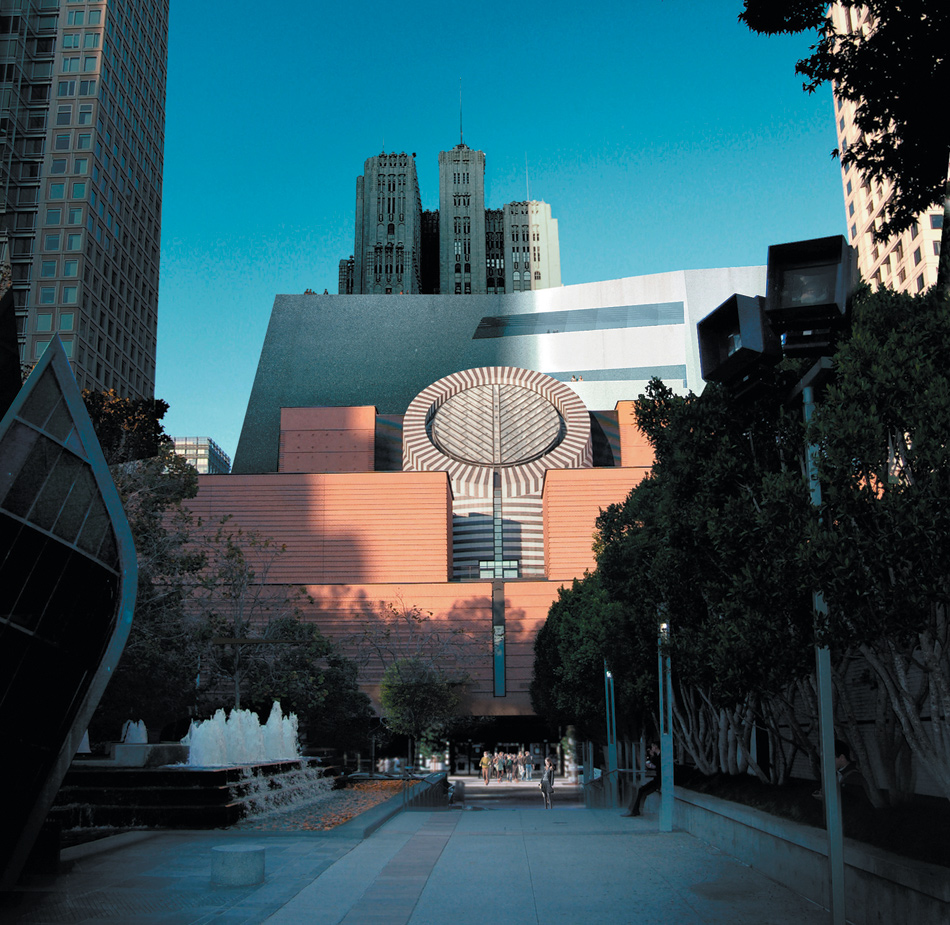
A similar rejection occurred with Mario Botta’s San Francisco Museum of Modern Art of 1989–1995. This ponderous brick-clad Postmodernist pile was quickly deemed both stylistically passé and also too small for the museum’s many recent acquisitions, including the coveted collection of Doris and Donald Fisher, longtime benefactors who unsuccessfully tried to build a private gallery in the Presidio, the disused military base next to the Golden Gate Bridge. Botta’s heavy-handed scheme was nonetheless notable for its stepped-back massing, which gave almost all the galleries natural overhead illumination and took into account the need for future expansion on an adjoining strip of land (used in the interim for staff parking). Given the unpredictable vagaries of architectural taste, it might be argued that the museum’s trustees—several of whom had generously contributed toward the Botta design—ought to have had the courage of their convictions and returned to him, however démodé his aesthetic had become.
Restricted to a narrow plot at the rear of Botta’s structure, the addition could well have become a nearly invisible backdrop had Snøhetta not decided to make its contribution contrast as much as possible with its blocky and stolidly symmetrical precursor. The ten-story stepped-back expansion, estimated to cost $555 million, is to be clad in striated white fiber-reinforced panels with a cement finish, interspersed with glass, and will rise like an iceberg behind the original. That maritime impression will be underscored by the Botta building’s most idiosyncratic feature, a central, smokestack-like cylinder that houses a grand stairway topped by a slanting glass oculus, which, with the icy new addition looming over it, will make Titanic buffs think of that doomed ocean liner. Yet the new wing’s organization appears logical and likely to much improve visitors’ experience of SFMoMA, which heretofore has exuded the sleek and somewhat snooty air of an upscale department store.
Snøhetta’s participatory modus operandi was on full and sometimes excruciating view in Eirin Gjørv’s revealing documentary film The Sand Castle (2007), which follows the firm’s senior members as they vie with Rem Koolhaas as finalists in a limited competition for a new capital city for the United Arab Emirate of Ras al-Khaima, sixty miles north of Dubai. Koolhaas won the master-plan commission, but Snøhetta was given the consolation prize of the Ras al-Khaima Gateway, the convention-center component of the mixed-use project. At one point the cagey client intermediary, Khater Massaad, airily dismisses Snøhetta’s initial proposal for a long low-rise structure with a gracefully undulating roof because “it is not an icoon” (icon) akin to the hideously overblown skyscrapers in Dubai that have become emblematic of the emirates, exemplified by Tom Wright’s scimitar-shaped Burj-al-Arab hotel of 1997–1999, and the world’s currently tallest man-made structure, the Burj Khalifa of 2004–2010, by Adrian Smith of Skidmore, Owings & Merrill.
As they prepare to meet their patron, Thorsen tells one of his colleagues, “If he doesn’t like what he sees tomorrow we’ll have to start over,” which is more or less what happens. It is dispiriting to watch the ingratiating and patient Snøhetta team bending over backward to please an obtuse and somewhat arrogant client as their subsequent schemes get progressively worse and worse, in marked contrast to the steely Koolhaas, who appears to have carefully and profitably gauged his haughty demeanor to convey an air of command commensurate with those who seek him out, a trick he learned from the past grand master of that power game, Philip Johnson, whose cool take-me-or-leave-me attitude won him far more jobs than it cost him. In any event, the vast undertaking has since been put on indefinite hold because of the emirate’s financial woes.
Snøhetta’s extreme willingness to adapt to the desires of its clients has never been more evident than in the collaboration between the firm and the New York–based Norwegian artist Bjarne Melgaard, for whom the architects are designing a house in Oslo that will be completed in 2014. This strange undertaking was the subject of “A House to Die In,” a small exhibition held last fall at London’s Institute for Contemporary Arts. The show featured an intentionally messy-looking installation that centered around a small model for Melgaard’s wildly biomorphic house in Oslo—a freeform, blackened clam-like structure held aloft by sinister, cartoonish doll-like figures (one based on the creepy fashion designer Donatella Versace) apparently meant as contemporary versions of classical caryatids—along with a full-scale mock-up of a portion of the building’s exterior, a deeply scarified and scorched swath of lumber that seemed as if a pyromaniacal preteen had run amok with a woodburning kit, or perhaps a maquette for a Tim Burton horror tree house. Private patrons of experimental architecture are perfectly free to indulge their whims as they please; but even in a period of unprecedented architectural weirdness, this embarrassment for all concerned proves that there are necessary limits to unbridled self-expression.
If one had to choose between a pompous grand vizier or a pretentious myth-befuddled artist—both of whom bombard you with endless “suggestions” on how you should design for them—it might drive the faint of heart mad. Yet the project-to-project struggle that is contemporary high-style architecture has rarely been pursued with more equanimity, or better results, than it has been by the happy warriors of Snøhetta. The firm’s eagerness (and occasional overeagerness) to please has also been a subtext of their work at Ground Zero, a project that remains mired in disputes over its funding and thus still languishes incomplete almost two years after the dedication of Michael Arad and Peter Walker’s magnificent National September 11 Memorial of 2003–2011. (The interiors of the Snøhetta museum are the work of another firm, the New York–based Aedas.)
Even a cursory glance at Libeskind’s hypothetical renderings of the former World Trade Center site indicates that Snøhetta—which adheres to no consistent design approach but varies their response from project to project—followed the master planner’s lead much too readily in their jittery-looking, diagonally scored National September 11 Memorial Museum Pavilion, which appears to mimic a structure falling down, a dreadful miscalculation on this bedeviled site. Now, long after Libeskind was unceremoniously shuffled offstage, this vestige of his aborted vision looks even more out of place next to the solemn grandeur of Arad’s twin memorial pools. If Snøhetta is to advance into the very forefront of the profession, its unquestionably gifted team members must realize that as congenial and nurturing as their sheltered workshop may be, in the rough-and-tumble world of architecture there can be such a thing as being too nice for your own good.
This Issue
February 7, 2013
Diving Deep into Danger
Why ‘Zero Dark Thirty’ Fails


