Of all New York’s museums, only the Metropolitan Museum of Art, with its vast holdings and long reach, could have opened an exhibition of modern and contemporary art with Titian’s Flaying of Marsyas. Painted nearly half a millennium ago, in 1575, the imposing canvas has lost none of its upsetting power and none of its strangeness. It is a modern work in nearly every useful sense.
Marsyas was a satyr, a homely goat-man who played the panpipes so skillfully that he dared to enter a musical contest with the golden god Apollo, who played the lyre with heavenly skill. Apollo was a handsome god, but mean. It goes without saying that he won the contest, after which, to punish Marsyas for his boasting, he strung the poor creature up and flayed him alive. Ancient statues show Marsyas hanging from a dead tree, shoulders dislocated but skin still intact, and these images are cruel enough.
Titian, however, compounds the cruelty by hanging him upside down, the better for Apollo and an immortal henchman to carve their way into the satyr’s flesh. True to his mission, the god of music exacts his revenge to an instrumental accompaniment: an Orpheus figure stands beside the tree, singing and playing a Renaissance descendant of the lyre called the lira da braccio as Marsyas bleeds to death. Just opposite, King Midas, together with another satyr and a little child, bears witness to the horror, while a sweet little dog laps up a startling crimson rivulet of the victim’s blood.
The Flaying of Marsyas was Titian’s last work, executed shortly before his death from plague in 1576, and probably inspired by an intimately Venetian trauma. In August 1571, the Republic of Venice had lost its dominion over Cyprus when the governor, Marcantonio Bragadin, surrendered his garrison to the Bosnian-Ottoman general Lala Kara Mustafa Pasha, over seventy and smarting from his defeat in the brutal siege of Malta six years earlier. Rather than negotiating a truce by the usual laws of war, Pasha subjected his prisoner to two weeks of unspeakable tortures, including the flaying that began while Bragadin was still alive but killed him in the process.
Two months later, a combined European navy would defeat the Turkish fleet at the Battle of Lepanto; but for Venice, that landmark victory was no match for the loss of its stronghold in the eastern Mediterranean. The tragedy of Marsyas is thus, in some sense, the tragedy of the Venetian Republic’s impending decline, and old King Midas, who bears silent witness to the scene, is, like Titian himself, an ancient who has lived to see too much.
The Flaying of Marsyas compels attention not only for its grim subject, but also because of the way it is made. Titian’s handling of paint became progressively looser over time, as he experimented with ever larger, more prominent strokes of his brush, testing how far he could push a sweep of painted pigment into suggesting another form altogether. Eventually the artist began to paint with his fingers, as he almost certainly did with The Flaying of Marsyas, its surface a frenzied mass of smears and daubs laid on thickly over coarse canvas.
The outlines of figures in most of Titian’s late paintings seem to emerge from a mist (or perhaps from a haze of floaters in the old man’s failing eyes), but in The Flaying of Marsyas they are shrouded in something more sinister: a malevolent darkness. Furthermore, as his surfaces became more three-dimensional and more abstract, Titian’s palette also shifted, from the radiant blues, greens, pinks, and golds of his early career to a texture made up of dark browns and grays, illuminated by sporadic flashes of shimmering white, yellow, or, as in this final work, the crimson of flesh and blood and the glinting gold of Midas’s crown.
Marsyas has traveled to New York from its usual home in the Czech Republic to celebrate the opening of the Metropolitan Museum’s new branch at 75th Street and Madison Avenue, that is, the 1966 stone and concrete structure designed by Marcel Breuer and Hamilton Smith to house the Whitney Museum of American Art. At the same time, a new advertising campaign has christened this new/old venue “The Met Breuer” with a capital “T,” part of an empire now to be known as “The Met” with a capital “T” and so celebrated with a raggedy new logo. (Was there, as one might imagine, legal scuffling with the Metropolitan Opera in order to drive a distinction between The Met and the Met?)
Fortunately, the works of art now on display in this new Met Breuer transcend the limits of the packaging, physical and conceptual, in which the museum has chosen to deliver them. Breuer’s upside-down pyramid has been spiffed and polished, but its ceilings are still low, its lighting sporadic and irrational (the greatest number of light fixtures occurring on the ground floor where they are least necessary), its walls as pitiless as a cliff face. With a gigantic seven-story concrete partition dividing the building from its brownstone neighbors and a concrete drawbridge separating it from the sidewalk in front, it remains a hunkered-down fortress of art rather than a temple.
Advertisement
Within a few years of opening, the museum’s 32,000 square feet of exhibition space had already grown limited, and Breuer never thought to provide the structure with an adequate loading dock. Between 1985 and 2003, architects including Michael Graves and Rem Koolhaas drew up expansion plans for the Whitney’s board of trustees, which rejected them all and decided, in the end, to abandon ship entirely and set sail for downtown in a new nautical-themed building designed by Renzo Piano. The Breuer building, in short, is a white elephant, on which the Metropolitan’s trustees have gambled an eight-year lease rather than a lifetime commitment. Most works of art, like most people, would be happier living somewhere else.
The one exception, perhaps, is the miniature mud village called Dwellings, which Charles Simonds perched on an exposed concrete crossbeam of Breuer’s main stairwell back in 1981. Dwellings still clings charmingly to its precipice, like a museum diorama escaped from the confinement of a display case. Any label that might have identified the work is long gone, which makes the tiny settlement seem all the more like a renegade outpost, insinuating its own eternal critique of the building’s sterility.
The Breuer building may have its limits, but it can still serve the museum’s stated purpose: broadening the horizons of art in every direction, geographical, temporal, and cultural. For the inaugural exhibitions, Sheena Wagstaff, formerly of Tate Modern and now chairman of the museum’s new Department of Modern and Contemporary Art, lays out an engaging plan:
One of our goals with The Met Breuer is to present thoughtful exhibitions that posit a broader meaning of modernism across vast geographies of art…. Great works of art can transcend both time and place, and our program will powerfully demonstrate that potential.
And indeed, there are some wonderful things to see within the old Brutalist box, insightfully placed so that they resonate with one another in ways that go beyond any of the lines suggested by the individual exhibitions or their catalogs. On the ground floor, for example, visiting artist Vijay Iyer provides the musical soundtrack to a film by Prashant Bhargava that juxtaposes scenes from the Indian festival of Holi, a spring celebration of purification and love in which participants pelt one another with powdered pigment and colored water, and an erotic encounter between a paint-powdered man, barely seen, and a beautiful woman. We have Holi, then, on the grand scale, and Holi as an intimate experience, but above all we have Holi as an expression of art itself, an upwelling of color, energy, passion, affection. Yet like every ecstatic experience, Holi is fraught with danger. Loving caresses mar the woman’s face with sweat and smears of indigo—are these acts of love or violation? At the same time, the hordes of color-drenched revelers, like Iyer’s music, grow more and more frenzied, more and more violent in their paint-pelting, until exultation verges into menace, just as the musical contest between Apollo and Marsyas once slipped in its own way from melody into perversity.
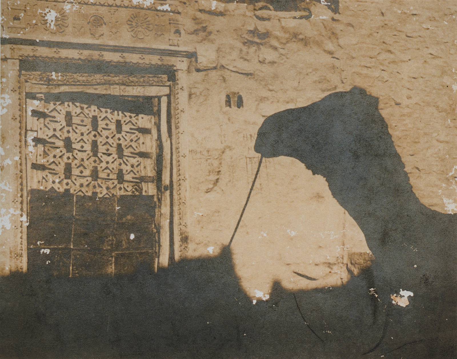
The second floor continues the Indian theme, but in a spirit utterly remote from Holi’s orgy of color: it houses a lovely monographic show devoted to the Indian artist Nasreen Mohamedi (1937–1990), whose meticulous ink drawings and black-and-white photographs create delicate poetry out of horizontal lines, diagonals, and geometric shapes. In Mohamedi’s case, the details of her life afford indispensable clues to the meaning of her art. A secularized Shiite Muslim of part-Arab ancestry, she was born in Karachi but grew up in Bombay (as it was then called). At seventeen, she enrolled in a London art school, and studied in Paris before returning to Mumbai to work with some of India’s first Modernists.
Her lifelong interest in abstraction thus combined immemorial Islamic tradition with influences from twentieth-century Europe and distinctively Indian ways of life: she drew and painted while sitting cross-legged on a low stool, her work spread flat before her. An enthusiastic traveler, she spent a lifetime searching for austerity in life and in what she created. After a broken engagement broke her heart, she sought out solitude, spoke sparingly, and struggled to strip her art to its essentials. Early on, she abandoned color for black and white, moving from watercolor to graphite and ink. Throughout her life, she kept a series of diaries on lined paper, blacking out entries that no longer pleased her with geometric precision. Many of these pages are on display, with her own notes in English and Urdu. Her thoughts often sound like haiku:
Advertisement
The full moon
A perfect circle
Complete serenity
Over time, we see how exquisite drawings of nature turn into abstract compositions of misty shapes and lines, some languid, some sharp. By the late 1950s, her hands had begun to tremble, the first sign that she had inherited the same Huntington’s disease that had already killed her father and brothers. To control the effects of progressive nerve damage, she began drawing with a Rotring pen and precision tools like a T-square, compass, and straightedge, first covering sheets of paper with intricate rows of lines and then reducing her lines and diagonal planes to the barest presence on the paper’s blank surface, braving terrible pain to do so. She took photographs with a series of sophisticated Nikon cameras—she loved fine machinery—and these images show her same refined ability to discern an essential geometry in nature and in the works of human hands. She is a sublime artist who merits the attention she has been given on this occasion. The exhibition itself is a collaboration among the Reina Sofía Museum in Madrid, the Metropolitan, and the Kiran Nadar Museum of Art in New Delhi.
The most ambitious of the museum’s inaugural exhibitions occupies its top two gallery floors. Under the rubric “Unfinished: Thoughts Left Visible,” this monumental show gathers together works from the fifteenth century to the present, reserving the upper floor (the one with the big picture window that looms on the building’s façade like the eye of a robotic Cyclops) for the more recent objects. Some of these pieces are indeed unfinished, but just as many are not. Some are sketches. Some are reworked. Some, like Titian’s Flaying of Marsyas and Rodin’s Hand of God, are completed works that display rough or unusual techniques. The idea of incompletion is more a convenient catch-all for bringing together a wide variety of objects than a coherent guiding principle.
This confusion about the nature of completion and its lack extends to the physical form of the exhibition catalog, which is bound in gray cardboard just as the Breuer building is bound in unadorned gray concrete. In both of these cases, however, the stripped-down grayness is a finished product, a fully developed conceit. There is nothing unfinished about either one. The catalog’s essays are equally rootless, wandering beyond art to take in literature and film, mostly in the kind of language that is demanded of graduate students in art history but has scant purchase with a larger public.
Here is an opportunity to communicate with the world across Marcel Breuer’s drawbridge, but the discussion is basically addressed to a relatively restricted circle of adepts. As tiny a word as “the” becomes obtrusive, between a director’s introduction that keeps invoking The Met in all its majuscule splendor, and locutions like “the unfinished” or its Italian cousin “the non finito” that sound inflated because they are. “Unfinished,” show and catalog, The Met and The Met Breuer are all simply trying too hard to be special, focusing on themselves rather than the art. (Nasreen Mohamedi, forging ahead on her own eccentric trajectory, provides a bracing contrast.) The art, on the other hand, at least much of it, is a marvel.
A selection as consciously eclectic as the gathering assembled for “Unfinished” must have its highs and lows, but the highs are celestial, beginning with that Flaying of Marsyas, hanging on a wall between Titian’s Agony in the Garden (1558–1562), with its pinpoints of flame and glinted reflections piercing the darkness of Christ’s despair, and Jacopo Bassano’s radiant Baptism of Christ (circa 1590), where the light that bathes Jesus and the Baptist like holy water is the light of pure divinity. What could be better than drawings by Michelangelo and Leonardo next to unfinished paintings by Jan van Eyck and Albrecht Dürer that reveal their underdrawing, all ranged alongside one another in one exquisite row (and having the expert Carmen Bambach to explain them in the catalog)?
When will there be another opportunity to experience two of the greatest oil colorists of all time, Federico Barocci and El Greco, in a single glance? El Greco’s cosmic vision certainly suffers from confinement beneath a low ceiling raked by artificial spotlights. They take the edge off his incomparable greens and shoot a glare off the painting’s glazed surface. The whitewashed, sun-soaked wall of a soaring Toledo chapel without spotlights would be better from every conceivable standpoint—but who cares? His Vision of Saint John (circa 1608–1614) is still a glory under Breuer’s boxy, repetitive ceiling coffers.
Pier Francesco Mola’s Portrait of Alexander VII Chigi (circa 1659) is finished within its own terms: it is a probable presentation sketch for a larger portrait, composed of ribbonlike slashes in crimson and flesh tones. With its blazing color and shimmering brushwork, it sets out deliberately, even at the sketching stage, to challenge the masterful portrait that Velázquez made of Pope Alexander’s mentor, Pope Innocent X (in Rome’s Doria Pamphilj Gallery). Mola’s work rises beautifully to that lofty challenge, with its ravishing technique and its penetrating inquiry into the soul of a pope who was renowned as a scholar, lawyer, and diplomat, and was elected, in fact, by unanimous vote of his peers.
But the pope, born Fabio Chigi, was held at his baptism by a painter, Francesco Vanni, and he remained an artist at heart, as well as one of the very greatest patrons of art and architecture in Baroque Rome. When Alexander went drawing with Gianlorenzo Bernini in the Vatican gardens, they both put pen to paper on the very same page of their shared sketchbook (which still exists in the Vatican Library). In the current exhibition, Mola’s painting hangs in one of the rooms that receives natural light from Breuer’s random trapezoidal windows, so its colors are true. It deserves to be savored at length, but there is no place to sit down and do so.
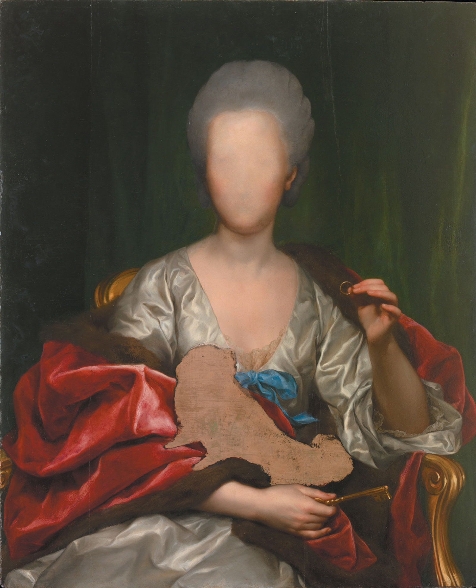
Portraiture is a genre for which the guiding theme of “Unfinished” works rather well, fortified by an excellent catalog essay, “Portraiture and the Question of Focus,” by Andrea Bayer and Nicholas Cullinan. From Titian’s all-too-insightful portrait of his friend Pietro Aretino (1545) to Kerry James Marshall’s majestic allegory Untitled (2009), the range of human likenesses presented here is as broad as the range of reasons for their incomplete state. Weirdest of all is a painting of the Spanish artist Mariana de Silva y Sarmiento, Duquesa de Huescar, by the eighteenth-century Neoclassicist Anton Raphael Mengs, complete in every detail except the face and the figure of a lap dog, both of which have been scraped away for reasons unknown (see illustration on page 27).
Usually the situation is reversed, with cursory body and detailed head, an effective means, as Bayer and Cullinan note, to concentrate the viewer’s attention on a sitter’s face. Pietro Aretino complained that Titian gave him a slapdash body because a more careful likeness would have inflated the cost of the portrait, but in fact the slashes of pink paint angling down Aretino’s red velvet robe have a slimming effect on his monumental belly—and from a distance they do not look unfinished at all, but rather mimic the glint of bright light on crimson satin.
Several painters opt for a sketched-in body and a detailed face, among them the portrait of his teacher Michelangelo by Daniele da Volterra (circa 1544), Sir Joshua Reynolds’s Young Black (circa 1770; the National Portrait Gallery in London identifies him as Dr. Johnson’s manservant Francis Barber), George Romney’s painting of himself (1784), and Édouard Manet’s portrait of his wife, Suzanne (circa 1873). Daniele da Volterra also devotes careful attention to Michelangelo’s left hand, closed around the chisel it plied with such incomparable skill.
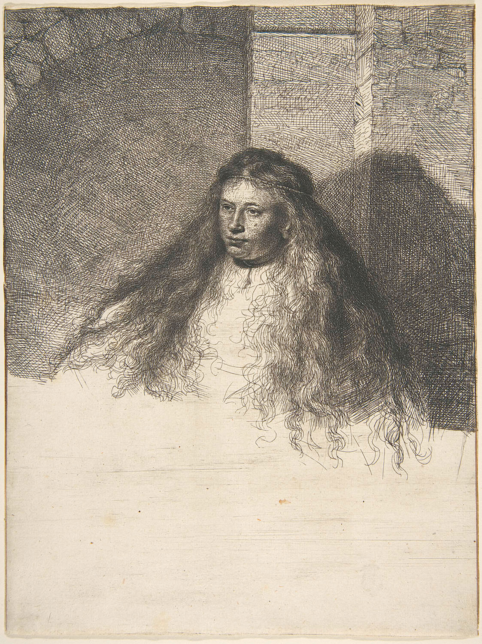
The “unfinished” category works well for Rembrandt’s prints and engravings, discussed in Nadine Orenstein’s helpful catalog essay. By its very nature, printing took place in several stages, although Rembrandt was willing, for money, to sign earlier states of his engravings and sell them as finished works. He created contrasts between dark and light by leaving areas of blank paper, a technique exploited to similar effect by Giovanni Battista Piranesi in the eighteenth century and Nasreen Mohamedi in the twentieth, but he also signed off on evidently incomplete works like his Great Jewish Bride (1635), which occupies only the upper part of the paper on which it is printed. “Unfinished” also describes the work of Impressionists like Cézanne, eternally dissatisfied with what he produced.
Sometimes, however, the category is so broad as to be frustrating. By the sheer volcanic energy of their urge to create, J.M.W. Turner and Pablo Picasso defied the idea that any work of art could ever be fully resolved, let alone an artist’s career; they are represented in this exhibition, as they must be, by multiple works to capture several of the facets of their lifelong quest. But these two driven men went about their artistic experiments in different ways, for different reasons, perhaps for different ends. “Unfinished” is too indefinite and too small a category to contain them both in any illuminating way. A roomful of Turners, moreover, commemorates an enterprise radically different in its bitter struggle from something like the series of six black, white, and green drip panels that Cy Twombly painted from the safety of his wealth and privilege.
The upper floor is largely, though not entirely, devoted to more recent works. Compared with Rodin’s luminous marble Hand of God (circa 1907), tingling with the new life still enclosed within its fingers, the circle of obscenely gesturing cast-bronze hands that makes up Bruce Nauman’s Untitled (Hand Circle) (1996) looks like so much dead meat; not every comparison between works of art ends in a draw. On the other hand, two white-ground paintings by South African Marlene Dumas and Austrian Maria Lassnig show surprising affinities to one another in their bold brushwork, penetrating color, and nude female subject, although in The Painter (1994) Dumas depicts a little girl with her hands dipped in paint, whereas Lassnig’s self-portrait You or Me (2005) shows an elderly woman with a gun in each hand, one aimed at her own temple and one at the viewer. With their depictions of human life at two different stages of its cycle, this pair of canvases also provides a challenging counterpoint to the emergent man and woman still cradled in the sculpted hand of Rodin’s Creator, and all three works, each in its own way, refer back insistently to the creative force that brought them into being: the hand of the artist.
Several of the later rooms, the ones devoted to installations by such artists as Robert Smithson and Felix Gonzalez-Torres, are supplied with long titles punctuated by colons, another academic peculiarity that has seeped over into the curatorial slant of this exhibition, with rubrics like “Assistance Needed: The Role of the Viewer.” And of course everything, everywhere, is “iconic,” which word, like “like,” should be banned for at least a decade from the English language. “Unfinished” is one way to look at the pile of hard candy Gonzalez-Torres has heaped in the corner of a room (1991), but “entropy” would work just as well, and “plate of spaghetti” is probably even more to the point (like snowflakes, no two strands are exactly alike, but we know them just the same).
Nor does “Unfinished” quite cover what is happening with the delicate inked-in squares of Reticulárea Cuadrada (1971–1976) by Gertrud Louise Goldschmidt—“Gego”—or the busy, repetitive calligraphy of Hanne Darboven’s Four Sheets (1974), ink drawings on paper, or Vija Celmins’s meticulous engraving Drypoint—Ocean Surface (1985). Taken together, these black-and-white works raise interesting questions in connection with Nasreen Mohamedi, not so much about finishing or the lack of it, but about how women artists have managed to navigate their way through the shark-infested waters of contemporary art. Five centuries separate these small, intricate pieces from the grand sweep of Titian’s brush and fingers, and perhaps there is no real way to bind the two extremes together, but they do tell a continuous story of human striving, intelligence, and—if one may utter a forbidden word—beauty. They can be appreciated on their own terms, and their own terms may be enough.
White elephants were the king of Siam’s gift to courtiers he wanted to ruin, because taking proper care of them was so expensive. But for those who had the means, white elephants provided the ultimate proof of majesty. Marcel Breuer’s white elephant now does its tenant great honor, and has every potential to continue doing so in the future.


