I wept, but about what precisely I cannot say. Much to my amazement, after having done everything possible to shut out the ubiquitous maudlin press coverage that engulfed the tenth anniversary of the 2001 terrorist attacks, I visited Michael Arad’s National September 11 Memorial in New York City—which was dedicated exactly a decade after the disaster—to find that it impressed me at once as a sobering, disturbing, heartbreaking, and overwhelming masterpiece.
Arad’s inexorably powerful, enigmatically abstract pair of abyss-like pools, which demarcate the foundations of the lost Twin Towers, comes as a surprise to those of us who doubted that the chaotic and desultory reconstruction of Ground Zero could yield anything of lasting value. It is generally held that great architecture requires the participation of a great client, but just how this stunning result emerged from such a fraught and contentious process will take some time for critics and historians to sort out.
Against all odds and despite tremendous opposition from all quarters, the Israeli-American Arad—an obscure thirty-four-year-old New York City Housing Authority architect when his starkly Minimalist proposal, Reflecting Absence, won the memorial competition in 2004—has created the most powerful example of commemorative design since Maya Lin’s Vietnam War Memorial of 1981–1982 in Washington, D.C. It is not accidental that Arad’s scheme derives so directly in several respects from Lin’s epochal monument (she was a decisive voice on the jury that selected the September 11 memorial design, a commission that could have been hers for the asking but for which she did not compete) yet the congruities between the two do not in any way lessen Arad’s stupendous achievement.
As things now stand, the eight hundred-foot-long arrival sequence at the memorial is a dismal prologue that so closely replicates the security checks of a post-September 11 airport—replete with metal detectors, jacket-removals, pat-downs, and conveyor belts for personal-property scans—as to verge on black comedy. Because Ground Zero is still an active construction site, visitors are then channeled around the rising buildings through a series of fences and barriers that lead them toward the south pool, an emphasis that will likely change when the surroundings are completed and the public is free to approach the memorial from any direction at will.
After this entry maze is negotiated, one comes upon the pleasant park designed by Peter Walker, the Berkeley, California-based landscape architect enlisted by Arad on the instruction of the competition jury, which felt that his scheme needed the softening touch of greenery and the technical expertise of a collaborator more experienced than he. Walker planted a grid of some four hundred swamp white oak trees that seem either randomly positioned or formally aligned, depending on one’s vantage point. The low-hanging branches of these vigorous-looking specimens, many of which sport acorns at this time of year, have been clipped upward to about half of their approximately twenty-five-foot height, presumably to keep them from touching the heads of visitors, and though those proportions now look somewhat artificial, the trees will ultimately form a handsome grove.
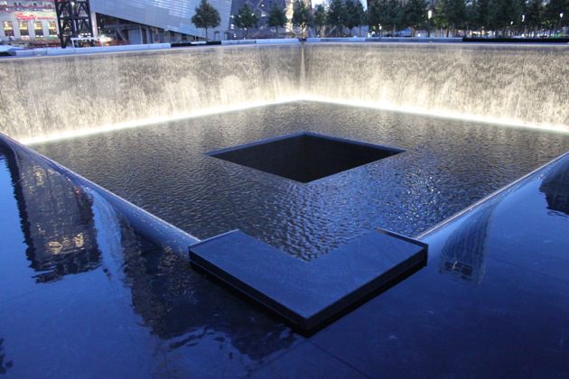
As one nears the pools across the light-gray granite paving stones installed by Walker, the murmur of rushing water rises from the cascades that pour Niagara-like down all four sides of the sunken fountains. The sound becomes louder and louder, until it reaches such a steady crescendo that the noise of the surrounding city, even from the construction going on very close by, is drowned out completely.
The veil-like flow of water down the dark-gray granite-clad sides of the recirculating pools is a feat of hydraulic engineering achieved by the installation of weirs—downward-curving comb-like spillways—set all around the upper perimeter of the giant squares. Looking down into the equilateral thirty-foot-deep pits, one sees yet another, far smaller square recessed even more deeply at the midpoint, bringing to mind a simplified, monochromatic version of Josef Albers’s Homage to the Square series. With that last, centered quadrangle, the water vanishes into nothingness.
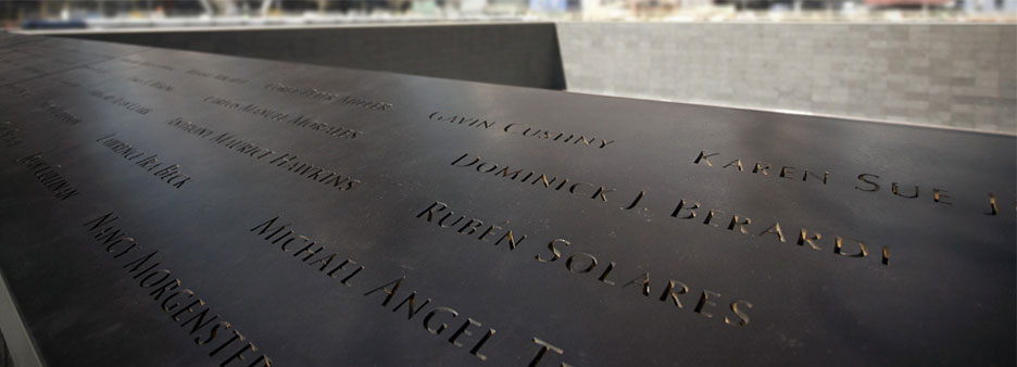
The propulsive aural and visual excitement of the three-story-deep waterfall and its mysterious disappearance captures and holds your attention in a way most unusual for the static medium of conventional architecture. That distraction makes one’s next perception all the more shocking, as you focus on the names of the victims, incised into the continuous tilted rim of bronze tablets that surround each pool.
The initial perspective provided by the cascades mimics a technique employed in classical Japanese gardens, through which one’s gaze is briefly diverted by a change in paving, screening, or some other element to dramatize a coming transition. Here, after you take in the diaphanous waterfalls, you discover spread out before you at waist level the names, the names, the names. Nearly three thousand victims—not only those lost at the World Trade Center, but also those who died at the Pentagon and near Shanksville, Pennsylvania—are memorialized with their names inscribed in Hermann Zapf’s classic Optima typeface of 1952–1955 (an elegant, slightly flaring sans-serif font), with the letters cut through the bronze so they can be backlit after dark. This is a typographic tour de force.
Advertisement
Phalanxes of firemen are listed, ladder company by ladder company, and cops precinct by precinct; hundreds upon hundreds of Cantor Fitzgerald traders; teams of Windows on the World busboys; an entire family on one plane; and on two of the hijacked flights women with “unborn child.” The names are grouped in “meaningful adjacencies” to suggest comradeship among those who died together at work, as first responders in the line of duty, or as travelers who would never reach their destinations. The ecumenical indifference of fate cannot have been more plainly put.
Although the locations and proportions of the square pools, which measure 176 feet on each side, were determined by the footprints of the Twin Towers, the overall dimensions—especially the relation of width to depth, and the juxtaposition of the two bodies of water to each other—somehow seem so ideally balanced that they might have been determined not by the disaster but by an environmental sculptor of uncommon talent.
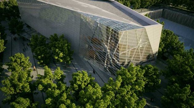
The only discordant note at the memorial is struck by the freestanding two-story pavilion that will serve as the entry point to the subterranean September 11 Museum slated to open a year from now. Standing next to but fortunately not between the twin pools, it is the work of the Oslo-based partnership Snøhetta (which has a branch office not far from Ground Zero to oversee this and several other American projects, including a revamping of Manhattan’s Times Square). In an odd division of labor, the belowground exhibition galleries are being designed by another consortium, the New York firm Aedas. (The entire cost of the Arad memorial and September 11 Museum is $700 million.)
The exterior of Snøhetta’s wedge-shaped visitors’ center is rendered in the sharply angular, diagonally striated Deconstructivist mode originally proposed for the site by Libeskind, who won the competition for the World Trade Center reconstruction master plan but was sidelined from any serious implementation of his ideas by the property’s leaseholder, the real-estate developer Larry Silverstein. Apart from the 1990s Deconstructivist aesthetic already looking quite dated, the pavilion’s nervously off-kilter, exaggeratedly slant-roofed form imparts the deeply disquieting appearance of a building in collapse, which under these circumstances seems not merely unfortunate but downright tactless.
Furthermore, the perforated portions of its metal panel cladding give the museum entry structure the mechanistic feel of a thinly camouflaged ventilation equipment housing. One can easily imagine that in due course this will be the first part of the memorial ensemble to be redesigned.
Whatever one’s feelings about the events of September 11, 2001 or their baneful political aftereffects, it seems impossible not to be moved in some way by Arad’s memorial. I came away with the same feeling that overtakes one after a funeral or memorial service for a relative or close friend, even though I knew no one who perished at the World Trade Center, or even someone who knew anyone who did.
In creating something at once so monumentally simple and yet so evocatively complex, Arad reconfirms the radical reconception of public memorial design that Maya Lin set in motion with her Vietnam War Memorial three decades ago. Lin herself was accused at the time by some critics of basing her work too closely on the ideas of Michael Heizer, Richard Serra, and other Earth Art or Minimalist sculptors. But the test of time has proven the validity of her insights into the wellsprings of mourning in the modern age, and with his profound variations on her themes, Michael Arad has become one of the signal place makers of our time.


