The colours which approach the dark side, and consequently, blue in particular, can be made to approximate to black; in fact, a very perfect Prussian blue, or an indigo acted on by vitriolic acid appears almost as a black.
—Johann Wolfgang von Goethe, Theory of Colours (1810)
Standing in front of Ellsworth Kelly’s Blue Black (2000), a twenty-eight-foot-tall painted aluminum wall sculpture commissioned for the main exhibition space of the Pulitzer Arts Foundation, I heard Louis Armstrong’s gravel-strewn voice singing, “What did I do to be so black and blue?” Given the title of the sculpture, that the Armstrong song would pop into my head was not so unexpected, yet I had to ask what the lyrics of a melancholy show tune about racial inequality had to do with Kelly’s rigorous and elegant paintings, sculptures, drawings, and collages, part of an artistic practice that sought to “erase all ‘meaning’ from the thing seen” so that “the real meaning of it [could] be understood and felt.” Indeed, to view a work by this artist is to be made intensely aware of color, shape, and form, and Blue Black, with its strong palette and meticulous placement in architect Tadao Ando’s austere yet sensual building, is a perfect example of Kelly’s artistic mastery.
Yet the colors blue and black, as Armstrong’s persistent voice in my head suggested, are evocative in ways that perhaps operate outside Kelly’s vision for his work. For example, “blue-black” is a term used primarily by African Americans to describe a skin tone found among dark-skinned people on the African continent. Blue and black also figure in the blues, a musical form deeply embedded in African-American culture, and the colors show up in Steve Reich’s Minimalist composition “Come Out” (1966), which loops recorded testimony from Daniel Hamm, one of six black youths wrongly accused of a murder in Harlem in 1964. After being beaten by the police, Hamm said, he had to open his bruises up “to let some of the bruise blood come out to show them” the extent of his injuries. This is not to say that all associations with black and blue that lie beyond Kelly’s concept for the sculpture are racialized, but to begin to think about the ways in which color often exceeds the boundaries of any artist’s stated intentions.
Gazing at the Kelly sculpture on my first visit to the Pulitzer, I realized an idea for an interesting exhibition was staring me in the face—a show that would explore the space between Kelly’s Blue Black and Armstrong’s “Black and Blue,” using them as bookends for an inquiry into how these two colors have been employed within a wide range of artistic practices. The exhibition that I ended up curating at the Pulitzer Arts Foundation this year, “Blue Black,” is by no means a comprehensive survey of the subject. The selected works hew flexibly to the theme, with many that contain colors other than the exhibition’s titular pigments and some that evoke blue or black without utilizing them. The exhibition was conceived as a meditation on the formal, political, and metaphysical ways the colors have been used, and an attempt to reveal the conversations artists have set up between them. In my ideal show, the artworks would physically touch—blue and black a shared identity prompting metaphoric backslapping and fist-bumping.
While Ellsworth Kelly and Louis Armstrong were the catalysts, there are many artists, writers, and exhibitions that anticipated and shaped it. David Hammons’s Concerto in Black and Blue (2002), an installation consisting of vast dark and empty gallery spaces, which viewers explored with tiny blue LED flashlights, was a formative influence, as was Chris Ofili’s chapel-like installation of crepuscular blackish-blue figurative paintings in “Chris Ofili: Night and Day,” his 2014 retrospective at the New Museum in New York. The poet and theorist Fred Moten presented a paper about Ofili’s work titled “Bluets, Black + Blue, Lovely Blue” at the New Museum in 2014. Ralph Ellison’s 1952 novel Invisible Man (whose prologue has a brilliant meditation on Armstrong’s recording of “Black and Blue”) anticipates this exhibition, as do works by James Baldwin, Toni Morrison, and Amiri Baraka.
The works are roughly organized around three combinations of the words “blue” and “black.” The first section of the exhibition, “blue black,” references the Ellsworth Kelly sculpture, and its works employ the colors as discrete visual elements. The second, “blueblack,” gathers works in which the colors are used in ways that visually blur the boundary between them. The last is “blue-black,” where portraiture of various kinds is used to explore the connection between blue and black as colors, on the one hand, and blackness as an identity on the other. Furthermore, the layout of the show—which eschews chronology, genre, and medium as organizing principles in favor of improbable conversations, provisional alliances, and poetic flow—is intended to encourage in the viewer a disloyalty to the curatorial structure.
Advertisement
So I went to the motherland; it was so beautiful. Just seeing black people in charge of everything. I’m talking about from the wino to the President. It was black. Blue-black. Original black. The kind of black where you go, “Black!”
—Richard Pryor, 1982
Blue-black is the kind of black where you go, “Black!” Perhaps that’s because blue-black traces its roots back to a mythic point of origin in Africa, whereas “black,” along with “Negro” and “African American,” might be considered just one more stopping point on the way to an as-yet-unknown destination. Many works in this section insert an invisible hyphen between the words “blue” and “black,” their depictions of black people deeply rooted in the combination of the two colors and proposing a subtle link to imagined African origins and American identities. Other works depict blackness in more oblique ways, while still others rely on literature, archival material, photographic representations, and ritualistic practices to figure blackness, a blackness which is intimately connected to blue.
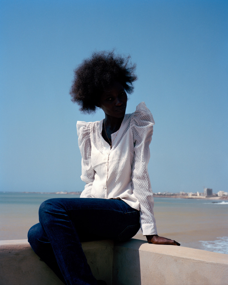
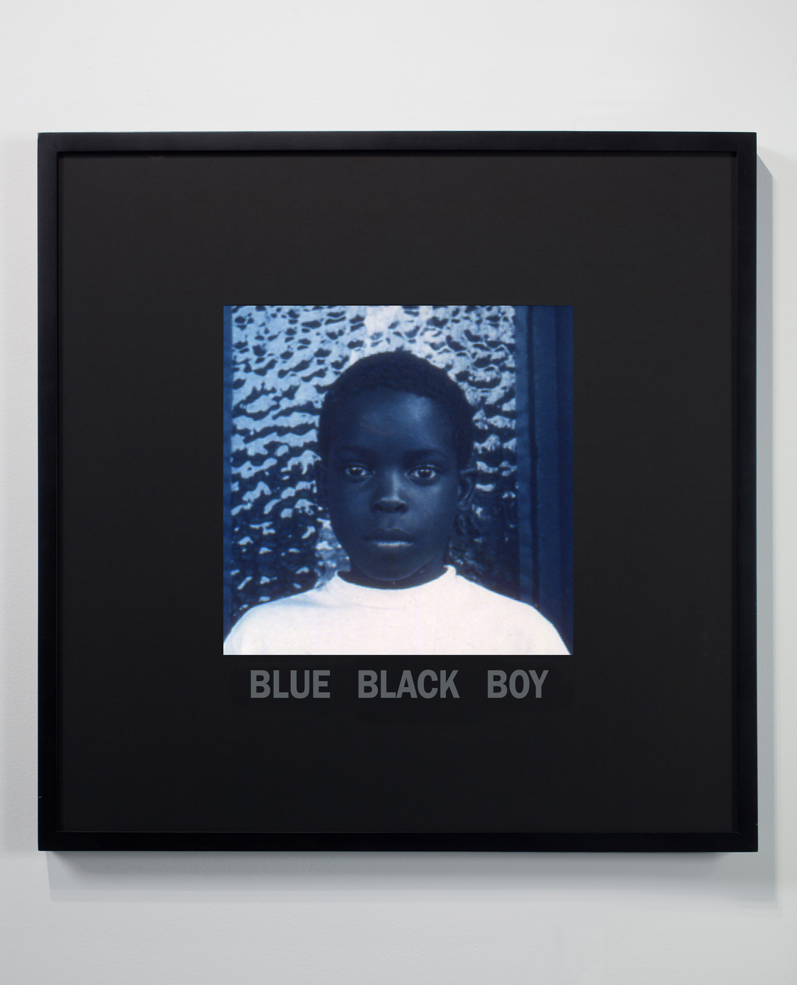
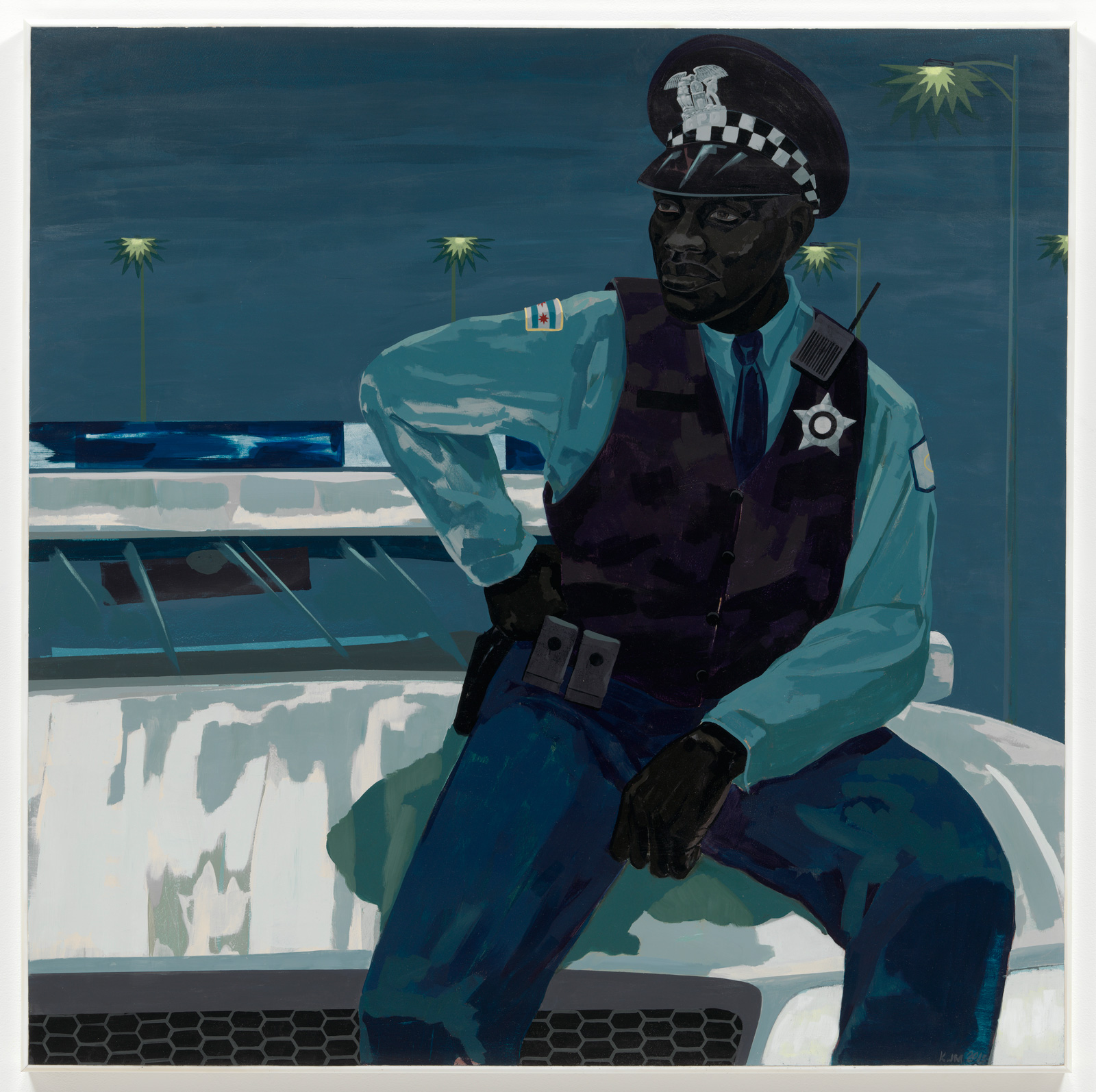
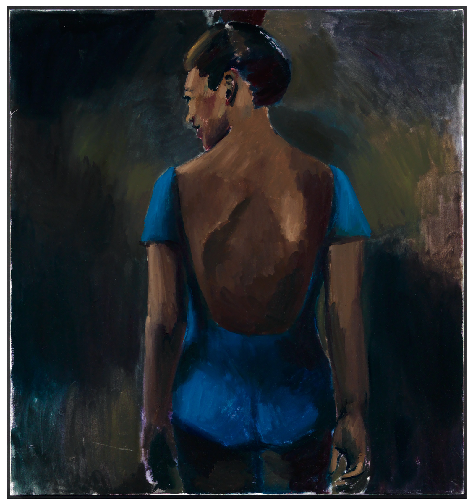
In Kerry James Marshall’s Untitled (policeman) (2015), a black cop sits impassively on the hood of his patrol car. Blackness as racial category and color converge in Marshall’s use of bone, ivory, mars, carbon, and other shades of black to give dimensionality, depth, nuance, and complexity to the rendering of black bodies, while blue is reserved in the painting for parts of the policeman’s uniform, patrol car, and the night sky. For Blue Black Boy (1997), Carrie Mae Weems toned a photograph of a young black boy a deep blue, playing with the connection between blackness, color, and language. Lynette Yiadom-Boakye is represented with two works, Greenhouse Fantasies (2014) and Messages from Elsewhere (2013). Each of these uses naturalistic skin tones in its depiction of black subjects, yet Yiadom-Boakye’s canvases are not portraits but are instead amalgamations of a wide range of archival materials. Her titles suggest that blackness is a product of the imagination. The same could be said of photographer Viviane Sassen’s photographs Lemogang (2013) and Kinee (2011), each of which depicts an African subject draped in shadow against bright blue skies. Blackness is very black in her work, and although the subjects in her photographs are individually named, the works remain cryptic as portraiture.
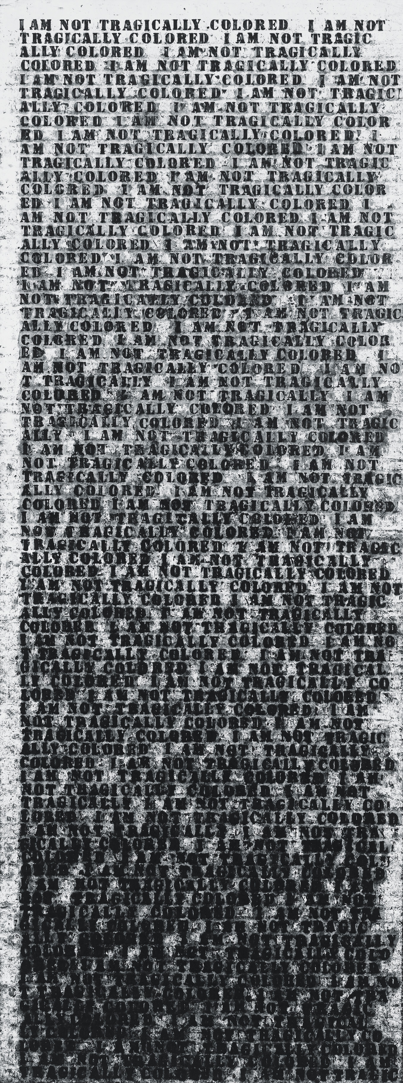
There is a strain of figuration in the exhibition that is rooted in language. For example, Tim Rollins and K.O.S.’s Invisible Man (after Ralph Ellison) (2008) layers the letters “I” and “M” over a grid of pages from the novel. The two letters can be read as a shorthand for the title of the book or as the words “I am,” a historically and politically freighted assertion of personhood mirroring the quest of the unnamed protagonist in Ellison’s novel. Untitled (I Am Not Tragically Colored) (1990), a painting of mine where a text by the author Zora Neale Hurston is repeatedly stenciled in bluish-black oil stick down the length of a door-shaped panel, also uses language to figure the body. The gradual disintegration of the text in this work resonates with Jean-Michel Basquiat’s two oil-stick-on-canvas works To Repel Ghosts (1986), where a covering of paint ostensibly enacts the operation expressed in the title, which is also the only text that remains visible. Crossing out simultaneously annuls and asserts figuration, the ghosts that haunt him vanquished by the author’s expressive mark.
I did not create A Small Band (2015) specifically for this exhibition, but I could have. Comprising three large-scale aluminum words—BLUES, BLOOD, and BRUISE—with white neon tubes covered in black paint attached to them, the work references many of the central themes of this exhibition: a connection between the colors blue and black, the myriad ways artists have employed them in their work, the centrality of music and language in relationship to the two colors, and how identity is expressed through them. A Small Band was commissioned for the facade of the Central Pavilion at the Fifty-Sixth Venice Biennale in 2013. It set the tone and mood for the entire exhibition within, which was described by its curator, Okwui Enwezor, as a “project devoted to a fresh appraisal of the relationship of art and artists to the current state of things.” Situated here at the Pulitzer Arts Foundation adjacent to Kelly’s Blue Black, A Small Band is meant to signal that it is part of a conversation on the “current state of things,” a conversation that began between Ellsworth Kelly, Louis Armstrong, and me, and that continues between the almost seventy works assembled. Tadao Ando said that he wanted the Pulitzer to be a place “where works of art are not exhibited merely as specimens but can speak to us as living things,” and as an exhibition, “Blue Black” aims to be noisy.
Advertisement
Adapted from Glenn Ligon’s catalog essay for “Blue Black,” which is at the Pulitzer Arts Foundation through October 7.


