This article is part of a regular series of conversations with the Review’s contributors; read past ones here and sign up for our email newsletter to get them delivered to your inbox each week.
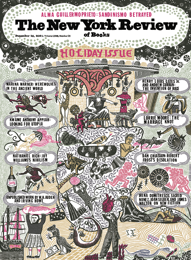
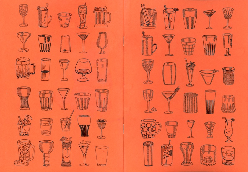
The cover of our Holiday Issue was done by the Yorkshire-born, London-based illustrator John Broadley. I’ve been admiring and collecting Broadley’s work for years, beginning with copies of his handmade zines Wild for Adventure and Pond Life that I picked up at art book fairs or comic shops. Years later I recognized his work at the restaurant Quo Vadis, on Dean Street in Soho. I pinched a cocktail list and slid a Broadley-illustrated menu into my handbag that night.
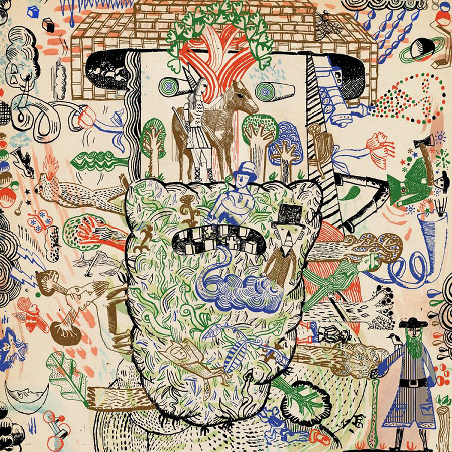
Broadley’s drawings and collages feel timeless. While they have a backward-looking romance, they levitate stylistically into the present. His line is sharp and jagged, naive and wise. His world is peopled with toughies and sweeties and clerks and leading women, and it carries a whiff of toner and lead. I’ve always loved Broadley’s cheerful darkness, his resistance to cuteness and the absence of platitude from his figures and landscapes. His hand-made type is idiosyncratic and charmingly deranged. His depictions of kitchens, streets, advertisements, and scenes from movies are all his own, but they evoke the war artists Eric Ravilious and John Nash, or Hockney on the Brothers Grimm; the London of Leon Kossof and the Lancashire of L. S. Lowry.
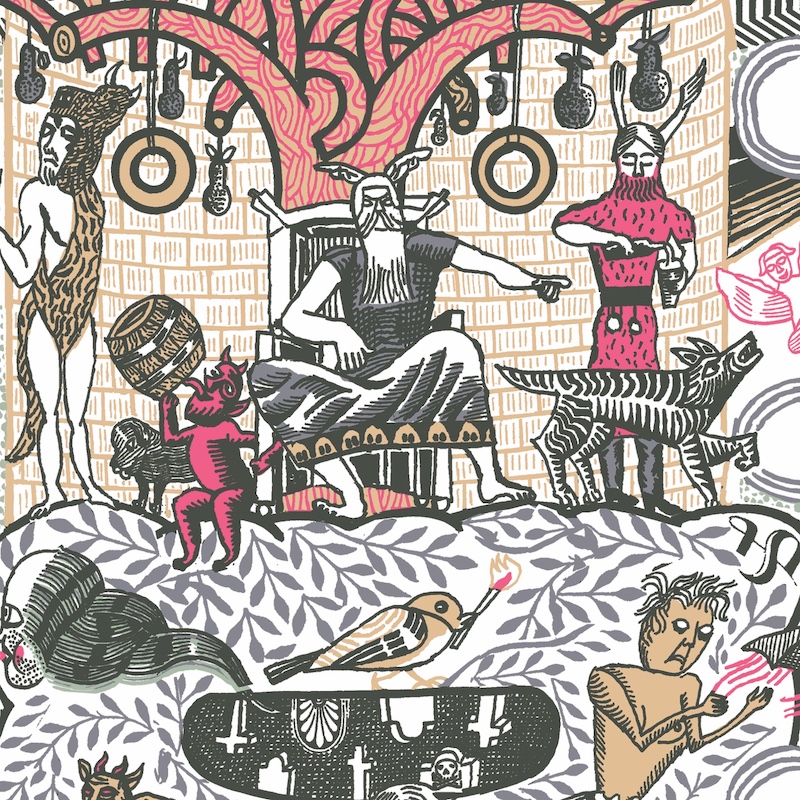
We decided to ask Broadley to make a holiday cover after seeing a wonderful drawing he’d made of the pagan deity Leshy. It was for the second book of Beasts! (2008), a two-volume Fantagraphics anthology of mythological creatures as depicted by contemporary artists and cartoonists. To our delight, Broadley agreed to hand-draw the entire cover in the space of two weeks. After acquainting him with the visual spirit of past holiday issues (death, doom, famine) and ruling out traditional holiday symbolism (partridges, candy canes, Santa, and, as editor Emily Greenhouse put it, “anything too rah-rah reading”) Broadley landed on an anthropomorphic wintry landscape that reveals the head of a sylvan Father Christmas.
In an e-mail this week, I wrote to Broadley to ask about his practice. He responded from his family home in Huddersfield, England.
Leanne Shapton: What did you grow up looking at?
John Broadley: I grew up in a house situated almost at the bottom of a Yorkshire valley, amid nineteenth-century textile mills with their tall chimneys and smoke-blackened bricks. There was a mill opposite our house. From my bedroom window I could see into the mill’s windows and would often wake in the night and stare into the darkness of the building, daring myself not to look away. At the bottom of the slope is a canal, which in the 1970s was as yet unrestored and was full of dumped car tires and old bits of furniture, and, it was rumored, giant pike which would bite your finger off if you put your hand in the water.
Across the way, the opposite side of the valley rises up, and I can see the route I used to walk to school, up the steep hill right to the top. We would take a shortcut through a mill yard to start the daily climb. The mill itself was the occasional site of games of hide and seek: baskets you could climb into, giant bobbins of oily-smelling wool, bottles of milk left outside one of the offices that one of our fellow school travelers would swipe and drink on the way.
Tell me about a formative period in your career as an artist and illustrator.
I don’t think I realized how little I knew and how unready for an art career I was until I left college and started freelancing. I picked up work sporadically in the early years, but desperation over money and a gradual erosion of my confidence meant that five years after graduation my work was so awful, I couldn’t carry on. My attempts to tailor it into something more commercial looked fake and uninspiring. I decided I was not going to get anywhere in the art world and found a full-time job at a press cuttings agency instead. That was an opportunity to start from scratch. I bought cheap school notebooks in packs of ten and made dozens of pen and ink drawings a day, taking inspiration from memories and photos from books and newspaper clippings I’d brought home from work.
Can you describe your studio?
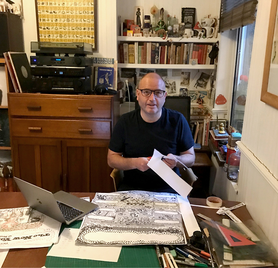
I’ve never had a studio. I only became fully self-employed just over two years ago, so I work in a corner of the living area in the family home. I have shelves of books for reference, my records, CDs, and DVDs, and a spare computer to stream videos. There’s a G-Plan dining table that folds out quite large to accommodate a MacBook, a scanner, and a lightbox. When I have a rough sketch I like, I make a scan and enlarge it and use the lightbox to trace over the original sketch. Every so often I make a series of books. Sometimes I use a desktop photocopier to print the pages, other times I have the inner pages professionally printed without a cover. I construct hard-backed covers using card and buckram. This can end up being quite a messy job—lots of discarded bits of paper everywhere, which I try to clear up by the end of the day, not always successfully.
Advertisement
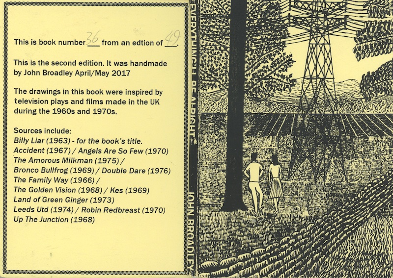
The illustrator Richard McGuire gave me a yellow hardcover paw-sized book of your black and white drawings, mundane scenes of couples, smokers, and friends. It was Everything’ll Be Alright (2017), book 36 from an edition of 49. Can you tell me about that series of books and what went into them?
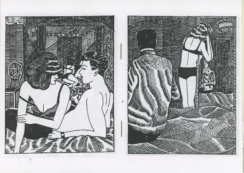
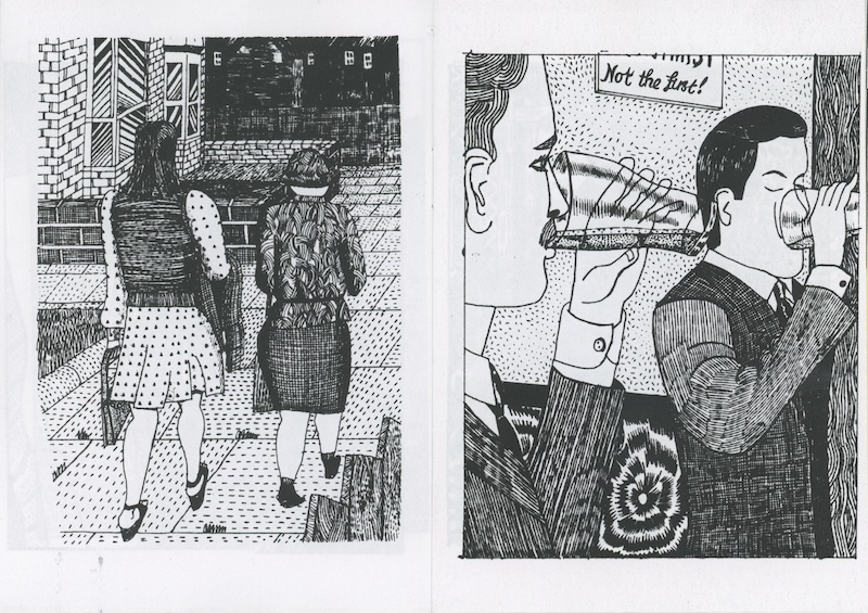
Usually I use a dip pen, Chinese drawing ink, and collaged cut-outs, but the drawings that went into Everything’ll Be Alright and a second volume, Love and Kisses from Our Lorraine, I drew with a fine line gel pen in a much more careful, almost sedate manner. They’re the sort of drawings I do when I’m visiting family and can’t risk spilling ink, or when we go on holiday and I take a notebook to the beach. The images are all taken from British TV plays or “kitchen sink” plays from the 1960s. I used to watch a lot of these when they were re-run in the 1980s and was attracted to their bleakness. There are a few lines from the plays in the books. The title comes from the film Billy Liar: “If I can get to the end of the street without opening my eyes, everything’ll be alright.”
I watch the DVDs of the films and skip through, looking for compositions to make screenshots of, then print these out and draw from them. There’s a deliberate wrongness to my interpretation of them. I didn’t think that the imagery in this small body of drawings would have been suited to my looser pen and ink work, so I developed a kind of naive etching style. I like to find compositions where I can exploit a pattern, such as fabric or brickwork. I sometimes black out the eyes and also find shots where there is no expression in the character’s face, when they are doing something mundane like brushing their teeth, say. There was a great shot I found in an episode of Play for Today of two kids in their pajamas sitting with their faces almost up to the TV screen, watching an Open University program about nuclear physics or something. Things like that really illustrate the time—the days when you would watch whatever came on, however irrelevant.
The Holiday Issue cover draws on both pagan and high street vernacular—how’d you come to that mix?
The very distant past perpetuating itself in the present is an idea I’ve been fascinated with since seeing Quatermass & the Pit on TV when I was about ten years old. In the show there are apparitions of goblin-type figures in Hobbs Lane, London, which was originally named Hobs Lane—an old name for the devil. A long-empty house has scratch marks down the walls, and an investigation of parish records reveals the site to have been the location of weird happenings as far back as records were made. Nigel Kneale, who wrote the show, as well as The Stone Tape and a lost play titled Road (set in the eighteenth century, a scientist and philosopher investigate ghostly sightings that are revealed to be apparitions from the twentieth century of a mass exodus of people escaping from an impending nuclear strike), inspired me with this idea that characters and objects from any era can be combined together in single images. It feels natural to me now to do this, but I only really get to in my self-published work and the very rare instances when I have carte blanche to do whatever I like—the Review cover and in some of my drawings for Quo Vadis.
Why do I think of L. S. Lowry and Leon Kossoff when I look at your work?
Both artists produce work that combines naiveté with detail, which I guess I do too. I never have the confidence to make large pieces with a single, stark image, but have this desire to bombard people with lots of details. There is a real melancholy to Lowry’s work that I relate to strongly. People in my comic strip drawings generally look like they are staring off into the distance, lost in thought. Either that or maniacally laughing. I really have problems if I have to do an illustration where people are supposed to look happy.
Advertisement
What books, shows, or graphic novels have you liked recently, or loved always?
The graphic novel It’s a Good Life, If You Don’t Weaken, by the Canadian cartoonist Seth, I’ve read lots of times and just love. His Clyde Fans is an epic, but I also love Wimbledon Green. I’ve got the whole set of House of Hammer magazines (yet another bit of childhood nostalgia), which each feature a comic adaptation of a Hammer film and are really great. Recently I’ve been reading British Library reprints of classic crime novels from the 1930s and 1940s, which are very cozy reading, especially their Christmas-themed stories.


