This article is part of a regular series of conversations with the Review’s contributors; read past ones here and sign up for our e-mail newsletter to get them delivered to your inbox each week.
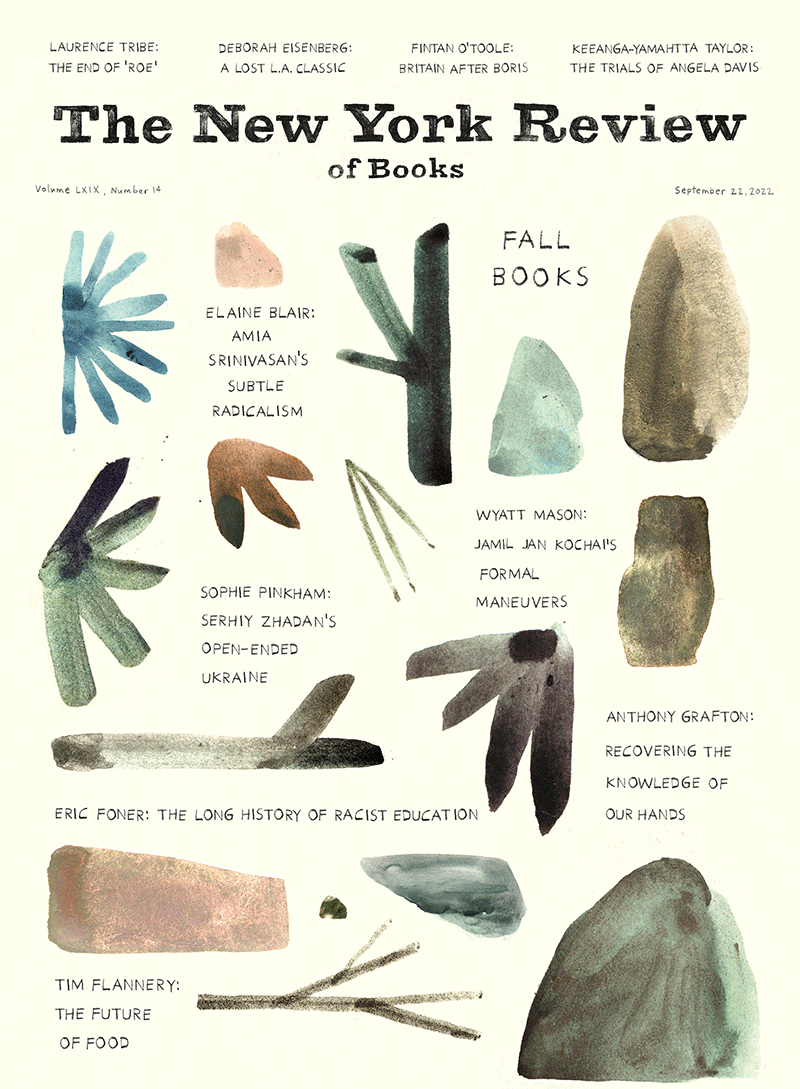
The cover of our Fall Books Issue was hand-drawn and -painted by Jon Klassen, the Canadian writer and illustrator of a Caldecott Award–winning picture book trilogy about hats: I Want My Hat Back, This Is Not My Hat, and We Found a Hat. As a mother, I find his work reliably weird and beautiful, finding the right balance of dark and light that I want my kid to experience. As an adult fan, I admire the surreal quality of his illustrations. He’s a Magritte for the nursery. His art has respect for the living nature of things, for the scale of the world and the mystery that even a chair or a bowl can hold. I e-mailed Klassen last week at his home in LA, where he was reading The Twilight World by Werner Herzog and Seek: Reports from the Edges of America and Beyond by Denis Johnson. Klassen’s next book, The Skull, will be out in 2023.
Leanne Shapton: I love the cover you made for us because it feels like it’s full of the things you pick up on an autumn walk and pocket, or the shapes that get stuck to the pavement or windshield after a wet storm. Where did these bits and bobs come from?
Jon Klassen: That was very much the idea. We have a few shelves at home of just stuff from walks and trips. I like that they all just sit together equally, and also that you end up arranging them specifically even though they come from all over: “Well obviously the little piece of meteorite from the Sahara should go next to the skipping stone from Georgian Bay.” I think the more I do illustration, or even writing, the more it seems like my interest is in the arrangement of things, reacting to known quantities, as much as it is generating anything new myself. Some of the pieces here are supposed to look literal, but I like how that gave me permission to draw objects that don’t look like anything in particular. They’re just little guys. I did pages and pages of them and kind of chose my favorites intuitively, then arranged them all later. It was really, really fun.
What is your relationship to nature and the natural world?
It feels like a combination of the romantic and really unromantic. Romantic because I know very little about how it all works, so in looking at nature I mostly feel affection and awe, but unromantic because I’m attracted to how impersonal and mechanical it all is too. Telling stories using natural elements like animals or plants is fun because nature isn’t especially emotional in how it works, so even a little bit of emotion stands out.
You’re best known—through your kids’ books—for your animals and rocks, but sometimes you draw very plain, prosaic things: chairs, bowls, simple buildings. What else do you like to sketch?
I don’t think I understand why some things appeal to me to draw and others don’t. I tried to draw an apple the other day for fun, got partway through and just thought, “I can’t find a way in here.” Geoff McFetridge mentioned George Saunders’s “A Swim in the Pond in the Rain” in his interview with you. I like that book too, and there’s a part in it where Saunders talks very generally about just working to keep his energy up. I don’t know specifically what keeps the energy up in my stuff, but I think I’m getting quicker at knowing when it isn’t there, at least. It’s not in an apple this week, apparently.
Your rocks and circles and triangles feel very portentous. Where does your sense of shape come from? What did you grow up looking at or surrounded by?
I grew up in Ontario. In the northern part of the province there’s a lot of big Canadian Shield rocks jutting out of the ground, big, ancient, soft shapes cut off at the base by the ground plane, suggesting much bigger things going on below. The islands in the lakes look like that too. In Niagara Falls, where I went to high school, there’s a deep glen by the river where the hiking paths wind around these huge chunks of cliff that fell off the gorge wall, rolled downhill, and just settled, leaning on each other or sitting by themselves in the trees. It’s really peaceful, but it implies this really brief, violent event a long time ago. I like when things have their own meaning or history, but it’s none of your business.
Can you tell us about your animation, because I think that’s one of the places I first saw your work: the video for U2’s “I’ll Go Crazy If I Don’t Go Crazy Tonight.” Did you grow up watching the Canadian National Film Board shorts between CBC programs? I saw Norman McLaren’s Neighbours when I was six and it scarred me for life.
Advertisement
I didn’t know that about the U2 video! I went to school for animation; I thought it was what I was going to do for life. I don’t like animating much, but I love designing for it. It’s like building a train set. That U2 video was made with David O’Reilly—we were both into how easily space can be defined in 3D without using “real” light or shadow. He called it “what CGI gives you for free.” I think that’s still a big part of how I work, figuring out what your materials give you for “free” before you start.
People ask me about the darker turn Canadians seem to have taken with children’s stories, and I think growing up watching the National Film Board stuff has a lot to do with it. McLaren’s A Chairy Tale (1957) was, naturally, very influential. But the animator who stuck with me the most was Richard Condie. The Big Snit (1985) and Getting Started (1979) changed my brain, I think.
The lettering on the Fall Issue cover avoids being slick or too cool. What is it based on?
My goal with lettering is usually some kind of neutrality, so there’s no visual hint as to how you’re supposed to read it. My favorite typefaces are always on old textbooks or the like, but it’s hard to draw something that plain and exact, so my letters always look a little off. There’s the intention of seriousness, and I’m not quite getting there, but the effort is sincere. In kids’ books there’s often an impulse to try and excite young readers with the lettering, but even when I was little I think I preferred the more conservative-looking letters. “It must be really good if they don’t feel like they need to bait me with some wacky font.”
This question is from my nine-year-old: Did you ever lose one of your own hats?
I’ve lost a few and it never gets any easier.


