The American Museum of Natural History’s new Richard Gilder Center for Science, Education, and Innovation completes that venerable teaching and research institution’s four-city-block campus on Manhattan’s Upper West Side with decidedly mixed results. The $465 million infill project, which is architecturally fatuous though otherwise highly commendable, was designed by Studio Gang, the Chicago-based firm headed by Jeanne Gang, the fifty-nine-year-old architect who is rapidly becoming her profession’s best known woman since the death of Zaha Hadid seven years ago.
Gang first made a name for herself early in the new millennium with signature designs like the Aqua Tower of 2007–2010 in Chicago, an eighty-two-story mixed-use skyscraper distinguished by its hypnotically undulating exterior, which resembles a superscale, monochromatic Bridget Riley painting. Studio Gang replicated that shimmering effect by sequentially curving the edges of each of the structure’s exposed concrete floor slabs, which give the entirety of its vertical surfaces an ethereal illusion of continuous, windblown movement.
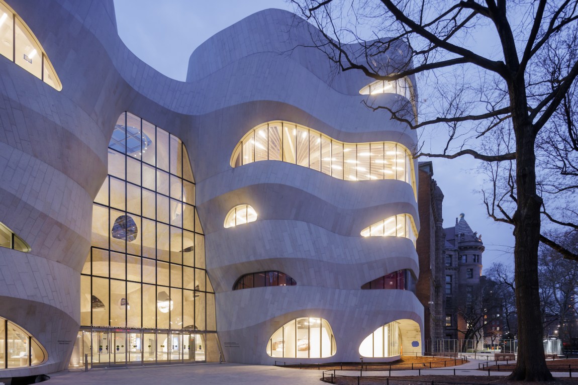
One’s first impression, by contrast, of the stone-clad Gilder Center from Columbus Avenue—where the new addition is approached through the seventeen-and-a-half-acre Theodore Roosevelt Park, part of which has been thoughtfully reconfigured by the Cambridge-based landscape architecture firm Reed Hilderbrand—is of turgid stasis and oppressive weightiness. Several critics have likened the building’s curvilinear design to the work of the sui generis Catalan architect Antoni Gaudí, a comparison that ought to have him revolving in his Barcelona tomb. For me the Gilder Center’s bulging, hulking forms (veneered with the same pink Massachusetts granite used on the museum’s main entrance on Central Park West, but looking dull gray on the overcast day I visited) brought to mind the fake mastodon that struggles to free itself from the La Brea Tar Pits in Los Angeles. Perhaps such zoomorphic similarities will excite schoolchildren anticipating the museum’s fabled dinosaur skeletons, but the whiff of bogusness I first detected on the exterior grew even thicker when I passed into the vast new entry hall.
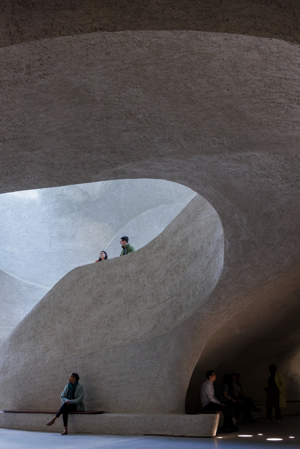
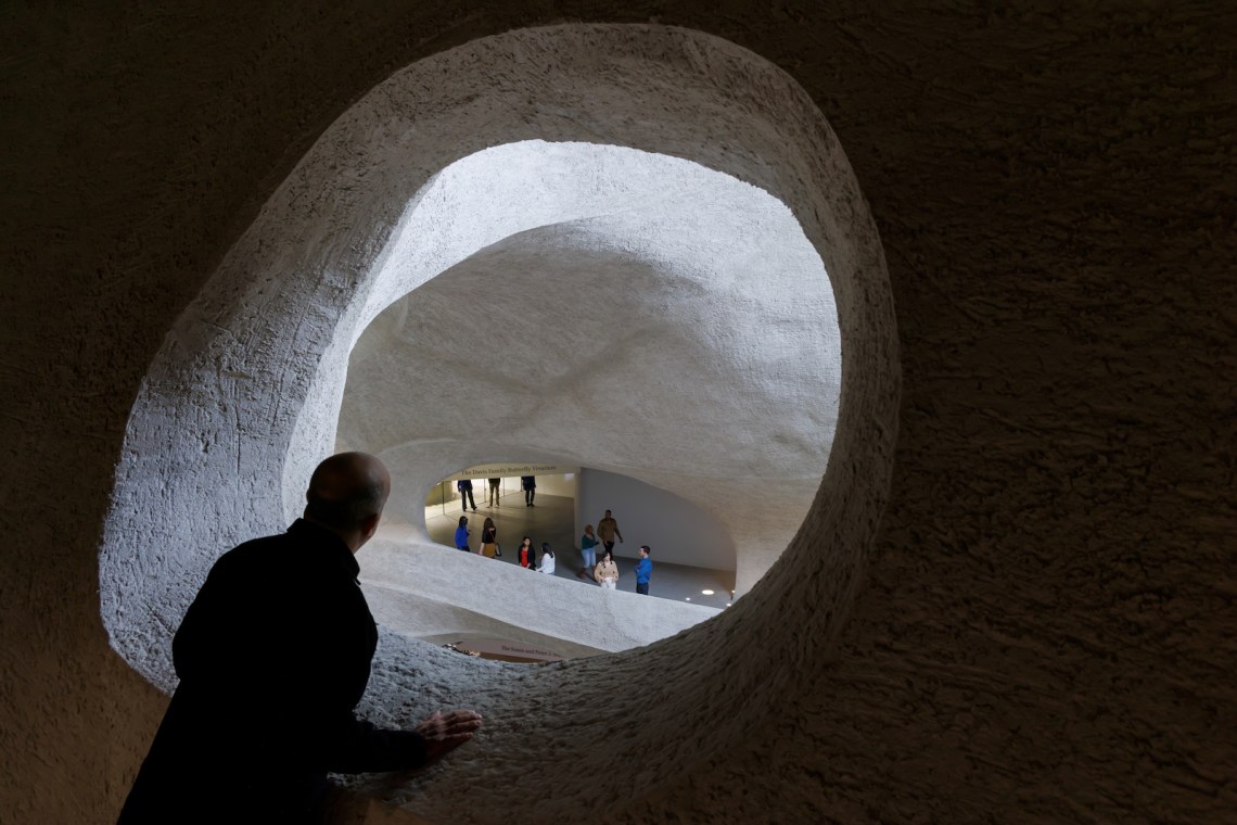
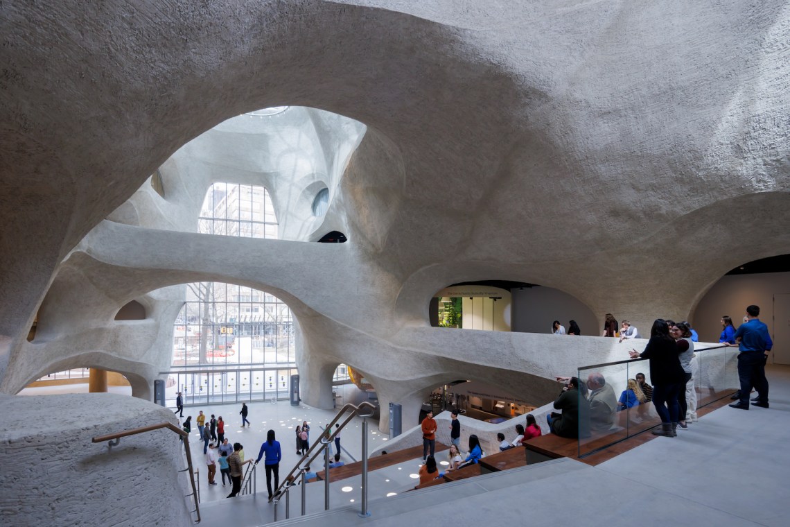
The five-story-high atrium—illuminated from the west by a huge, corporate-looking glass curtain wall and from above by three skylights (two oval, one round)—is spanned by a Piranesian bridge that crosses the amoeba-shaped space on the third level. The billowing, cave-like volume is delimited by curving extremities made from a veritable forest of tilted rebar (steel reinforcing rods) covered in shotcrete, a form of sprayed concrete that, appropriately enough, was invented in 1907 by the taxidermist Carl Akeley of the AMNH Exhibitions Lab.
One can understand Gang’s desire to express architecturally the institution’s organic program, a contemporary vindication of the German Enlightenment polymath Alexander von Humboldt’s pioneering belief that the entire universe comprises one interdependent whole, here reiterated by a kaleidoscopic but laser-like sampling of the thirty-four million objects in the museum’s collection. Highlights include such beloved classics as the recently renovated Mignone Halls of Gems and Minerals (an earlier incarnation of which was the scene of the globally publicized 1964 heist of the legendary 563-carat Star of India, the world’s largest sapphire, again on dramatic view but, one imagines, now better protected) as well as the ninety-four-foot-long blue whale model suspended from the ceiling of the Milstein Family Hall of Ocean Life.
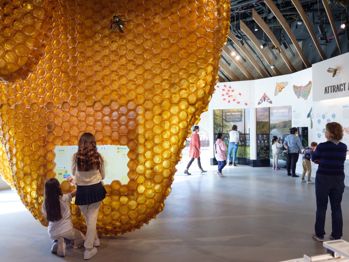
Then there are wonderful new additions like the Solomon Family Insectarium, which includes both living and preserved examples of one of the most endangered classes of animalia, and the Gerstner Collections Core, which presents a dizzying array of anthropological to zoological samplings that range from propagandistic Mao-era Chinese household objects to seventy-one creepy bat specimens. Most importantly, in everything from its most minute components to its grandest summations, the new addition subtly but insistently addresses the all-enveloping threat to life on Earth posed by climate change.
Exhibition design throughout is by the inevitable but incomparable Ralph Appelbaum Associates, the firm of display wizards whose influence on how information has been conveyed in museums since its founding cannot be overstated. Appelbaum set up shop in 1978, the year Charles Eames died, picking up where the Eameses left off in developing imaginative display techniques. If the Appelbaum office’s output doesn’t often rise to the poetic heights that could be reached by the twentieth century’s preeminent design couple, RAA’s body of work—which encompasses everything from the United States Holocaust Memorial Museum in Washington to the crown jewels in the Tower of London—has made an epochal contribution to modern museology that will merit close historical study in years to come.
Advertisement
Regrettably, the design of the Gilder Center’s introductory space falls far short of a credible expression of the natural world. Its ineptly modeled internal surfaces—with underpinnings discernible among its contours in some places, and a crumbly finish sure to degrade as thousands of tiny hands touch it—reminded me of nothing so much as the Tunnel of Love at the old Willow Grove amusement park near Philadelphia, where I went as an adolescent, a wholly unconvincing pseudo-geological concoction even by pre-Disneyworld standards. With the western hemisphere’s most splendid example of freeform architecture just across Central Park—the concrete whirlwind of Frank Lloyd Wright’s Guggenheim Museum—the deficiencies of Studio Gang’s design seem all the more glaring. To slightly alter the tagline of the 1977 commercial for Chiffon margarine, “It’s not nice to fool with Mother Nature.”
Paradoxically, though, the Gang office has done an excellent job with the Gilder Center’s site planning. The new building provides thirty-three connections to the ten surrounding structures—the AMNH campus contains twenty-four components in all—and it rationalizes circulation among them remarkably well. This intelligent rethinking reduces the time staff members have to spend moving from one part of the far-flung complex to another and greatly improves public circulation. The possible dichotomy between ground plan and volumetric form has never been more apparent to me.
*
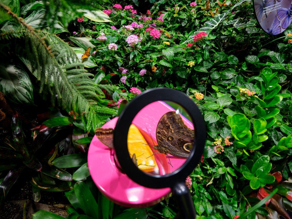
Moving past the falsity of the Gilder Center’s arrival sequence, there is little but praise for what lies beyond. Because it was a given that in order to engage young people nowadays the exhibits would need to have plenty of electronic and interactive features, it is a relief to report that there is a sensible balance between the virtual and the real throughout. The Davis Family Butterfly Vivarium was formerly a seasonal treat during the warmer months. In its new version, visitors can enter a climate-controlled, plant-filled environment in which Lepidoptera fly freely around them year-round. The encounter promises to be so immediate that museum employees will inspect all who depart from the Vivarium (which has sliding double doors to prevent its inhabitants from flying out) to make sure that no enfolded butterflies surreptitiously exit with them.
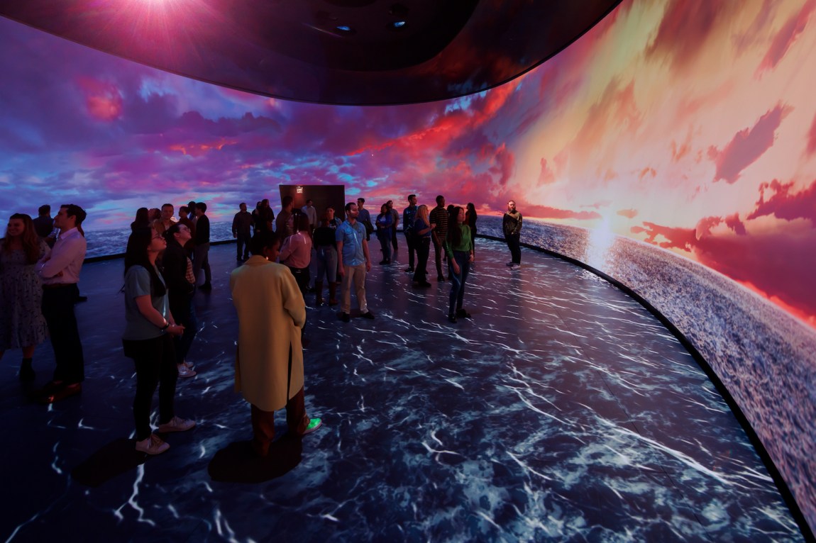
The pièce de résistance of the new building, however, is Invisible Worlds, a 3D immersive experience of the sort that has been employed at the AMNH’s Hayden Planetarium for the past two decades. The Gilder Center’s application of that concept, produced by the Berlin-based firm Tamaschick Media + Space (a self-described “studio for media-enhanced scenography”) is a looping twelve-minute light-and-sound show presented within an oval space the size of a hockey rink. Onto the continuous walls, ceiling, and floor of the enclosure are projected a dazzling array of interrelated images that jump in scale from the molecular to the cosmic with such gut-grabbing immediacy that earlier attempts to do the same thing, most famously the Eameses’s marvelous short film Powers of Ten (1977), look charmingly antique in retrospect.
Invisible Worlds takes us from evocations of the cellular basis of life to breathtaking panoramas like an enormous blue whale loudly fending off predators in the Pacific with such amazing involvement that at certain points I felt unsteady on my feet and had to quickly focus my attention on the darkened gallery spaces on either side of the elongated rotunda to regain my equilibrium. There is also much to learn from the incisive accompanying narration, which pulls off the neat trick of entering your mind subliminally rather than talkatively diverting your attention from the spellbinding visuals.
*
In The Catcher in the Rye, Holden Caulfield waxes lyrical about his childhood school trips to the AMNH, and specifically its quality, to him, of never seeming to change:
The best thing, though, in that museum was that everything always stayed right where it was. Nobody’d move. You could go there a hundred thousand times, and that Eskimo would still be just finished catching those two fish, the birds would still be on their way south, the deer would still be drinking out of that water hole, with their pretty antlers and their pretty, skinny legs, and that squaw with the naked bosom would still be weaving that same blanket. Nobody’d be different. The only thing that would be different would be you…. Certain things they should stay the way they are. You ought to be able to stick them in one of those big glass cases and just leave them alone.
Fortunately, the multidisciplinary team of artists and scientists, designers and technicians who collaborated for over a decade to make this century-and-a-half-old institution more enticing to new generations have struck precisely the right note between tradition and innovation, scholarship and entertainment, style and substance. Their scheme also demonstrates how irrelevant a misguided building design can be when all the internal functional requirements of a commission are as well fulfilled as they are at the Gilder Center.
Advertisement
The tendency of major cultural institutions to place undue emphasis on spectacular architecture as a means of spurring public interest in their activities increased sharply after the completion of Frank Gehry’s Guggenheim Museum Bilbao in 1997. Art museums have been particularly susceptible to this trend, but museums of all kinds have not been immune. Although some institutions have commissioned conventional buildings that would “stand the test of time”—which is to say, not look unfashionably dated within a few years—the Gilder Center indicates that there is still a market for “destination” or “attraction” architecture in a world where theme parks, skyscraper-like cruise ships, and Las Vegas simulacra of faraway landmarks are many Americans’ favorite public gathering places.
All the same, I’d wager that the AMNH’s most important visitors—the young people whom the museum’s staff and benefactors hope will evolve beyond dinosaur mania to become scientifically aware adults and supporters of the institution—would have been happy enough if the Gilder Center’s stunning array of exhibits were arranged in an airplane hangar, or even an industrial-looking shelter like that of the museum’s handsome Rose Center for Earth and Space of 1995–2000 by the Polshek Partnership (now Ennead Architects). Perhaps the philanthropic prodigy of the Gilder Center—which cost about the same as the alleged Leonardo Salvator Mundi did at auction in 2017—would have been difficult to realize in a less ostentatious manner, but no matter. Wonder awaits all who enter, and architecture is the least of it.


