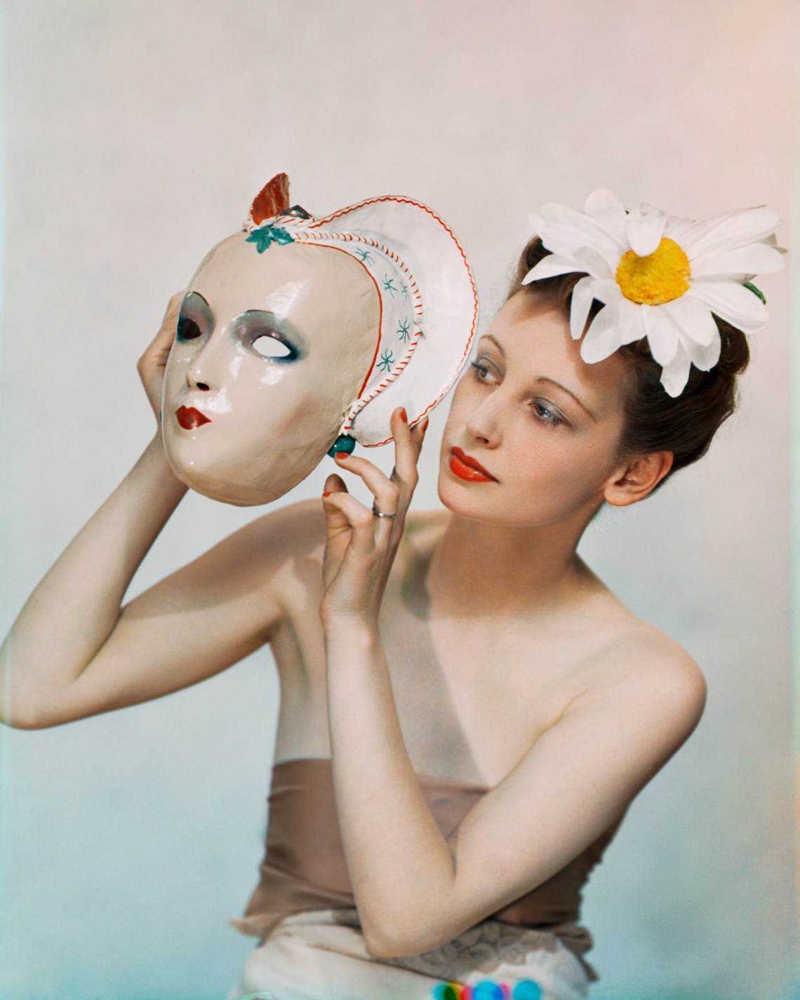
“WANTED: Red-faced, port-wine complexioned and gone-to-seed colonel as model.” This strange classified was drafted in the early 1930s by a pioneering English color photographer who went by the name Yevonde. Today she’s best known for her 1935 “Goddesses” series, society beauties posed as green-, blue-, and gold-hued deities, shot for an exhibition to mark the opening of her new studio in London’s fashionable Berkeley Square. The Times declared the portraits “among the best direct colour photographs we have seen,” praising the “ingenuity” of her vision. Rehung this summer in the newly refurbished National Portrait Gallery in the largest ever retrospective of Yevonde’s work, they certainly make for an arresting spectacle. But the color that pops most luminously from the 150 prints on display in “Yevonde: Life and Colour” is undoubtably red, apt for an artist who, even before she took up color photography, signed the mount of her prints in bright red crayon.
Yevonde Cumbers was born in Streatham, South London in 1893, and as a teenager she become involved in the suffragette movement. Central to her political awakening was her determination to attain professional and financial independence, and so when she was eighteen she answered an ad in the newspaper Votes for Women placed by the well-known photographer and fellow suffragette Lena Connell, who was looking for a young female pupil. Connell was known for her portraits of the leading luminaries in the Votes for Women cause, and Yevonde was impressed with these photographs of her “heroines.” “If only I could ever become great enough to take such wonderful celebrities!” she recalls thinking during their encounter in her memoir, In Camera (1940). The only problem was that Connell’s studio was in St. John’s Wood, a well-to-do neighbourhood in northwest London, and Yevonde deemed the commute from south London, where she was still living with her parents, too arduous.
Still, her visit to Connell’s studio piqued her interest in photography, and shortly thereafter she apprenticed herself to the society portraitist Lallie Charles, whose Mayfair studio was exactly the kind of woman-owned and -operated business that Yevonde aspired to build for herself. Charles had fashioned a distinctly feminine environment: “The curtains were of rose-coloured silk, the chairs were upholstered in pink velvet, and a thick-piled carpet covered the floor…. Even the photographs were of a soft pinkish tinge.” Under Charles’s tutelage, Yevonde learned to create with her camera the opulence and beauty that wealthy clients wanted their portraits to exude. This was her initiation into an aesthetic of fantasy and excess that would flower in her color work two decades later.
According to the Daily Herald’s gossip column, Yevonde’s call for models never made it to print; the newspaper she’d sent it to “refused” to place it, joking that although many of its readers were both port-wine complexioned and colonels, “they had not yet gone to seed.” Not to be discouraged, Yevonde found a cinema agency that was more accommodating. “I saw the full-bodied result in a frame at the Albany Galleries yesterday,” wrote the rumormonger. This wasn’t the first time her exciting new color prints had been shown—five had appeared the previous year in the “Royal Photographic Society’s Colour Exhibition,” the most comprehensive show of its kind yet held in England—but it was her first one-woman show in bold Vivex tricolor, the revolutionary process that soon became her trademark. “If we are going to have colour photography,” she declared in a lecture at the society, “for heaven’s sake let’s have a riot of colour, and none of your wishy-washy half-tinted effects.”
*
The first color photography prints on paper were made in the 1860s, but it took sixty years for color development to become widely available to professional photographers. There were two main types of color process: the subtractive system and the additive system. Autochrome, the most common version of the additive, produced color by overlaying a plate onto a color screen. Since only a single exposure was required, it was straightforward enough for amateur use, but the long exposure produced a somewhat etiolated color palette—the “wishy-washy” effect Yevonde decried. The subtractive system produced much richer chromatic saturation and a higher quality of large-scale image (when Autochrome prints were enlarged, the grain of the plate became visible). It was, however, much more complex and thus expensive: it involved the use of three plates, each with its own filter (red, green, and blue), that were processed separately and then printed on top of one another. In addition to special equipment it required an understanding of color chemistry and considerable practical skill on the part of the photographer.
The subtractive process became much more accessible when the British lecturer and color chemist D. A. Spencer invented Vivex, which he patented to the company Colour Photographs Ltd in 1928. All Vivex photographs were developed and printed by the manufacturer’s specialist technicians in their laboratory in Willesden, North London. Yevonde was one of Spencer’s earliest accolytes, immediately falling for the charms of “the bad boy of the photographic family,” as one of CPL’s employees called color photography in 1931.
Advertisement
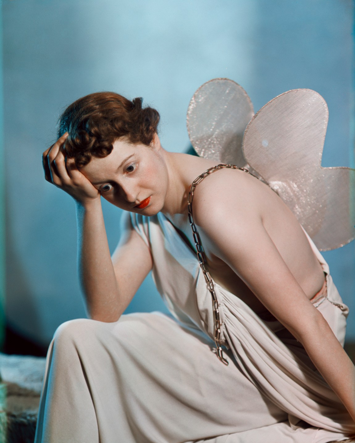
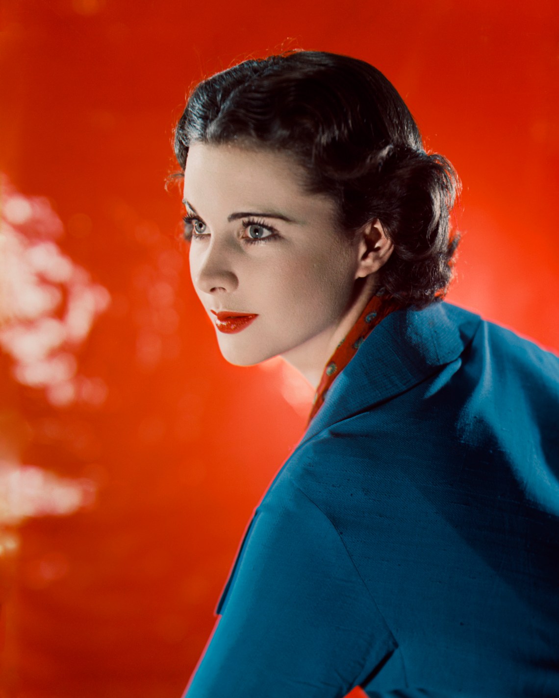
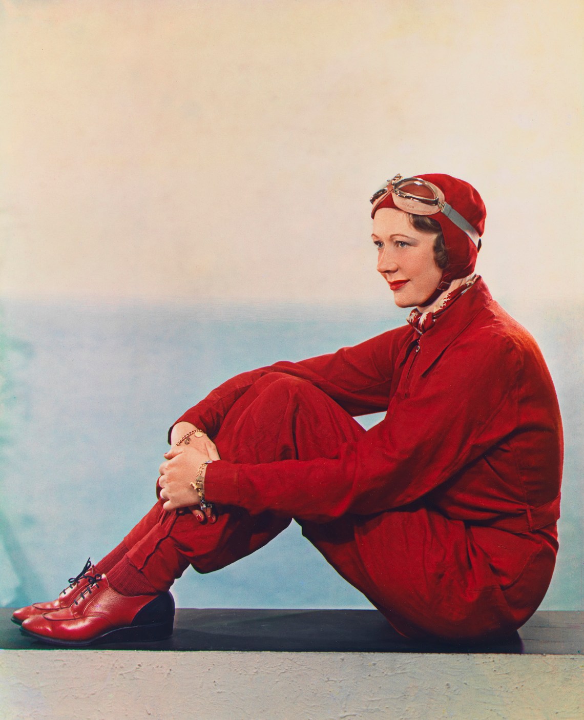
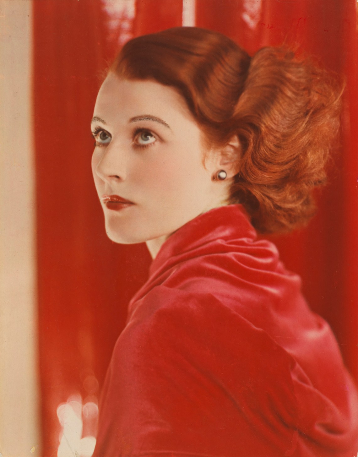
At the National Portrait Gallery, one minute we’re admiring Yevonde’s early monochrome portraits—among the high-society commissions there are more intimate images such as that of her sister Verena with a stuffed toy named Mr. Penguin and the family cat Moses, and the montaged double portrait of Yevonde and her husband Edgar that she took in 1929—and the next we’re dazzled by chromatic flamboyance. A 1932 portrait of the flame-haired actor Joan Maude is a study in scarlet; the shades of her hair, lips, cheeks, and coat are echoed in the hues of the background, which subtly intensify from left to right across the print. Another highlight is Vivien Leigh. Although shot in 1936, three years before the release of Gone with the Wind, the image feels synonymous with her career-defining role as Scarlett O’Hara. The “swashbuckling” British racing driver and aviator Jill Scott appears here with her signature cherry-red ensemble, accessorized in Yevonde’s 1938 portrait with matching lipstick and nail polish.
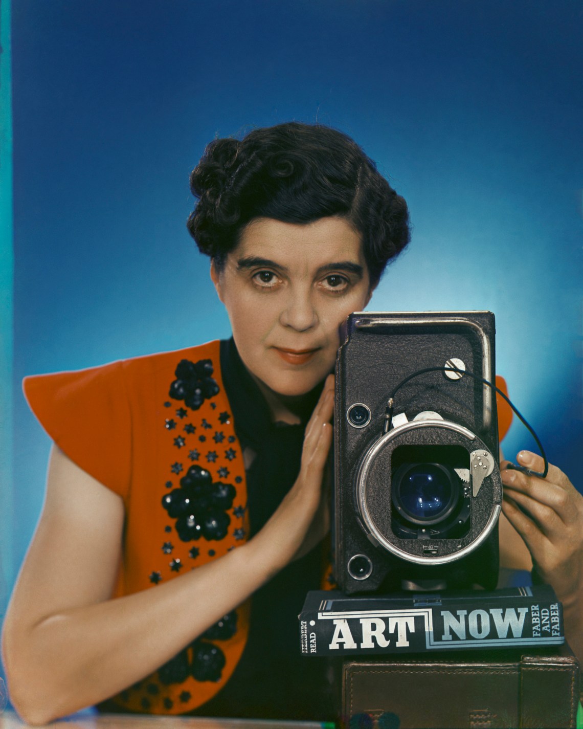
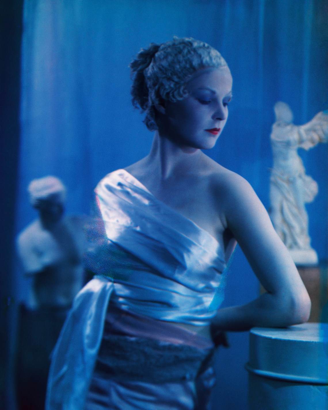
Yevonde embraced color photography as an artistic, rather than documentary, medium. Note her carefully chosen prop in Self-Portrait with Vivex One-Shot Camera (1937): her camera is balanced on a bulky copy of Herbert Read’s 1933 survey of modern art, Art Now. Early on she learned that the color of the background was just as important as that of the foreground, but she also quickly discovered that “some colours, though beautiful to the human eyes, were not so effective in reproduction.” Primary colors were easiest to capture, but those on the edge of the spectrum—she specifies “greeny-blue, bluey-green, purple or wine”—were distinctly more difficult. Thus, when she couldn’t quite achieve the tones she wanted, she covered her studio lights in sheets of tinted cellophane. Two of the most evocative examples can be found among her “Goddesses”: Eileen Ward Jackson (Hunter) as Dido (1935) and Beatrice Eden (Beckett) as Clio (also identified as Dido) (1937), where a blue tinge gives her subjects the cool look of marble. She treated faces like canvases: a dab more rouge, or carefully applied kohl, helped to achieve the striking results she was after. She believed that cosmetics were “an important side-line that should be studied carefully by any photographer with Colour ambitions.”
Yevonde’s earliest experiments led to confusion at the CPL laboratory. Unaccustomed to photographers taking artistic license, the technicians who developed her photos set about conscientiously readjusting her careful manipulations. Soon she was submitting her negatives with an attached directive: “Don’t correct anything, just print!” She had her pictures printed 15 by 12 inches, roughly fourteen times larger than Autochromes. “The colour photograph was to be something precious,” she writes in her memoir, “not to be doled out in dozens like cabinets or cartes de visites.”
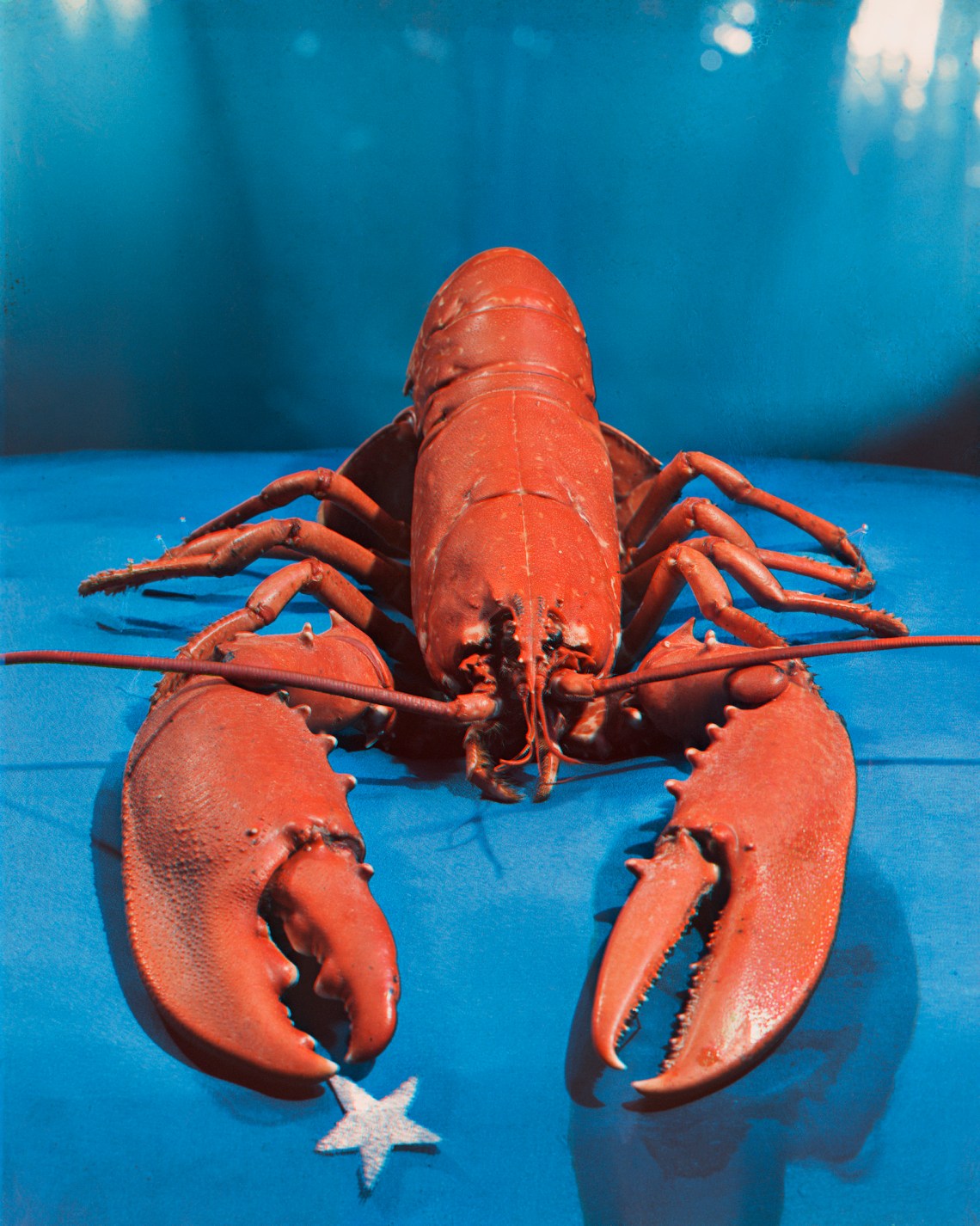
She didn’t want verisimilitude, but a heightened, almost abstracted artifice akin to that of the Surrealists. Lady Dorothy (‘Dolly’) Campbell as Niobe (1935)—an intimate close-up of her red-raw eyes and glycerine-smeared cheeks invoking the Queen of Thebes’s infamous tears—is reminiscent of Man Ray’s Glass Tears (1932). But Lobster (1934), the crustacean’s creamy red shell juxtaposed with a turquoise-infused royal blue background, predates Dalí’s Lobster Telephone by four years. Look closely at Leigh and you’ll see a narrow but bright halo effect around her torso, created by slight movement between exposures. She literally glows, a film star radiating a golden gleam.
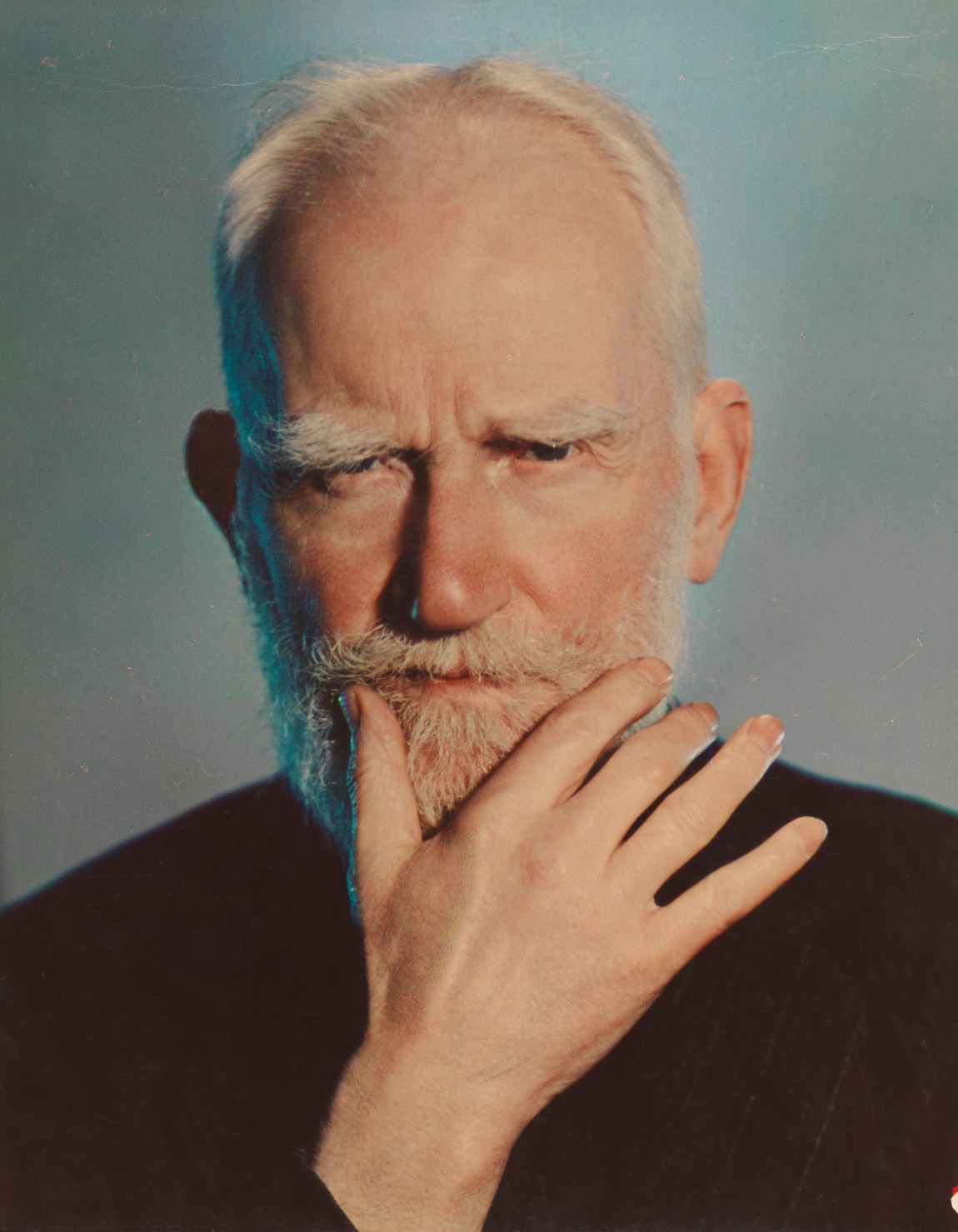
Yevonde much preferred photographing women, but George Bernard Shaw was the exception. She loved his soft, elegant hands, and apparently he excelled at sitting still. The blue floodlight that hits one side of his face, harmonizing with the delicate pink of his skin, transplants him from the Victorian era to the modern world. When the portrait was first exhibited at the Royal Photographic Society Annual Exhibition of 1937, one critic denounced the blue tint as an act of violence. Another simply asked, “Why do such things?”
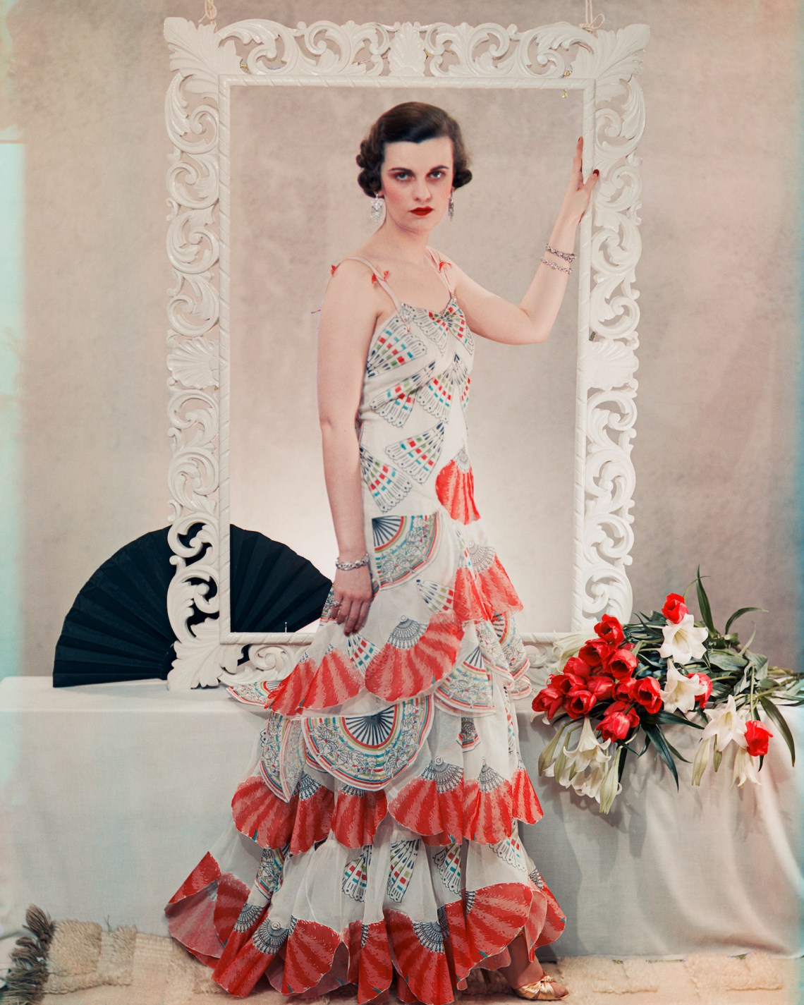
When Spencer praised his most daring disciple’s work “as an adventure in the field of beauty,” he was onto something important: the parallel between the vibrant colors Yevonde was able to produce and the vivid hues that dominated fashion and cosmetics trends. It didn’t take long for her to be “drawn,” as she puts it in her memoir, “into the commercial world.” In her address to the Royal Photographic Society in 1932, Yevonde argued that women were much better placed to embrace this flashy new medium because color was so important in their lives, be it that of their clothes, their make-up, or their home decor. Kirsty Sinclair Dootson points out in her recent study of modern British visual culture, The Rainbow’s Gravity, that the advance of accessible technology that shifted photography “away from technical expertise towards a more feminised interest in aesthetics,” and thus allowed a photographer like Yevonde to flourish, “echoed broader debates about the deskilling and feminisation of work in the inter-war years.”1 The feminization of photography is evident all over these walls. Lounging debutants, royals, and stars of the stage and screen hang alongside photographs used to advertise Lanoline hand cream and Eno Fruit Salt and as covers for women’s magazines, from the mainstream Woman and Beauty to the pocket-sized periodical Eve’s Journal (“we stimulate—we challenge—we amuse,” was its tagline). These were pictures of women, taken for women, by a woman. Everywhere you look, the female gaze abounds.
Advertisement
Yevonde argued that photography was a profession greatly “influenced by feminine feeling.” In fact, she continued, given how so much of the professional photographer’s work is dictated by the whims and desires of women—whether young women who want to be photographed modeling the latest fashion, or mothers who want pictures of their beloved children—“it is rather surprising that portrait photography is not considered almost entirely a woman’s profession.” When the lecture was published in the British Journal of Photography, it elicited more than its fair share of misogynistic replies. “Women photographers are merely a passing fad,” wrote one reader, “as much out of place in our community as women barbers or police.”
Yevonde’s postwar prints are largely indistinguishable from those of the many other talented women photographers of the time. World War II marked the end of two eras for Yevonde, and a return to monochrome, both professionally and personally: her husband, Edgar, died of cancer in April 1939, and in September CPL shut down—wartime austerity meant diminished advertising budgets for expensive color photography, but so too the laboratory lost most of its employees to the armed forces and the war effort. The exhibition draws to a close in black-and-white. Yevonde’s experiments in the 1960s with solarization, achieved by exposing a partially developed photograph to light and already used extensively in the 1930s by Lee Miller and Man Ray, are nothing more than intriguing. But the final collection of portraits on display are well worth lingering over. In 1968, to mark the fiftieth anniversary of the Representation of the People Act, which gave 8.5 million British women the right to vote, Yevonde mounted what would be her final studio exhibition, “Some Distinguished Women.” Among those featured were Barbara Hepworth, Laura Knight, and Iris Murdoch (who apparently turned up at Yevonde’s studio ready for her close-up only to be mistaken for the cleaning lady due to her “bohemian” attire).
As befits the show’s title, there’s a gravitas to Yevonde’s subjects. She captures them in calm, considered concentration. The portrait of Hepworth is of an artist communing with her own work, her sculpture Corinthos (1954–1955) is between her arms, the light on the hardwood concentrated in a spot that seems to emanate a glow. Murdoch, meanwhile, is sunk comfortably into a high-backed chair, legs outstretched, reading a book. Knight, cigarette in hand, gazes off to her right, beyond the frame. These women are posed, but not posing; one feels that they’re being photographed on their own terms. The images, silver gelatin prints, don’t feel especially modern, but that’s not the point. Hepworth is sixty-five, Knight is ninety. Like Yevonde herself, they’ve been around for a while. I’m reminded of Connell’s portraits of the suffragettes. Fifty years after she hoped she might one day prove herself worthy, Yevonde photographed a whole new gallery of heroines.


