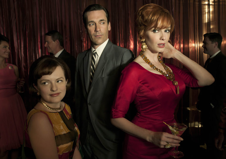
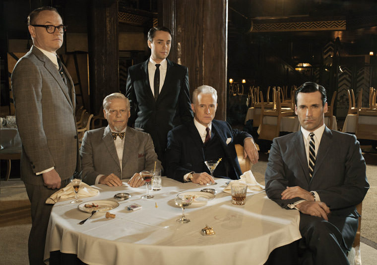
A major theme in literature is a wistful regard for life as it was lived some forty or fifty years earlier, typified by Edith Wharton’s The Age of Innocence (1920), which looked back at upper-class mores in 1870s New York. Similarly, the five-decade postmillennial perspective afforded through the rear-view mirror of Mad Men—the critically acclaimed and cultishly followed cable-television drama series that first aired on AMC in 2007 and began its fourth season on July 25—bridges an equivalent time span, long enough to feel historical yet still within living memory of many.
For those of us who came to cultural awareness during the Kennedy years—the purview of Mad Men during its first three seasons, with the present cycle beginning in 1964—Mad Men offers anything but a comforting wallow in nostalgia. The series, which focuses on the fictive Madison Avenue advertising firm Sterling Cooper (later Sterling Cooper Draper Pryce), derives its thrilling power from the dark and seamlessly unified vision of its creator, executive producer, and head writer, Matthew Weiner, an auteur with few peers in the history of his medium.
In the first episode of the new cycle, for example, time marches inexorably onward in the small but significant ways that used to be of considerable import, most noticeably those seasonal adjustments of skirt length, figure silhouette, and hairstyle that women followed with far more conformity than they do today. Yet Mad Men’s extraordinary fidelity departs from conventional period recreations in one crucial respect. As the series’ production designer, Dan Bishop, has explained:
[Weiner] wanted to make sure it wasn’t a textbook study of mid-century modern America—as Matt specifically pointed out, look around your own house, does everything exist from 2007 or do you actually have stuff lying around from the ’80s?…People didn’t adopt the modern ideas any faster then than they do now.
Among many things that make Mad Men so intriguing is its broad definition of what constitutes design. For example, its cunningly detailed, not-quite-couture female costuming—the B.H. Wragge-style coat-and-dress ensembles, the Koret handbags, the Coro costume jewelry—makes the female characters (especially the spectacularly curvaceous Christina Hendricks as the office manager, Joan Holloway) seem as if they have stepped straight out of the Sunday New York Times during the twilight of Lester Markel. But the clothing’s impact is accentuated by the way in which these good, serviceable outfits are seen on more than one occasion, as would have been done by working girls on a budget in those days before such disposable-chic stores as H&M.
Equally fanatical attention is paid to interior design. The offices of Sterling Cooper were done up in the spacious, late International Style corporate mode epitomized by the boxy glass-and-steel skyscrapers that rose along Park Avenue after World War II. (The first was Lever House of 1950–1952 by Gordon Bunshaft of Skidmore, Owings & Merrill.)
Authentically, Sterling Cooper’s executives occupy private offices on the periphery of the structure, with the open-plan secretarial pool closer to the building’s core. The women’s workspace is illuminated not by windows, but rather by dropped ceilings that conceal fluorescent lighting above an overhead gridwork of translucent plastic panels. (The new offices of the fledgling breakaway agency Sterling Cooper Draper Pryce, seen for the first time in season four, are decorated in the same mid-century modern style as the partners’ former digs, though the current spaces are rather more cramped, a subtle signifier of the firm’s still uncertain financial footing.) In a technique pioneered by the master cinematographer Gregg Toland for Orson Welles’s Citizen Kane (1941), Weiner assumes an uncommonly low camera angle to include ceilings in his shots, and thereby gives a greater sense of verisimilitude by incorporating one of the most characteristic design elements of the upscale postwar office.
Such High Modernist interiors were already being satirized when they were almost new. Edward G. Boyle’s exuberantly cartoonish set designs for the film adaptation of Frank Loesser and Abe Burrows’s musical comedy hit How to Succeed in Business Without Really Trying (1967) present a perky, pastel-colored flip-side to Weiner’s relentlessly moody vision. Not that Mad Men’s creator is immune to knowing winks. In one of the show’s most inspired casting coups, the part of Bertram Cooper, the ad agency’s co-founder, is played by Robert Morse (now 79), who, as a brash young man, starred in both the Broadway and Hollywood versions of How to Succeed.
Then there are the countless small touches that can leave older viewers gasping with a shock of recognition over the most quotidian but long-forgotten activities. At the end of one Sterling Cooper workday, secretaries proudly swoosh beige vinyl typewriter covers over their coveted IBM Selectrics (the “golfball” model introduced in 1961, with its spherical type component that allowed interchangeable fonts).
Advertisement
Weiner’s perfectionism has of course challenged some aficionados to ferret out anachronisms. Though there have been none of the wristwatch-with-toga bloopers beloved by film buffs in Biblical epics, a few slips—in word usage and occasionally in soundtrack music—have been noted on several fan websites the show has engendered. An amusing if only fitfully provocative new book, Natasha Vargas-Cooper’s Mad Men Unbuttoned, is likely to become a trivia-lover’s bible, as well as recommended reading for the inevitable college media-studies courses on this pop-cultural phenomenon.
Weiner’s instinct for design appears closely reflected in the brilliant role assignments by his casting directors, Laura Schiff and Carrie Audino. How else can one begin to describe the series’ principal protagonists, Don Draper (Jon Hamm) and Betty Draper (January Jones), except in terms of their dazzling good looks, which so effectively distract us from their underlying weirdness? It’s not as though beauty has become any less useful an aid to career advancement since the 1960s, but Weiner brings this truth home time and again in the physical presentation of his actors.
Thus, aside from the Drapers, the lodestar of Mad Men is the mesmerizing secretary-turned-copywriter Peggy Olson (Elisabeth Moss), whose striking cosmetic makeover in this latest season could well presage her further rise in a world where appearances may not be everything, but nearly so. This Brooklyn-bred character is based in part on the trailblazing copywriter Shirley Polykoff, creator of the smash 1956 “Does She … Or Doesn’t She?” campaign for Clairol hair dye, which definitively proved that the ad game was no longer a boys-only club.
As such, Moss’s Olson has emerged as one of Mad Men’s most consistently fascinating personalities, not only because of her dogged proto-feminist gumption, but also because of her repeated willingness to sacrifice the personal to the professional. She never gives the slightest indication that she will live to regret either her cold-eyed decisions—including secretly bearing, and then giving up for adoption, a baby after she was impregnated by her slimy married co-worker, Pete Campbell (Vincent Kartheiser)—or her remorseless business-is-business ethos.
If Mad Men has one recurrent weakness, it is an annoying recourse to topical tragedies of those troubled times—seemingly gratuitous references that have included self-immolating Vietnamese Buddhist monks; the four black schoolgirls killed in the Birmingham church bombing; and the assassination of Medgar Evers, all of which occurred in 1963. Particularly offensive in the fourth-season opener was a brief, almost decorative invocation of Andrew Goodman one of three young civil rights workers murdered in Mississippi during the “Freedom Summer” of 1964. Goodman’s sacrifice surely deserves to be remembered, honored, and memorialized, but not as a throwaway line to vouchsafe Weiner’s liberal bona fides. Such missteps apart, by peeling back the surface layers from that not-so-distant past, Matthew Weiner is performing one of the most instructive—not to say diverting and entertaining—sleights of hand in the modern theater of memory.


