One of the stranger obituaries to lately appear in The New York Times marked the death of Richard Basciano, aged ninety-one and termed the “Times Square Sultan of Smut” for his “vast New York pornographic empire” of sex shops, peep shows, and X-rated theaters centered on the midtown Manhattan intersection that takes its name from the Newspaper of Record. This dubious valediction was a reminder of the proprietary attitude the Times has taken toward the city’s most renowned public space since 1905, when the daily journal moved its headquarters from Newspaper Row near City Hall to a newly built skyscraper on the triangular lot bounded by West 42nd Street, Seventh Avenue, and Broadway.
Formerly called Longacre Square, this awkwardly shaped nexus—which resembles an upended, etiolated bowtie—is no square by any definition, but instead a result of the collision between a meandering Algonquian Indian trail that evolved into Broadway and Manhattan’s grid plan of 1811. Along with its once seedy reputation, the area’s tortuous traffic arrangements have always posed challenges for urban planners. This is part of the impetus behind a new project by Snøhetta, the Oslo-based architectural collaborative that has maintained a New York office since it was hired to design the National September 11 Museum in 2004.
In today’s America of drastically reduced civic expectations, Snøhetta’s quietly brilliant reconfiguration of Times Square is an exemplar of how much can be achieved in city planning without the gigantic financial outlays and dire social displacements that typified American postwar urban renewal projects. Although many New Yorkers feel that the 42nd Street vicinity—like the Statue of Liberty and One World Trade Center—is strictly for out-of-towners, there’s no doubting the economic benefits that 45 million visitors each year bring to this so-called Crossroads of the World.
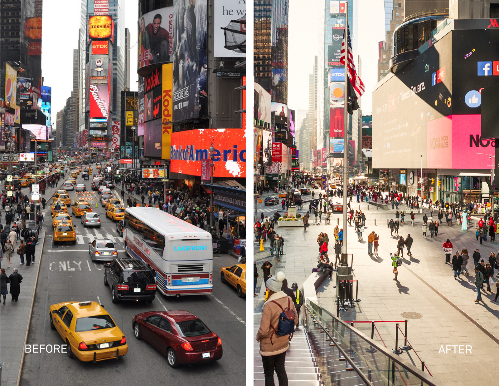
Improving its long-problematic circulation patterns was one aim of comprehensive traffic reforms begun under Mayor Michael Bloomberg. In 2009, the city’s transportation commissioner, Janette Sadik-Khan—a controversial figure who instituted some admirable changes, most notably a 250-mile network of bicycle lanes, but also other, less welcome decisions that are widely believed to have made congestion in the city much worse, especially replacing lanes on north-south avenues with concrete traffic islands—temporarily rerouted Broadway around Times Square and Herald Square (at West 34th Street) to create pedestrian plazas. The idea was so instantly popular—among those on foot, if not in cars—that a year later it was made permanent.
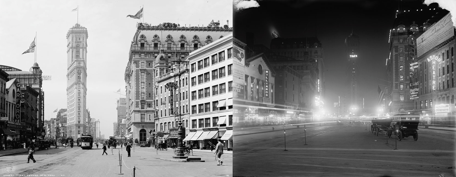
However, this is just the latest iteration of an area that has helped shape the identity of modern New York. By the early twentieth century, Times Square had become a hub of popular entertainment, from legitimate theaters, music halls, and movie houses to penny arcades, flea circuses, and freak shows. And thanks to the electric light “news zipper” that girdled the old Times building, this was where crowds congregated on momentous public occasions, most famously V-J Day. After World War II, Times Square descended from raucous raffishness—what the lyricist Al Dubin characterized as “naughty, gaudy, bawdy, sporty Forty-Second Street”—into downright sleaze. The Times took this degradation as a personal affront and prosecuted a decades-long cleanup campaign that drew on the newspaper’s considerable civic influence to spur various renewal initiatives.
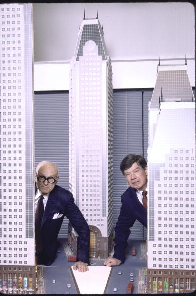
The most ambitious of these was designed in 1984 by Philip Johnson and John Burgee, that odd couple of Reagan Era corporate architecture, whose unexecuted cluster of prissy, mansard-roofed high-rises was antithetical to the funky, super-scale electrical signage that defines Times Square more than any single architectural element. The subsequent advent of the LED Jumbotron made it even more evident that the enduring spirit of the place resides in spectacular electronic effects, as proven by the area’s ability to survive even such crushing behemoths as John Portman’s hideous New York Marriott Marquis hotel (1985), an inevitable fixture on lists of the city’s ugliest buildings.
During the 1990s, when Mayor Rudolph Giuliani spearheaded a concerted effort to purge Times Square of its seamier elements, Basciano reaped a $14-million windfall after a number of his low-life properties were condemned to make way for more family-friendly businesses. Today the fully sanitized area is replete with generic chain stores and chain restaurants that can be found in countless other American cities.
The architectural density of Times Square—which makes large-scale demolition there virtually impossible—put an end to sweeping master plans, as did economic reality, especially after the World Trade Center attack of 2001, when so much public funding was diverted into the agonizingly slow, shamefully mismanaged reconstruction of Ground Zero. Major private developers much prefer a vast tabula rasa such as Hudson Yards, the $20-billion mixed-use complex now being erected atop a twenty-eight-acre platform over the old Pennsylvania Railroad tracks in far west Midtown, less than a half-mile from Times Square.
Advertisement
Snøhetta—a non-hierarchical, interdisciplinary practice completely unlike most big design offices, which reflect the corporate organization of their clients—began to attract widespread international attention with the opening of its Oslo Opera House in 2008. It was a scheme perhaps even more successful as populist urbanism than as an excellent music theater. An evident understanding of how people interact in public spaces—above all their desire to be seen as much as to see—made Snøhetta an obvious choice to revise Times Square. It was a stroke of luck for the city’s department of transportation and department of design and construction, who together hired Snøhetta for this $55-million commission—hardly a huge budget these days, in contrast to such recent public works excesses as Santiago Calatrava’s $4-billion World Trade Center Transportation Hub.
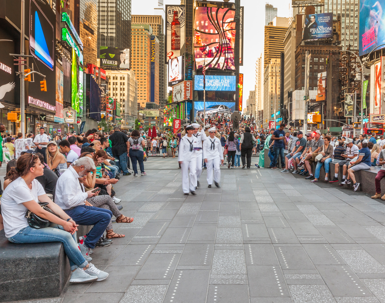
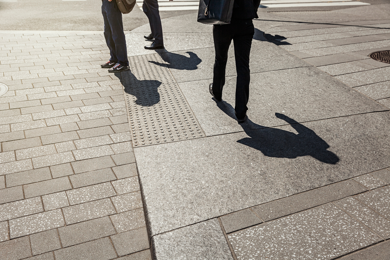
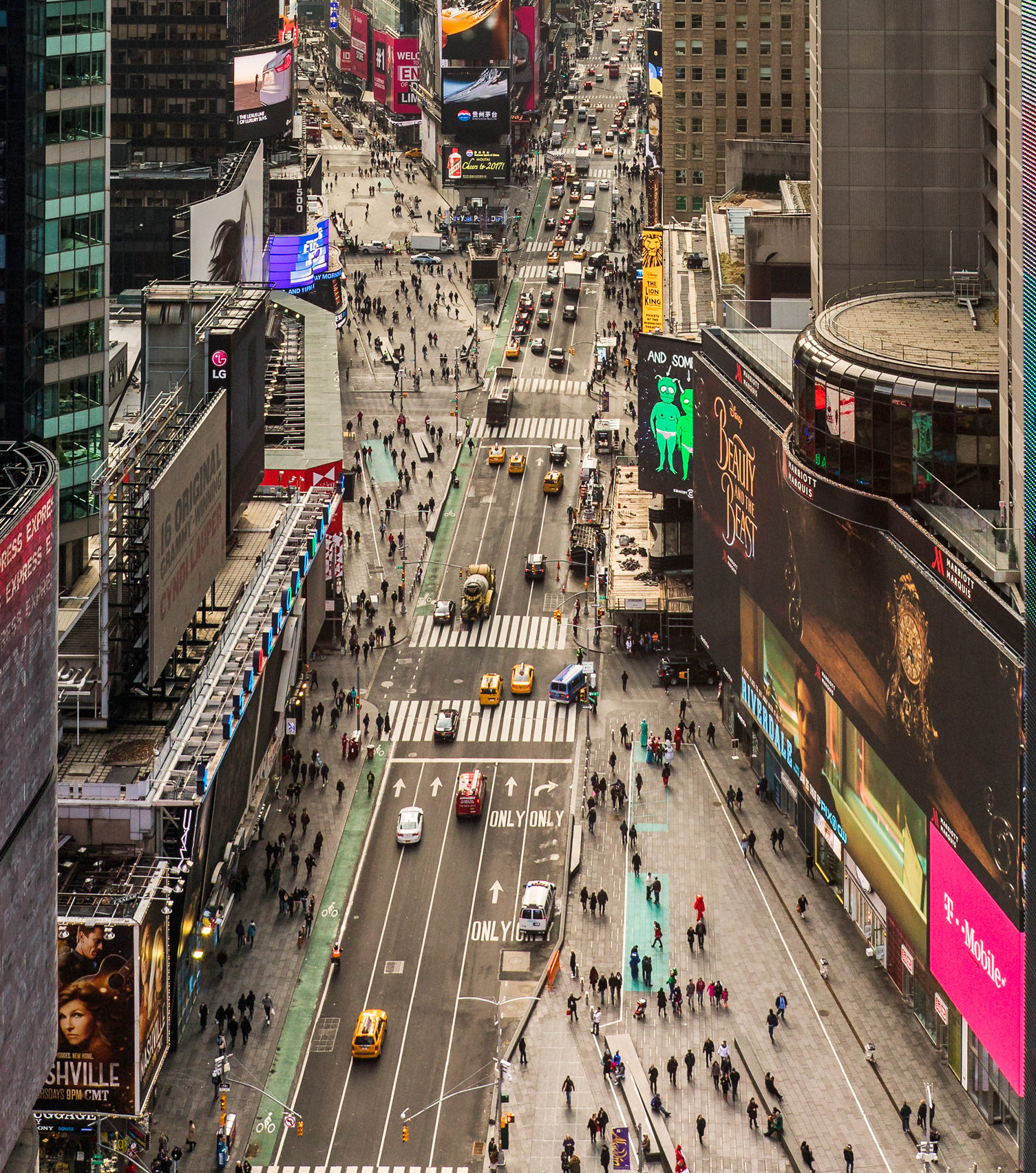
By closing off Broadway between 47th and 42nd Streets and rerouting southbound traffic to the adjacent and similarly southbound Seventh Avenue, 110,000 square feet—or two and a half acres—of new pedestrian space has been created. This expansive swath of found real estate—an immensely imaginative conceptual sleight of hand—is unified by precast concrete pavers in two tones of gray. The darker ones are embedded with rows of nickel-sized steel discs that catch the light and recall the round incandescent bulbs of Times Square billboards long ago.
This ground treatment continues straight across the east-west streets that remain open to vehicles. The regularization of a former jumble of surfaces and disparate levels—and the removal of much long-disused infrastructural clutter that had accrued over decades—makes it finally feel like a fully defined public plaza, not merely a jumpy sequence of broad but overcrowded sidewalks.
The entire area is given strong yet subtle delineation by a series of ten fifty-foot-long, slightly tapering benches of polished dark gray granite, as elegant in their attenuated simplicity as Minimalist sculpture. They bring to mind the work of Scott Burton, whose monumental pieces of furniture-as-sculpture in stone or metal, a staple of outdoor public art installations during the decade before his death from AIDS in 1989, are now largely and unfortunately forgotten.
Apart from providing ample seating for people-watching, the new benches are angled to encourage efficient crowd flow. They are also internally fitted with electricity to provide power for street performers who require amplification, thus eliminating the need for long, hazardous extension cables to surrounding outlets. The benches, along with bollards added at other strategic positions, serve as protective barriers, a not inconsequential factor in designing public spaces in an age of random terrorism.
Alas, just a month after the plaza’s dedication in April, a deranged and drugged driver plowed his car into a group of pedestrians on Seventh Avenue between 42nd and 43rd Streets, killed an eighteen-year-old tourist from Michigan, and injured twenty-two others. As Craig Dykers, a founding partner of Snøhetta, said in a statement issued after the incident, “We wanted to be sure safety measures did not define the public space while also creating highly effective protective features in the most populated areas,” but went on to add that “without these considerations more people would have been affected by this tragedy.”
However, as the Times reported on May 24, Tim Tompkins, president of the Times Square Alliance advocacy group (one of the principal clients, along with the two aforementioned city departments), “asked Snøhetta in recent days to dust off old drawings and make preparations for adding additional barriers of some kind.” This is a challenge that confronts urbanists worldwide now that even the most life-affirming re-imaginings of city life must take into account dark forces, both individual and institutional, that see such accessible and inclusive gathering spots as nothing more than inviting soft targets.


