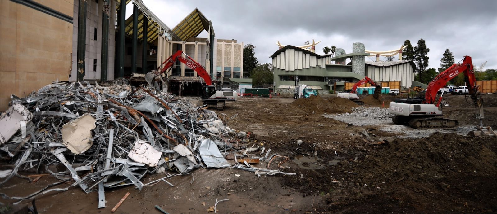
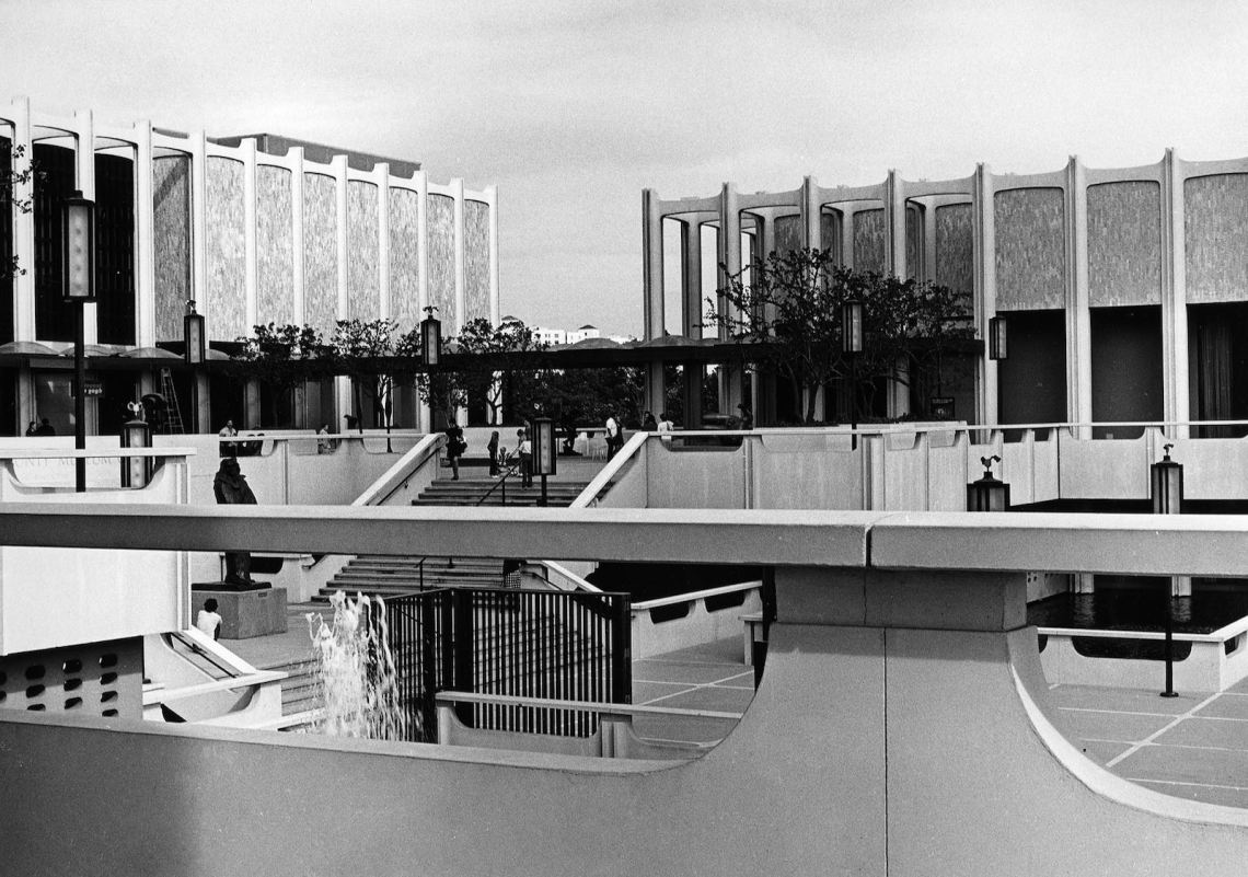
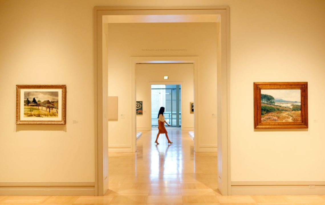
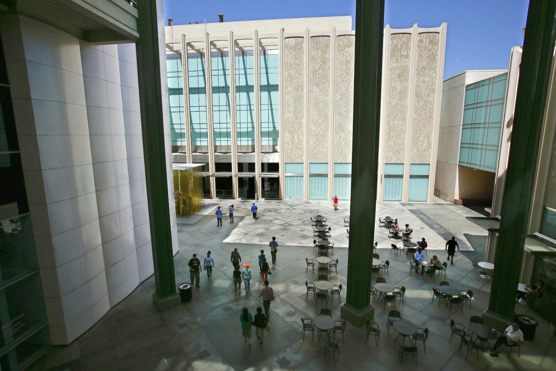
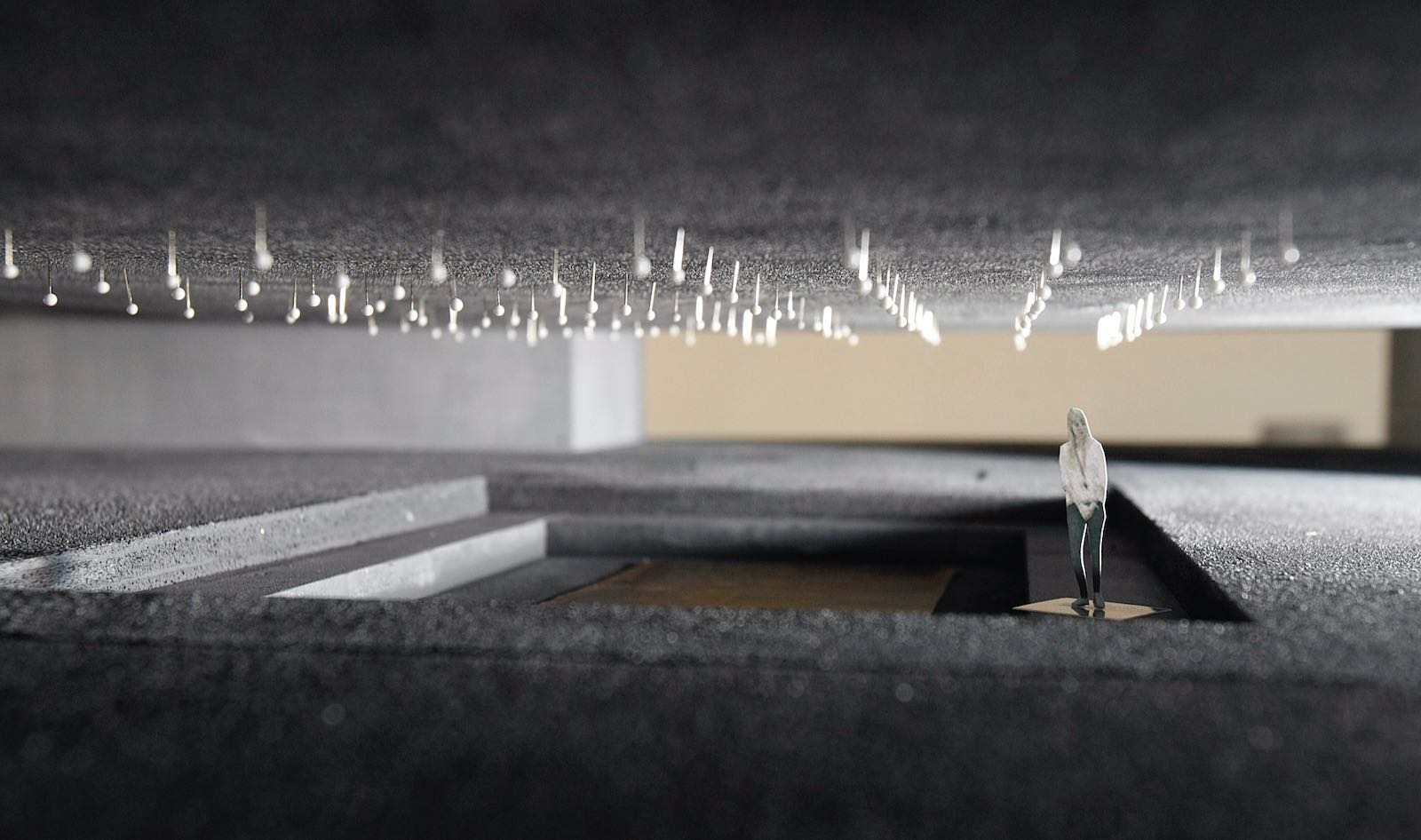
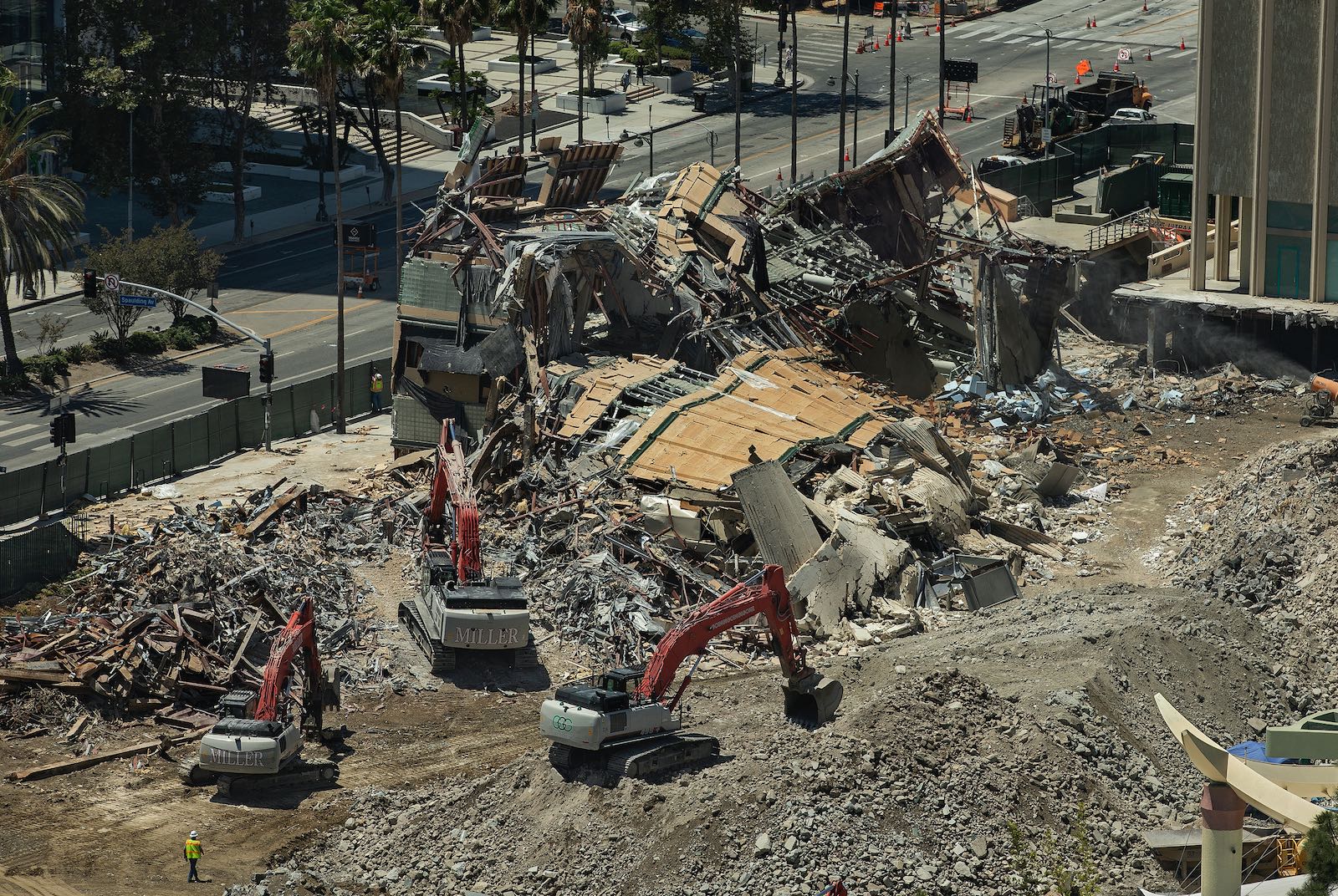
There are two demolitions going on at the Los Angeles County Museum of Art, the largest encyclopedic museum west of the Mississippi, with collections spanning many historical periods and cultures. Over the last several months, the museum has razed three of the four structures on the East Campus, the original core of the institution—themselves only sixty years old—and excavators are now polishing off the last and largest, the Ahmanson Building. The East Campus will soon be a bowl of dust.
The second is the demolition of the museum’s very mission. LACMA’s director, Michael Govan, has officiated over an aggressive proposal that will dismantle and relegate to storage collections that for decades have distinguished the museum and established its standing. Govan’s plan is at once grandiose and diminishing—and, above all, needless. The institution didn’t need fixing because it wasn’t fundamentally broken.
Govan believes LACMA’s collections are a product of “European and Western colonialism and capitalism,” as he recently said in an ARTnews Zoom interview—yet the museum has, in fact, displayed non-European art, both historic and contemporary, for decades. It was never a king’s or a colonialist’s collection but one that, early on, was skillfully curated and rationalized by one of the great museum reformers of the early twentieth century, Wilhelm Valentiner, who also helped shape the Detroit Institute of Arts and, to an extent, the Metropolitan Museum in New York, mixing disciplines and juxtaposing cultures, setting them apart from their forebears in Europe.
The encyclopedic museum is an offspring of the Enlightenment, a descendent of Denis Diderot’s encyclopedia, which he created and edited, he said, “to change the way people think” and better inform themselves with facts. LACMA’s collections—Chinese, Pre-Columbian, Colonial American, African, Greco-Roman, Egyptian, Assyrian, Islamic, Japanese, Arts and Crafts, and Southeast Asian—include the cultural artifacts of multiple civilizations, and over time, they were structured into what became a robustly multicultural, multidisciplinary institution.
Masterpieces outside the European and contemporary collections include the serene, handsome third-century head of a Bodhisattva from Pakistan, the columnar Hindu goddess Uma from Angkor, a ninth-century BC Assyrian alabaster relief of an eagle-headed deity, luminous eighteenth- and nineteenth-century screens from Japan and Korea, and a magnificent fourteenth-century carved wood mother and child from Mali. Works like these have become friends to many Angelenos who return to visit with them, knowing just where to find them. And the collections’ diversity represents a wide spectrum of Los Angeles’s own cultures.
Last year, in his offices, I asked Govan why he would advocate a building with significantly smaller galleries. Govan said he didn’t want collections that led visitors “by the nose.” He was espousing a popular post-structuralist position against overly directive museums critiqued for imposing hierarchical narratives that repress women, minority groups, and cultures marginalized by the mainstream. Curators and museum directors are, rightly, grappling with these issues nationwide—including, of course, the question of the canon: open or closed? But other museums are addressing the issues without bulldozers, by diversifying exhibitions and collections, expanding the canon with inclusive shows, and integrating outsider voices into existing collections.
Despite Govan’s nod in the direction of decolonization, simply garaging the collections out of sight does not address these larger issues. To establish greater equity among artworks and subvert the presumed patriarchal and Eurocentric prejudice of LACMA collections, he is resorting to the hard and expensive corrective—architecture—rather than managing and expanding the collections, making them more complex and inclusive, and simply upgrading the existing buildings (which he had allowed to deteriorate). In Govan’s scenario, design would solve the problem by making the collections disappear. Intending to save the museum, Govan is destroying it.
Under the redevelopment plan, the extensive American, European, Chinese, Southeast Asian, and South American collections, among others, will be effectively exiled off-campus, because the fragmentary layout of the new, smaller museum, by design, can’t display them. The floor plan itself breaks them up. Curators will instead fish artworks from permanent collections pooled in storage for perpetually changing theme shows.
“I’m interested in quality, not quantity,” Govan told me in that interview, adding that he wanted visitors to enjoy “the luxury of space, light, and transparency.” A museum director with prior experience primarily in modern and contemporary museums, Govan has a special affinity for the Light and Space artists of California, as well as other artists dealing with perceptual phenomena—Robert Irwin, James Turrell, Doug Wheeler, Dan Flavin. He has looked for that aesthetic predilection in the architecture he commissioned at LACMA. Without any public vetting process, Govan brought on Swiss architect Peter Zumthor, a master at light and phenomenal effects—natural light raking textured stone walls, for example—who designs experientially immersive spaces. But he had no experience building at the scale of complexity of a major museum, as Los Angeles citizens would learn; and, like Govan, he had no experience or even interest in building for an encyclopedic museum.
Advertisement
When Zumthor arrived in Los Angeles, he shocked curators at initial meetings by telling them, as Govan looked on, that he was “not interested in a museum organized by curators.” Asked if he could name any museums he liked, he couldn’t and didn’t, though he did allow that he generally didn’t like big museums: he came as an iconoclast to an iconic museum. Last year, in an interview for the Swiss newspaper Neue Zürcher Zeitung, he claimed, in remarks that were widely rebuked, that the objects in LACMA are deracinated from their contexts, accidentally assembled, and “displaced,” implying that his environments, instead, would immerse them in a sensory experience that would ground the art.
Throughout the design process, the curators maintained that it was the collections themselves that gave individual artworks context. According to a LACMA curator, “Curators came up with ideas that would have worked cross-departmentally in several possible areas that could draw on the collections, but there was no interest, no resonance, no encouragement to try to do this together.”
Govan and Zumthor disagreed with the curators and ignored their concerns (many have since left). Zumthor embraced the part of disruptor in this asymmetrical power struggle, which suited the director’s agenda of challenging the canon and downgrading the collections. Above all, Zumthor brought a drive to monumentalize Govan’s ambition. Client and architect bonded in a shared “edifice complex.” They were building for history.
Zumthor landed at LACMA in 2009. By 2013, glossy images began to appear online and in print to sell the public and the Los Angeles County Board of Supervisors, the government agency with oversight, what was turning out to be a bill of dubious architectural goods. The campaign was long on glamour but short on information; Angelenos were kept in the dark about how the new museum was organized and what the real square footage numbers were. Floor plans were kept secret, out of public view. What was the museum hiding?
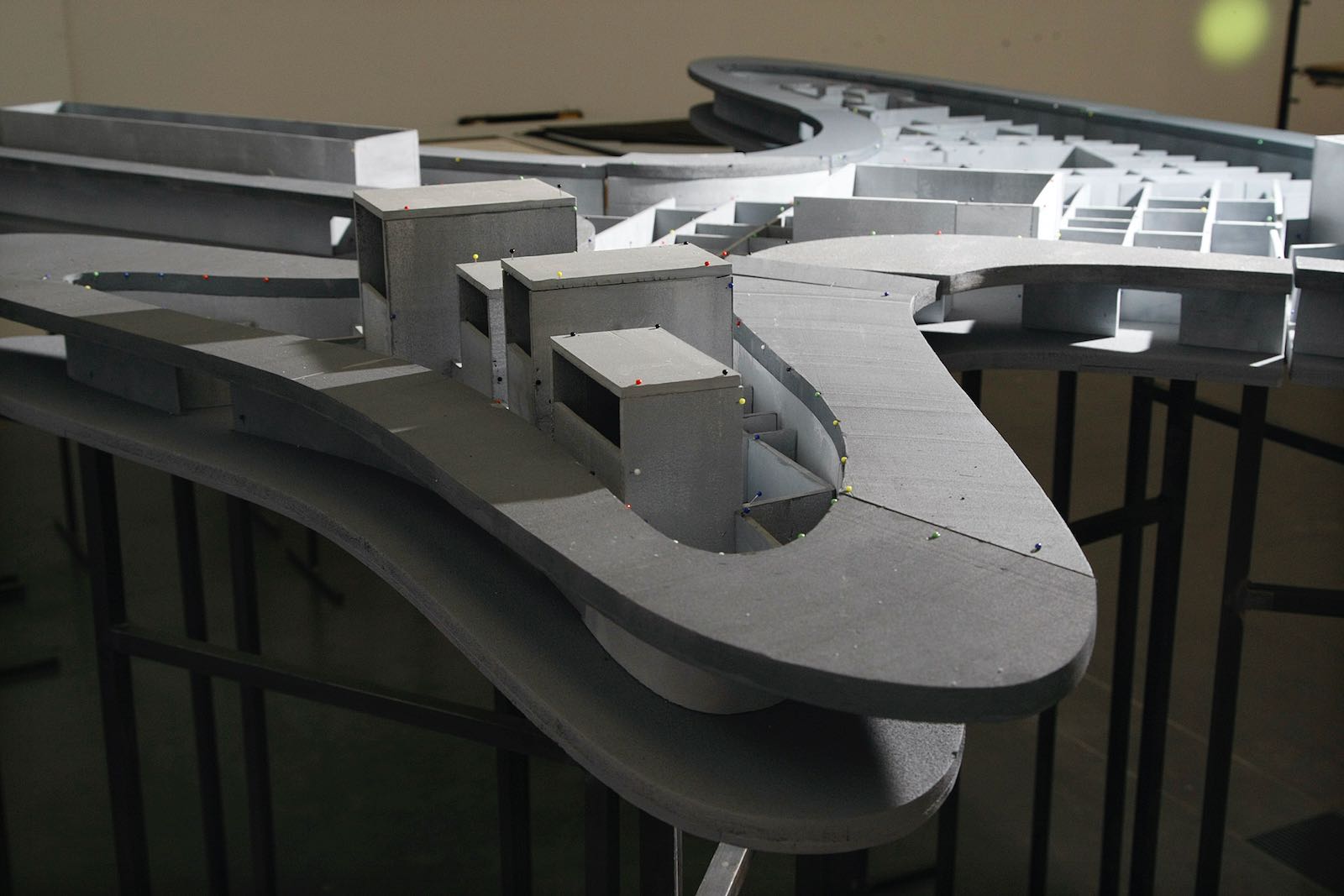
The images depicted an elevated, glass-enclosed, amoeba-shaped concrete structure lofted cinematically over Wilshire Boulevard. The form was inspired by the curves of an asphalt-mining pit—adjacent in Hancock Park’s historic La Brea Tar Pits—that Zumthor mistook for a Pleistocene-era pond. Bridging the structure over Wilshire is completely unnecessary from any land-use or programmatic point of view, and as many underwhelmed citizens pointed out in letters to The Los Angeles Times and elsewhere, the proposed structure looks like a freeway overpass or a rest station over a highway. Beyond the asphalt pit, Zumthor looked to well-known curvilinear architectural precedents built in Brazil and Germany, but his derivative, retro design hardly achieved the messianic vision Govan had promised.
Angelenos had understandably expected an expansion—not a contraction—of their art museum when the project was first announced. To shrink a museum in a project understood by the public as an expansion was unprecedented in the US, especially since LACMA’s art collection had grown by tens of thousands of artworks to more than 150,000 pieces since the fourth building on the East Campus opened in 1986. The project may be the most unpopular civic building in the city’s history: more than 15,000 citizens have signed petitions against it.
Asked recently at a dinner party what he thought of the building, Frank Gehry simply draped a napkin over his head.
*
Even after issuing the stamped plans for cost confirmation nearly two years ago, and for plan check a year later, the museum made no public disclosure about the galleries. In a display of bad faith, it became increasingly clear that the museum was waiting strategically until the demolition of the East Campus—a point of no return—to release that information.
Advertisement
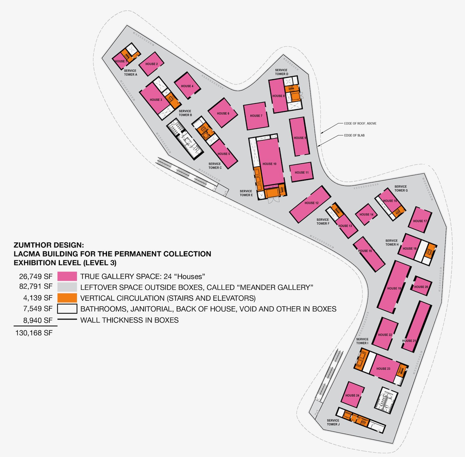
Now, with the demolition nearly complete, LACMA has finally issued a floor plan—but submerged it in a distracting deluge of images showing crowd-pleasing renderings of moody, atmospheric galleries delivering surprise encounters of eclectic arrangements of art on all-concrete walls (Zumthor doesn’t like drywall). A slick video, “One Collection, Many Paths,” ends with the false claim that the galleries are being expanded rather than downsized.
Even with the floor plan, however, the visuals fell short of full disclosure. The museum’s PR department failed to include a crucial element of information, one that reveals an alarming story. An investigative digital search through county records unearthed a Rosetta stone of square footage tables that put precise numbers on the museum’s demotion from a three- and four-story encyclopedic museum to a one-floor kunsthalle for changing theme shows. The new configuration replaces the original 117 galleries with 24 small galleries, occupying just 27,000 square feet rather than the original 138,000 square feet. Shrinkage alone effectively dissolves the collections, consigning to storage a large percentage of the collections once shown. Govan’s mandate was never to disband the popular collections, but with the compliance of an impressionable board he largely appointed and controlled, he arrogated the museum’s conversion so that the architecture usurped the encyclopedia.
There are two kinds of space on the gallery floor, first-class and third-class, one privileged and the other leftover. The boxed galleries in Zumthor’s miniaturizing plan amount to only a fifth of what had been the original square footage. At 3,200 linear feet, the wall space is a quarter of the originals’. Euphemistically called “houses,” all encased in solid concrete, the boutique-sized galleries are scattered with a randomness intended to purge the museum of hierarchical, by-the-nose displays. The “houses,” however, are monotonous, geometrically authoritarian bunkers, claustrophobic rooms that make it difficult for a curator to jump the gaps between the concrete shells. Collecting and displaying in depth allows museums to visualize the cultures, histories, and periods behind and beyond the brushstroke, but Zumthor’s design bakes a short, provincializing attention span into the boxes.
One former director of a major American museum told me, on the condition of anonymity: “It is all poorly configured and way too small and will mean that far fewer objects from LACMA’s excellent collections are shown and many more will remain in storage. I’m afraid no program of clever juxtapositions, novel interpretations, thought experiments, etc., will make up for the richness of experience that this radically smaller and poorly conceived layout will make inevitable.”
Beyond the boxed galleries, the rest of the floor space is the third-class, so-called “meander” gallery, where corridors interrupted by doors and other corridors lead from lobbies and elevators past bathrooms and emergency stairs to intersections with other corridors. The curving, half-mile-long perimeter walkway, the largest part of the gallery, is a destructively light-soaked promenade deck with floor-to-ceiling walls of glass that severely restricts what can be shown, again shortchanging the potential of LACMA’s own collections. An architect from Switzerland seemingly misjudged the glare of Southern California sunlight.
The meander gallery’s design even backfires on the director’s stated intentions. The dispersive floor plan mixes points of view along multiple pathways that will, theoretically, facilitate “a new art history.” But casting visitors adrift without a compass through centuries of art history, the strategy of providing random, serendipitous encounters with art will, in fact, lead visitors “by the nose” through episodic spaces that serve up only hors d’oeuvres without ever getting to a main course. The floor plan is all circulation, a maze with nowhere to go. You can only meander in these spaces, not sink into the culture or history that produced the pieces. Visitors, like pinballs, will bounce between paintings and sculpture—a piece here and a piece there—isolated on segmented walls and in narrow spaces. Over many decades, experts at LACMA have woven collections into nuanced tapestries that are now being unraveled in favor of a Whitman’s Sampler.
The plan also cannibalizes the 60,000-square-foot Broad Contemporary Art Museum on the West Campus by transplanting the modern and contemporary galleries there, and it cannibalizes the Pavilion for Japanese Art, to which most of the conservation lab will be moved. Stripped of functions, the design even exiles the library, administrative, and curatorial offices to a high-rise building across the street, at $5 million a year in rent, adding dysfunction and expense to the issue of shrinkage.
Another former director of a major American art museum called the plan a “joke,” citing the constant, disruptive flow of people in the corridors and the “ridiculous” size of the boxed galleries, which are “dead wrong: windowless, without natural lateral light, and just too plain small to show any one artist in depth.” The floor plan is a road map, he said, for dumbing down the museum: “Labels matter, curators matter, expertise matters.” The LACMA encyclopedia becomes a CliffsNotes jog-trot.
The Zumthor design also contradicts Govan’s rhetoric of inclusion. It isn’t a good neighbor. Hovering thirty feet above overly large, sun-baked plazas, this agent of urban desertification creates dead space, rather than touching ground and rooting itself in the cityscape to nurture a neighborhood. An aesthetic trophy, it wants to be alone, even though a building and institution of this scale could act as a catalyst for the formation of a diverse cultural village within the city. As designed, it’s out of touch with the boulevard and neighborhood it imperiously colonizes. Isolated in a moat of air, with inhospitable open spaces beneath the concrete belly, the elitist building is all piano nobile. Museum visitors look down on passersby, and passersby have to look up. The aloof posture encodes the exclusionary social hierarchy Govan professes to banish.
The cost of this cantilevered, all-concrete structure, including a bridge over Wilshire Boulevard engineered to resist earthquakes and truck bombs, is profligate, disturbingly Marie Antoinette at a time when the Southland sinks into a recession. LACMA’s website states the building cost alone is $640 million (out of a total project cost estimated to be between $750 million and $1 billion). As the filed plans have revealed, construction for the project’s usable space, which means discounting some square footage in the basements, will cost about $2,500 per square foot. This boondoggle thus exceeds by more than $1,000 per square foot the most expensive museum recently built in the United States—the San Francisco Museum of Modern Art, which came in at $1,385 per square foot, according to The Los Angeles Times.
*
Govan’s desire to build a monument—and not the museum’s program, not its functions, certainly not its collections—set the agenda for this project. The collections have been the soul and backbone of LACMA and would be the envy of most museums, but the impulse behind the architectural effort, the unstated subconscious of the project, was more fundamentally to sensationalize the design into a spectacle. Size mattered. Zumthor bloated the building gratuitously, stretching it from one side of Wilshire to the other despite shrinking the total gallery space itself. In place of the promised quality, Govan has played up quantity, and even then, only its appearance. Making it look bigger made it dominate.
Govan cut his teeth working at the Guggenheim, when his mentor, director Thomas Krens, built Frank Gehry’s Bilbao Guggenheim in the 1990s. All the moralizing about democratized exhibition space and reinventing the concept of museums seems an argument of convenience for the real ambition of out-Guggenheiming the Gehry building.
With the cement trucks about to roll in, Govan is poised to start construction on his vision, at vast and unnecessary expense and at the cost of dismantling one of the great encyclopedic museums in the country. The first demolition is near-complete. Unless the LACMA Board of Trustees and the Los Angeles County Board of Supervisors intervene to stop the foundations from being poured and develop another, better plan, the second demolition will soon be finished, too.
This is a hostile takeover of the museum, and if the design succeeds in hijacking the institution, Los Angeles will be living for a long time with a wanton act of architecture, and the bitter memory of a very expensive betrayal of the public trust.


