This article is part of a regular series of conversations with the Review’s contributors; read past ones here and sign up for our e-mail newsletter to get them delivered to your inbox each week.
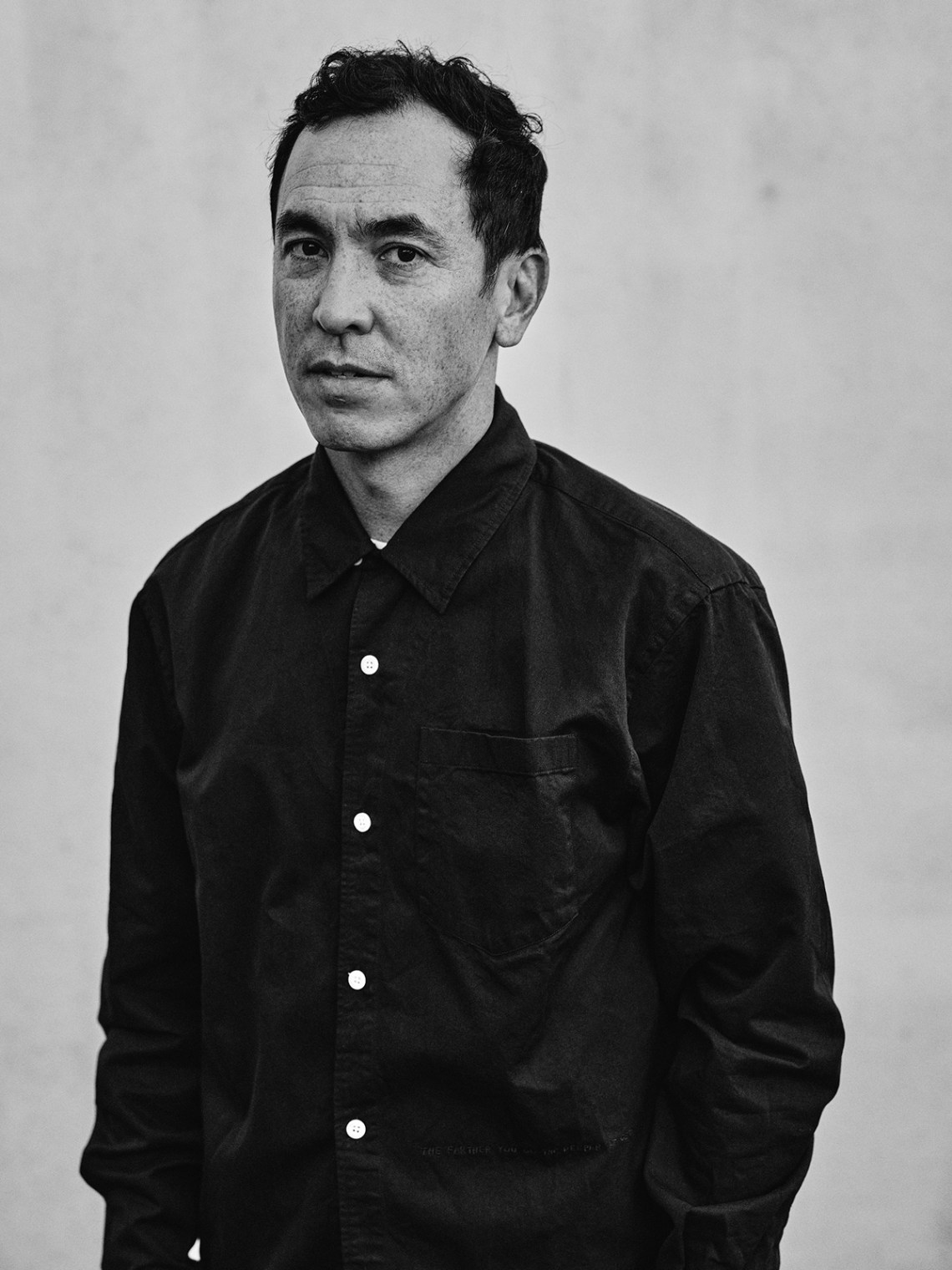
Geoff McFetridge is a Canadian-born, LA-based artist and designer whose creative practice runs the gamut from paintings, sculptures, and zines to commissioned work for Greenpeace, Spike Jonze, Pepsi, and Sofia Coppola.
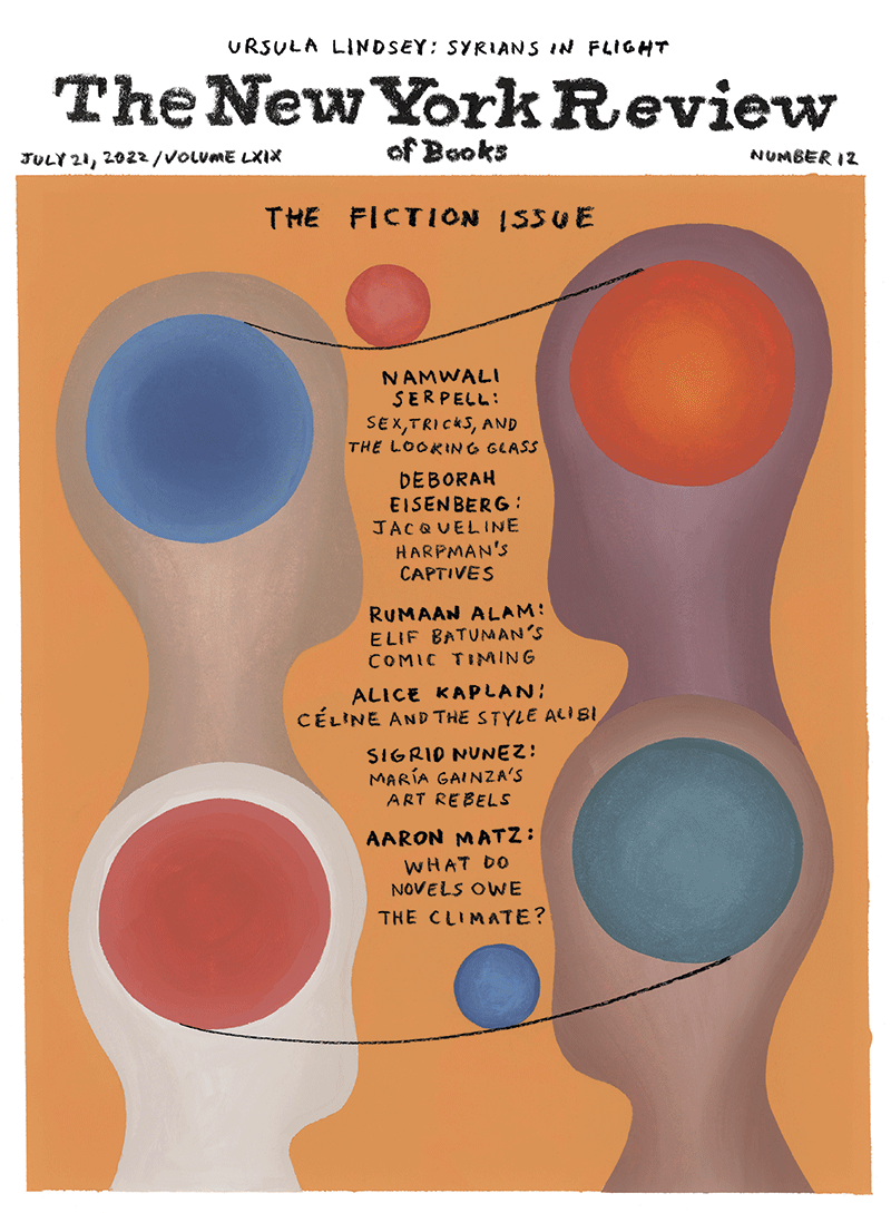
McFetridge hand-painted and -lettered the cover for our Fiction Issue, titling it Writing as the String of the Yo-Yo. In his work, certain themes and motifs yo-yo around and throughout: relationships, group dynamics, dreams, and patterns. Visual and metaphorical asymmetry and balance structure his images. There is a kind of yo-yo-ing in Geoff’s studio routine, too: repetitive drawing; scheduled times to sketch, then cycle, then paint; and an upstairs-downstairs set-up. I e-mailed with him upon his return from installing and opening a show of new paintings at a gallery in Tokyo, and we talked about visual literacy, story as process, and surfing.
Leanne Shapton: I thought of you for the cover of the Fiction Issue because of the stories that can be read into your figures and scenarios. They remind me of Borges’s Ficciones or little epigrammatic pieces of flash fiction. Did you ever want to write fiction? Do you think in terms of metaphor? Of scene?
Geoff McFetridge: That is a really nice comparison. I love to read, and I love how writing opens very specific doors in my imagination.
I don’t intentionally use metaphor, but I am sure it is a part of what makes my work function. Based on my background in design, my work is heavily reliant on language. In design you often start with a brief, which is a sort of story, and then you respond to it. Over the years I have taken these briefs and remade them so the story is more to my liking. This is probably the most important part of my process. The work itself is a response to these narratives.
I have always been interested in writing and would love to do what I do with words only…. But so far, I am most articulate with drawing.
Lucian Freud once said he’d seldom draw at the same time as he painted, or vice-versa. Do you have jags of just drawing or just painting? Or just surfing?
I agree with Freud. My studio is two stories and I paint downstairs and draw upstairs. I would also say that when I am drawing with paint it is not painting. And yes, I spend a fair amount of my time surfing!
I try to not compare paid art time to unpaid art time, or surfing time to painting time, for that matter. If I did, then as my work became more valuable my surfing would become too expensive.
In a 2021 interview with the art and design magazine It’s Nice That, you talked about the “edge of legibility”—I think you were talking about recognizing shape and manipulating meaning. I’m interested in nonverbal reading, and how artists who have some experience with design or commercial art (like you, or like Pierre Bonnard, Edward Hopper, Andy Warhol, Barbara Kruger) seem to have a sense of semiotics and legibility in their images, which is related to how we read publications and media. How does your fluency in words and pictures inform your work?
I have always traded in my own visual fluency, and I think a type of visual play can awaken viewers to their own fluency. Design and commercial art can be like assembling a sculpture out of found objects; building something unusual out of the familiar. The balance of “have I seen this before?” simplicity and “I wish I had thought of that!” inventiveness is an important aspect of my work.
I think that my years working in design and commercial art (like the artists you mention) have helped me develop a nimble creative strategy. My work for the cover of this publication is no different from work I would do for a show in a gallery. I am interested in how far I can take things, not to grow out of or graduate from commercial work, but to create a studio practice that can be broadly successful.
I like the idea of reading that goes beyond words because of this understanding—a sort of literacy of images. Do you think people are becoming more literate in images? Or were we always?
I am fifty-one, so I grew up in the 1970s and 1980s, when culture became really good at speaking with images. Every band had a good logo, and subcultures were all encompassing visual worlds. I think that this was the time when our natural human ability to understand and connect through images became hyperactive.
When a figure is far off in the distance, say, on a lonely desert road, even though this person appears only as a blob, just a few pixels of information, we understand that it is a person, not a tree or a fencepost. Our ability to organize our world visually in this way, all the time, is something that preoccupies me.
Advertisement
We can tell if a person in the distance is into heavy metal or K-pop. We know if a logo is for car polish or a smoothie. What we do with this literacy and cognitive acuity is a burden on all of us.
What have you been reading?
I just finished George Saunders’s A Swim in a Pond in the Rain while reading the new Geoff Dyer book, The Last Days of Roger Federer.
I love your figures, like the humanoid heads from the cover, and how they shift and morph and are human-divergent and ethnically ambiguous. As a fellow half-Asian Canadian, I recognize them! Can you tell me about your depiction of figures and genders and bodies?
That is great. Maybe being ethnically ambiguous from a hard-to-generalize nation like Canada has had some influence on me?
Human figures are the base material for addressing the themes I am interested in. So, coming up with different ways to depict the human form is a big part of my work; it’s a sort of broad visual generalization. I often use “Us” in my titles, and the figures I portray are meant to be…us.
I love it when people talk about a person in my painting and one may say “she” and another will say “he.” My motivation is not to be inclusive but just to put the viewer on a tightrope, balanced between their own thinking and what the painting is saying, in order to create an understanding of the work. In this way we are meeting me halfway; the outcome of the work is not wholly prescribed.


