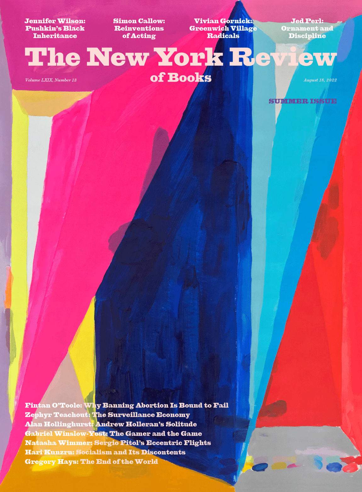
Andrew Kuo, whose painting Stay Up, 2014 shimmers on the cover of our Summer Issue—the first issue after we redesigned the print magazine—is an artist and author who contributes regularly to T: The New York Times Style Magazine and cohosts, with Ben Detrick, a podcast about basketball and culture called Cookies Hoops. In 2021 Kuo and Detrick published The Joy of Basketball: An Encyclopedia of The Modern Game, an illustrated and idiosyncratic guide to the sport and its charms.
Kuo’s art—color-coded and painted charts, abstracts, and still lifes—while stylistically varied, is marked by its ebullience and expressiveness. Perhaps like basketball, his work is a kinetic interplay of beauty and effort. I e-mailed with Kuo during the waning days of summer, and we discussed basketball, sketches, and comedy.
Leanne Shapton: I’ve always loved your loose, painterly work, your flowers, self-portraits, and abstracts. One of the first things that drew me to your paintings was your palette: bright and primary but not exactly childlike—really unexpectedly lurid and deep. This may seem like a question from a fourth-grader, but can you tell me about your favorite colors?
Andrew Kuo: Thank you! My taste in colors shifts every few years, but I try to include some “generous” ones here and there, like a bright red, a clear blue, or a rich purple. I’m really interested in small moments: a blue next to a red is funny, but too many clever combinations can be either too inviting or cold. Each painting is different! The edge of “dumb” is always enticing.
What is the relationship between the sketches or roughs you do for your more geometric chart paintings, and their final state?
The sketches give me a guide to the actual painting, but they also remind me to be loose and playful. Work can start from a place of joy.
Choosing this particular painting for the cover was a bit of a scramble, and at a certain point you sent pictures of dozens of gorgeous paintings I’d never seen before for us to choose from. Do you keep your sketches and studies? How did you know exactly what we were looking for?
I keep some studies and throw away others. Some I finish, some I use to write out ideas, and others are just references for colors and forms. I throw away a lot! The ones I showed you were further along, but also had bolder shapes and colors. Not all pictures read as fast as cover images should, right?
Do you consider yourself an abstract painter? Tell me how you came to work with (and subvert) the form of infographics?
I do and don’t think of myself as an abstract painter. I’m very interested in shortening the distance between abstraction and figuration. The chart paintings borrow from figurative ideas and follow strict rules, which I create. There’s nothing random. By adding a key to the bottom of the paintings, I’m telling you how to read the image, but also taking liberties with the truthfulness of a “work.” I think of the charts as figurative.
What are some of your favorite non-art things to look at as inspiration? Can you tell us about your new book, The Joy of Basketball?
Basketball inspires my work, not only with its data and information, but the little details of the sport that tell us about what we’re looking at: colors, lines, paths, boxes, rules. I’m interested in the bias that’s part of every story. The Joy of Basketball is reframing how we look at the game, after the era of analytics and mythologizing in the 1990s and 2000s. It’s an effort to take the game back from the grip of old ideas.
My workday often begins with these questions: How do I look at paintings and a picture in the context of other pictures? How do I add to the conversation? How far can I push something without losing the idea? In my opinion, with Twitter, Instagram, and TikTok, we are far more advanced than we give ourselves credit for.
Your work feels self-aware, or emotionally realized. Are you in analysis or psychotherapy?
I tried a therapist for a few months, but they were too obsessed with the Grateful Dead. The first ten minutes of every sixty-minute session was about John Mayer. I left that relationship but still, selfishly, use therapeutic ideas in my work as a way to get to another place. I want to bring the painter to the surface of the image, and a lot of that means revealing something personal in words or images. Messy, brushy paintings can feel as intimate as words to me.
How do you feel about self-portraiture?
I love it. You’re reminding me to make more of them. The world of identity and the truth feel never-ending and there are few things as direct as a painting of yourself. For a while I was painting myself skinnier, but these days I’m just happy to be here.
Advertisement
Your “Grub Street Diet” really stuck in my head—the veggie chicken wings, the Rao’s marinara sauce—I could see the colors. Am I right in sensing some connection between your love of food and the appeal of your paintings?
Thank you and definitely! Food has a reductive quality to it: everyone knows when something’s appealing when they see it. It crosses through rules. Being hungry is intense, the most human feeling.
What were you working out in the lower right section of the cover painting?
Color combos and a key—but to be honest, the next painting!
I get a real sense of comedy in your writing. How does humor work its way into your life and paintings, or your podcast? Do you write jokes? What do you laugh at?
I’m a tourist in the world of comedy but try to channel a lot of those rules and practices into my work. I have to admit that I look too hard for jokes, which is definitely a coping trick. I learned early in my life that no one likes to be around a short, sad person with glasses, so I thought being funny was my only hope for making friends. I always try to shift the tone of the words in my paintings from serious and factual to absurd. Also, jokes are useful: they can be a signature in a story, or a fingerprint. Comedies should be up for best picture awards, too.


